BreathWrks
IPHONE APP RESDESIGN
Breathwrk is the #1 app in breathing that's changing lives. This application involves a community to join together using breathing techniques to wake up, fall asleep, calm anxiety, improve physical performance, and more. Working with their existing application, I redesigned their interface with a motion study using Figma, creating a moving mock up of my proposed application that better suits the need of their users for this app.
This project used: Figma, Adobe Photoshop
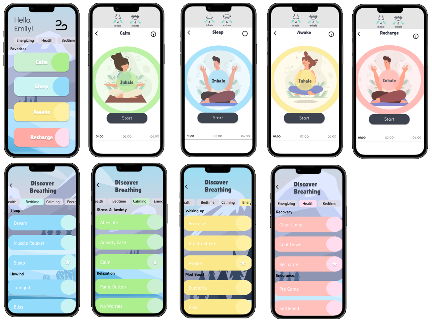
SPECIFICS: For this project, a motion study was done for the iPhone user interface of BreathWrks. The loading screen, menu, and user interactions were required to be shown. The resolution for the iPhone screen is 428x92. I created a flowing GIF in Figma that displays the users interaction sequences within the iPhone interface, with the user interaction displayed on the screen. The main purpose of this design was to give a more cohesive design that correlated with the brands identity and purpose while simplifying the categories and interactions. This apps purpose is to relieve stress and be simple to use, thus I created a design representing this.
GOAL: To maintain a design that correlates with Breathwrks purpose while promoting a user friendly flow when interacting with the app.
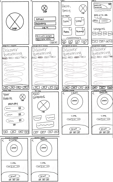
Wireframes:
BACKGROUND: I chose to redesign the application Breathwrks because I personally use this app on an everyday basis but I noticed a lot of design flaws and navigational issues. The application has some problems with user interface and accessibility as well as inconsistency with the design and color scheme. The applications navigation is chaotic and disorganized. The instructions for each exercise are small and hard to find. The color schemes under each breathing exercise do not match its intention, “Calm, Sleep, Awake and Recharge”. There is continuous repetition on the interface and may confuse the user where to go next or its purpose. The choice of design and characters within the design don’t appear to correlate with the application's purpose. My solution is to reconstruct the application to better align with the brand and create a smoother navigation and flow to and from each task and page. The solution is doable within 7 weeks and will allow the company more users to get what is intended from the application, exercises in which they can easily use to destress.
BEFORE
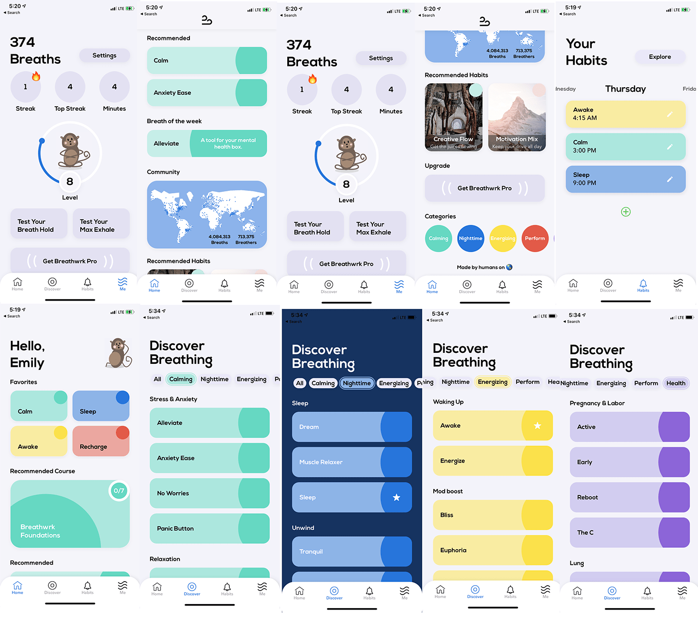
AFTER