


Gostid - Branding & Packaging
Background
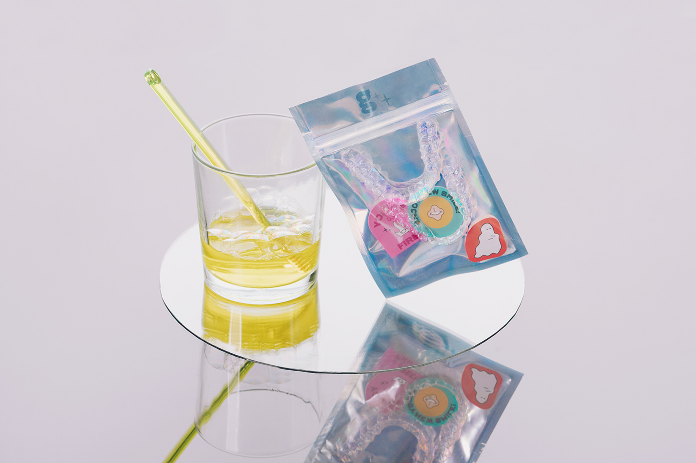
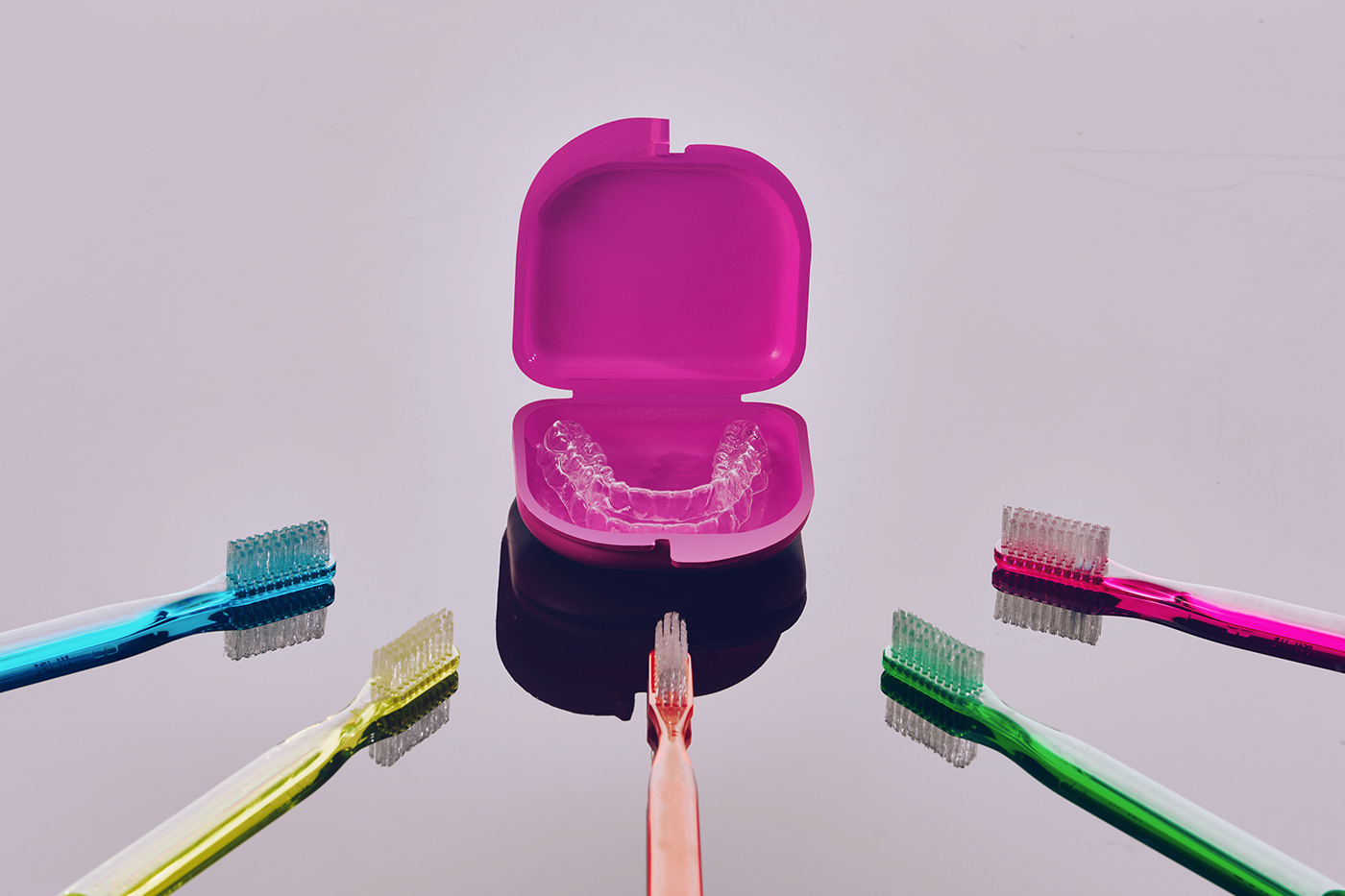
A Mexican producer of clear aligners based on Yucatán & Quintana Roo came to us in need of a name, brand, identity, and packaging that would help them stand out in the aligner's market. With a clear mission of uncomplicating the complicated world of dentistry, they offer premium products with excellent care to their clients.

Naming & Concept
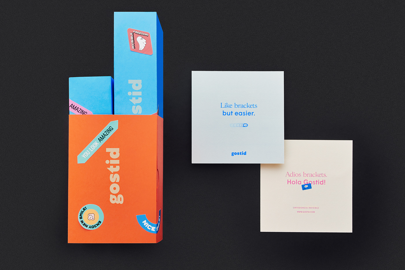
Having on mind transparency, they needed a name that matched everything they do with fun and a spirit of modernity, avoiding the "smile" cliché. Therefore, we landed on gostid, a trustworthy moniker that perfectly aligns with their ethos.
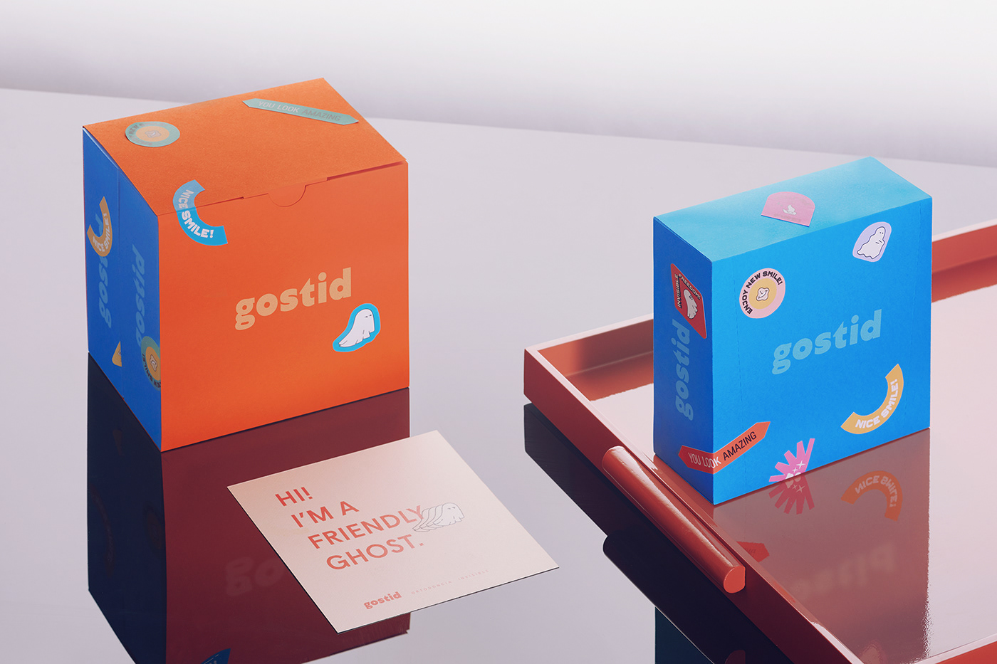
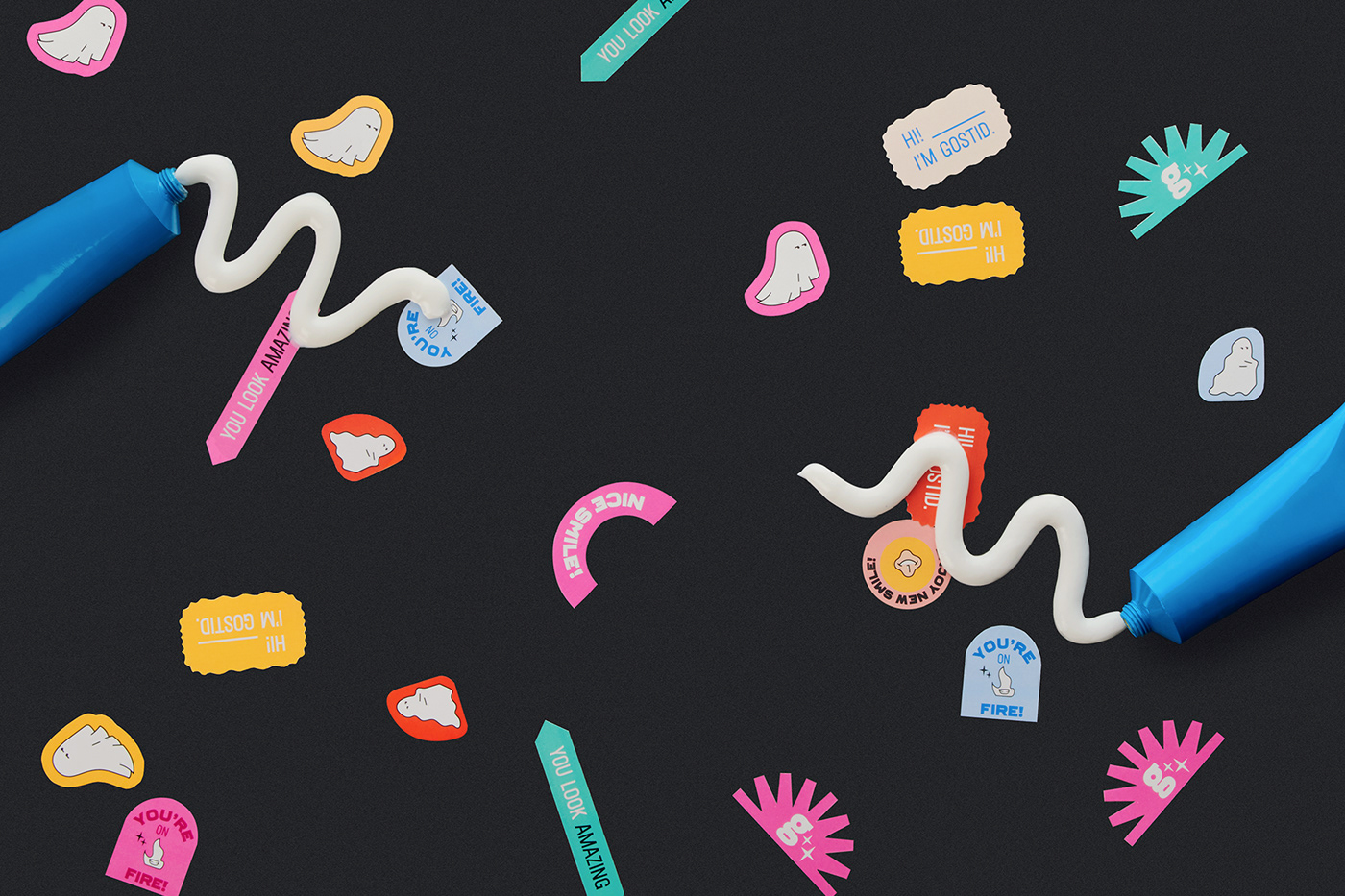
Drawing character in the brand
Our challenge was to create an identity that could be seen as professional, approachable and fun-loving, whilst standing out from competitors. With a name such as gostid it was important to inject brightness and fun into the illustrations, in order to create an identity that wasn't soulless nor boring. As a result, we designed a bright and happy brand, for extraordinary and confident people.
The ghost is the character who guarantees companionship and commitment every step of the way. The smile character was created as gostid's signature, an unafraid of putting their name on everything they do.


COLLABORATIVE PROJECT.
CREDITS:
CONCEPT & NAMING: IrregularBrands
BRANDING & ILLUSTRATIONS: Enrike Puerto
ISOTYPE DESIGN: Jose Acosta
ART DIRECTION & POST PRODUCTION: Adriana Mora
PRODUCTION ASSISTANT: Ricardo Magaña
PHOTOGRAPHY AND LIGHTING: Pablo Monterrubio
PHOTOGRAPHY AND LIGHTING: Pablo Monterrubio


