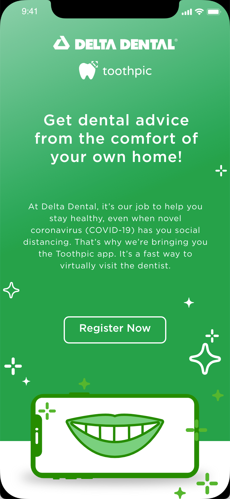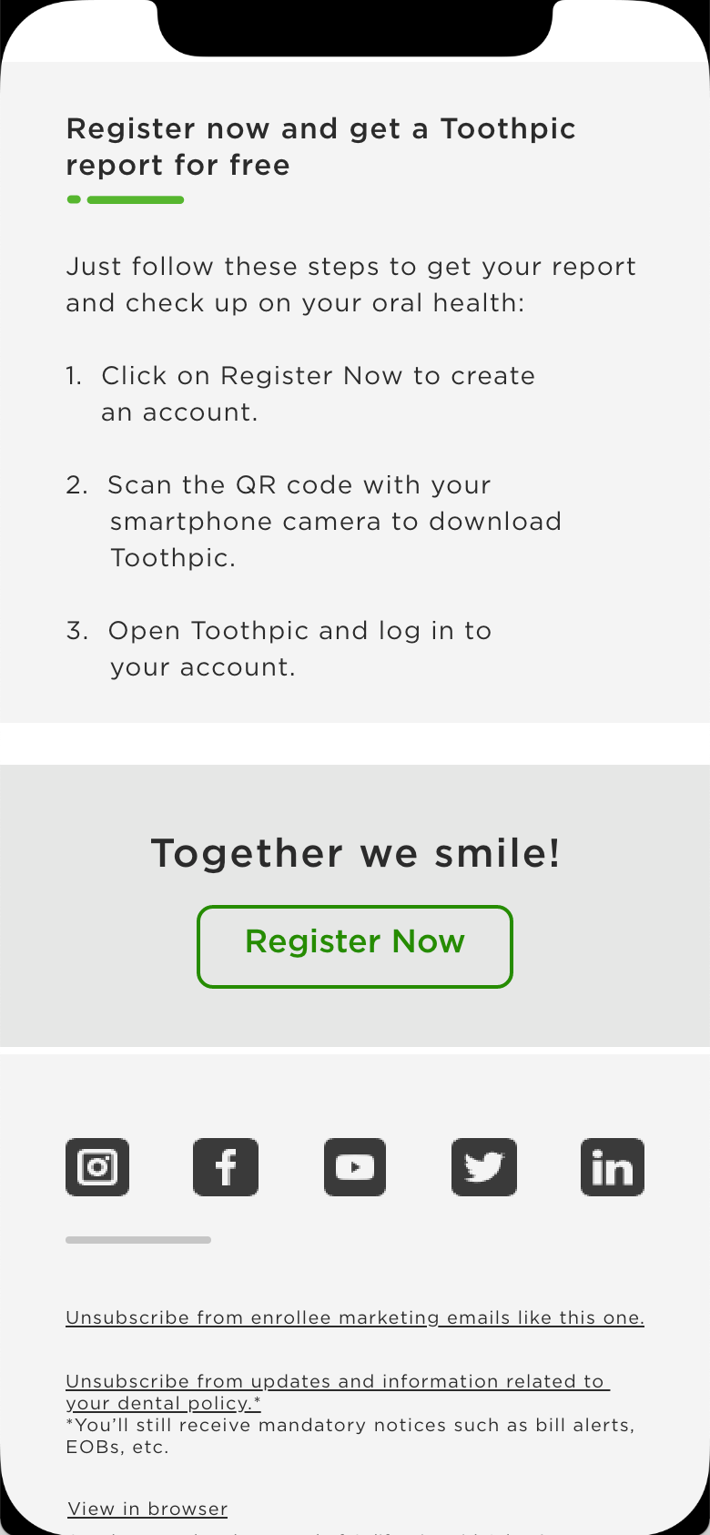
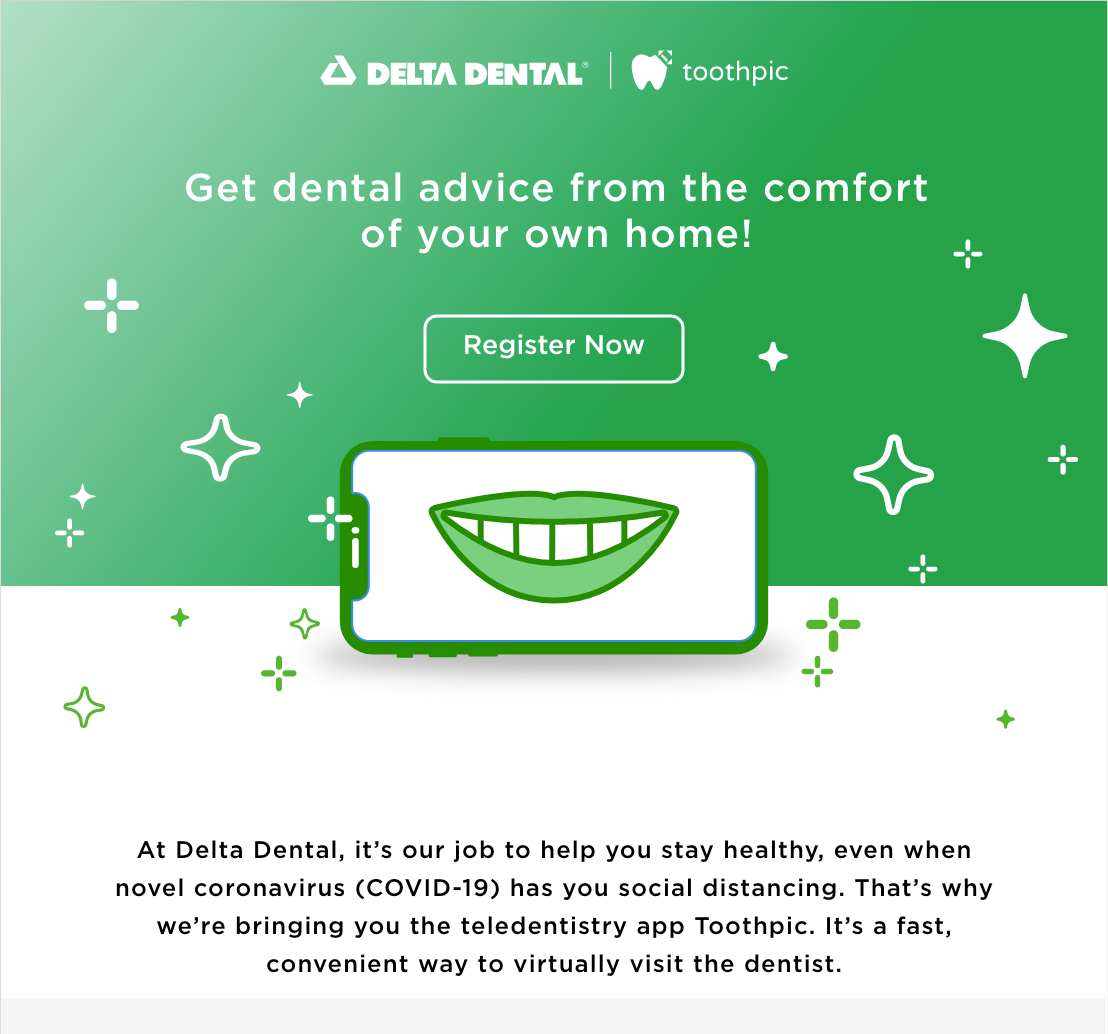
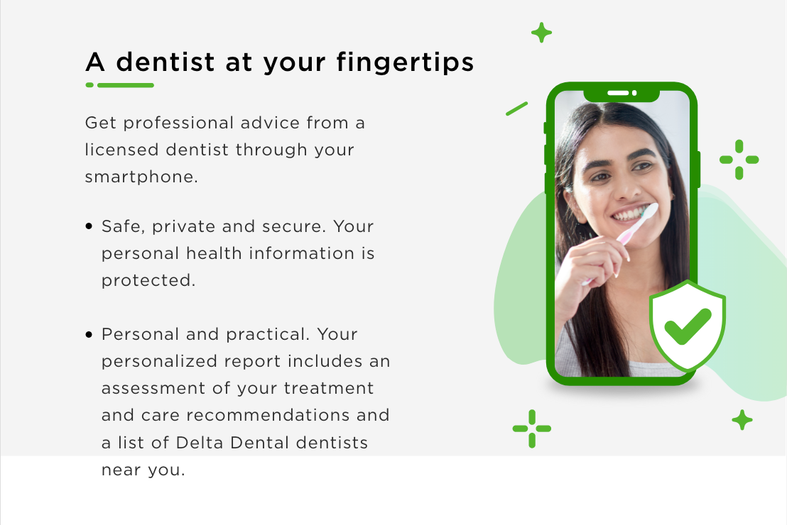
Toothpic Email Revamp
This was a fun small project to revamp older emails pertaining to the promotion of a Delta Dental/Toothpic partnership. The initial design worked for round one but had accessibility issues (the first designer was not presented with the accessibility needs for this document). I was able to take the round 1 files and fix color contrast concerns, font size issues, CTA placement and revise the layout to brighten up the document flow.
The initial file and pain points:
1. The light blue elements and green footer were too light to create enough contrast against white.
2. Bullets were not correctly left aligned.
3. The CTA fell below the fold.


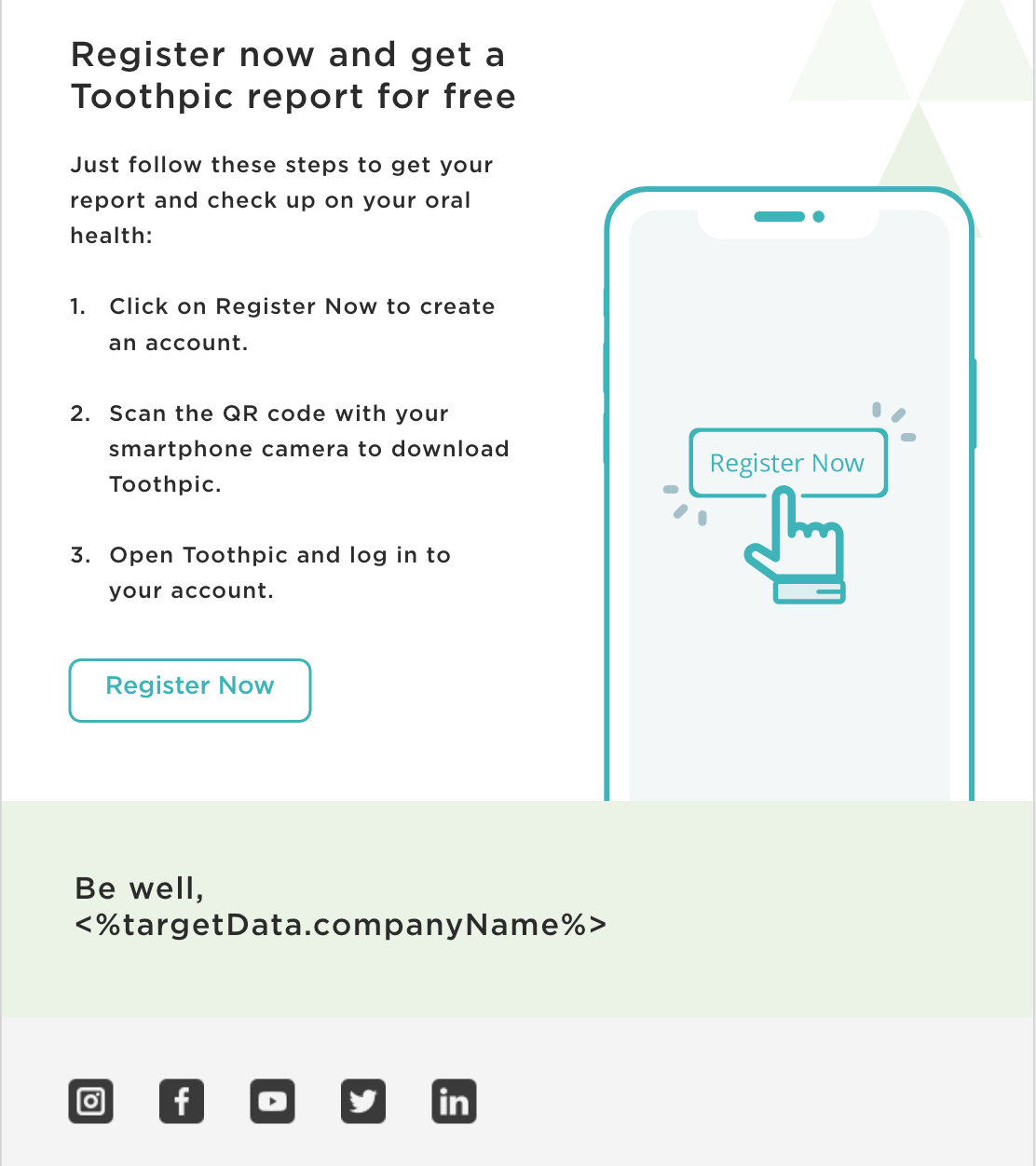
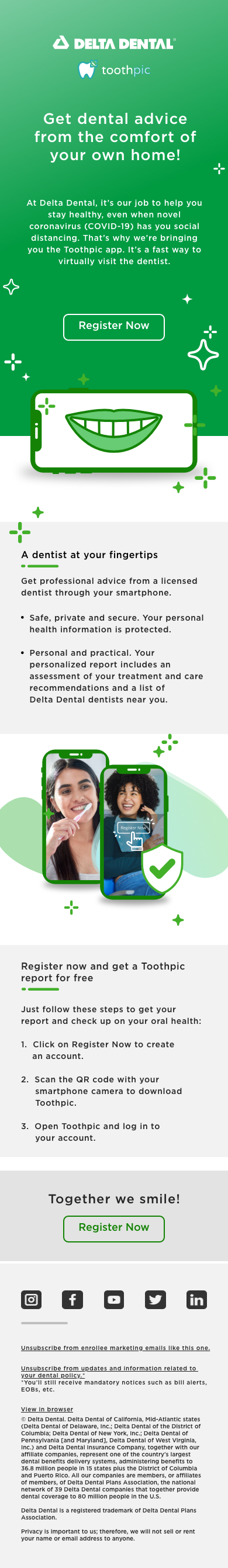
My revamp (desktop email):


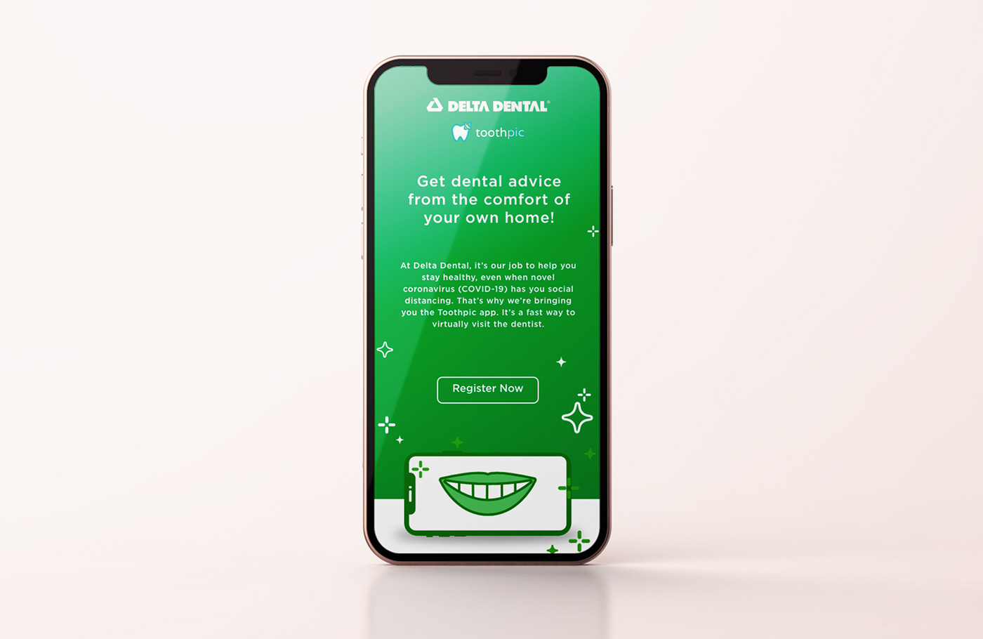
Mobile version: