Brand Identity Design - The Snack Lab
Our client, The Snack Lab, wanted us to create a clean, minimal logo identity for its range of healthy, roasted and oil-free snacks. Following a ‘Less is More’ approach, we created a typography-only logo design that is contemporary and yet has a classic appeal.
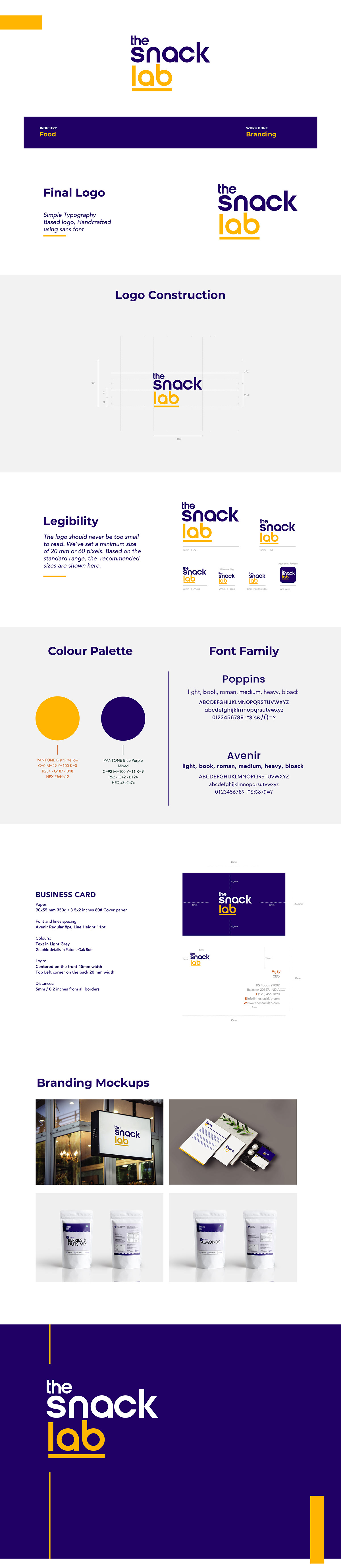
We used geometric sans serif typefaces, Poppins and Avenir and added a touch of pop with the bistro yellow and blue purple — positioning the brand as a young, fresh, and innovative food brand for the target audiences that are becoming increasingly conscious of their health and fitness.
Looking to create a brand logo design that gives your brand a unique identity and depicts what it stands for; drop an enquiry here https://www.codesignlabs.com/project-enquiry or drop us an email at 91@codesignlabs.com
PS. Everyone loves appreciation and so do we. Don't forget to tell us if you liked this brand identity.


