Foundry
Visual Identity, Print Design
The Foundry is a historic industrial building on the east side of Cambridge, Massachusetts. The city is repurposing the building into a center for creativity, innovation, and collaboration in the arts and engineering. Cambridge residents will have access to programs in visual and performing arts, entrepreneurship, technology, and workforce education. To coincide with the development, the facility needed an identity that would meld together the community's industrious past with its innovative future.

Discovery
Built-in 1890, the Foundry is a significant landmark in Cambridge’s industrial, economic, and social history. The building is associated with the critical turn of the century manufacturer Blake & Knowles Steam Pump Works, known for its leading steam engine designs. It also became a symbol of community and social progress, being the site of a significant labor initiative won by the national women’s labor movement.

There are no existing images of timber frame interior of the Foundry, the above image depicts an identical Erecting Hall operated by the Blake & Knowles Steam Pump Works.

Above image depicts masonry exterior of the Foundry, the former Blake & Knowles Steam Pump Works, on 101 Rogers Street and Bent Street elevation, 1935.
STEAM
Through the late 19th and early 20th centuries, the Foundry housed the manufacturing of steam pumps’ leading design. The building’s redevelopment celebrates its innovative history by providing programming in Science, Technology, Engineering, Arts, and Math (STEAM). The center seeks to forge a healthier and more productive bond between the East Cambridge community and the Kendall Square biotech sector.

Visual Ideation
The Foundry’s core values are community and fostering a connection between the arts and engineering. The brand identity needed to convey welcome, accessibility, inclusivity, collaboration, and innovation. It also needed to signify the bridge between its dualities: the industrial and technological, mechanical and organic, historical and contemporary.

Identity Concept
The circle logo mark features an industrial letter block with a digital letter form, signifying the convergence of historical and future innovation. The logo mark's negative space reveals part of the casting to be forged, a manufacturing process in which a liquid material pours into a mold containing the inverse of its shape.


Identity Elements
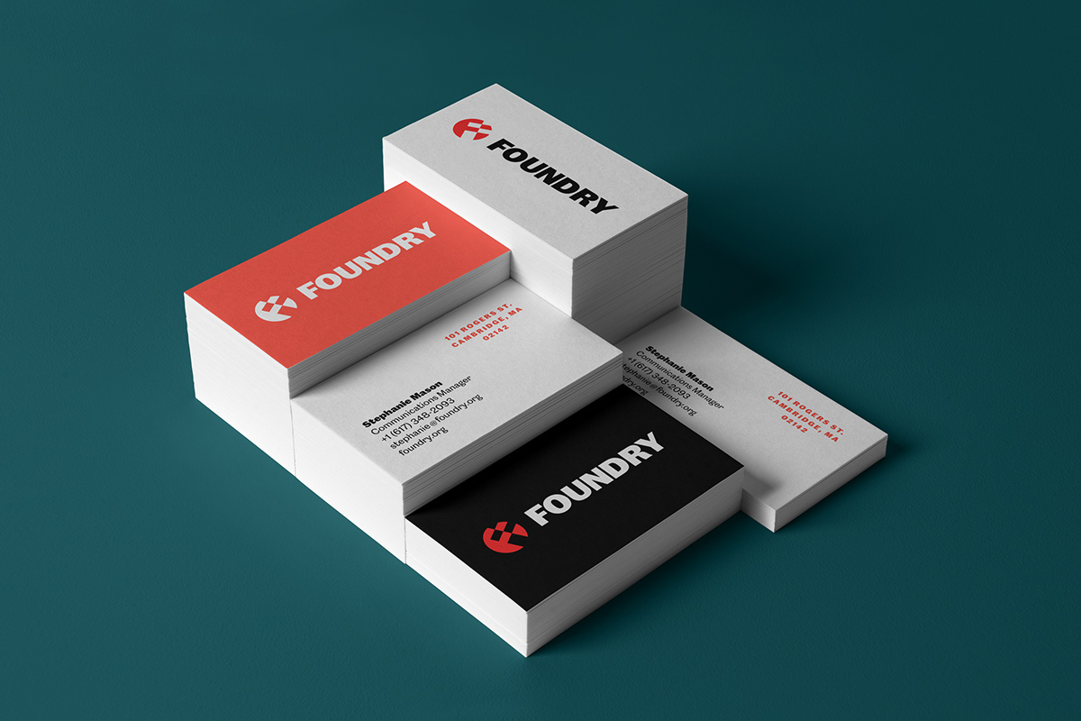
Colors are an integral part of the brand identity, setting the tone and signifying the multiple components of the center’s purpose. The primary colors are warm red and charcoal black, similar to the hot forging metal and iron hammer. The secondary colors are more organic, ranging from a deep evergreen to a manufactured, steel grey-blue. The blending of these colors creates a wild and beautiful gradient, mirroring the center’s mixture of disciplines.
In combination with other brand elements, such as color palette and gradient, the Caslon Doric font family mixes consistency with individuality. A reimagined nineteenth-century sans, Caslon Doric is familiar with the industrial revolution, woodblock printing, workhorse, and emotional sentiments such as consistency, rigor, the rationality of a modern sans-serif.
In combination with other brand elements, such as color palette and gradient, the Caslon Doric font family mixes consistency with individuality. A reimagined nineteenth-century sans, Caslon Doric is familiar with the industrial revolution, woodblock printing, workhorse, and emotional sentiments such as consistency, rigor, the rationality of a modern sans-serif.


Project Details
Client: Foundry Consortium, Cambridge Redevelopment Authority
Role: Sole Creative
Year: 2019

