EL DESAFÍO
Las proteínas están de moda.
Okami quiere revolucionar el mundo de la alimentación de una forma positiva y alegre. Es el embajador de una manera de cuidarse sabrosa y apta para shoppers inquietos y atentos a lo que consumen.
Cuando la marca nos contó la idea de lanzar una gama de Proteínas orgánicas, sin aditivos y aptas para vegetarianos, sabíamos que teníamos que crear un packaging que compitiera con fuerza en esta categoría. Teníamos que ser creíbles sin renunciar a la esencia de Okami.
THE CHALLENGE
Proteins are all the rage.
Okami wants to revolutionize the world of food in a bright and positive way. It’s an ambassador for a delicious way of pampering yourself that is perfect for curious shoppers who pay attention to what they eat.
When the brand told us about the idea of launching a range of organic proteins which were additive free and suitable for vegetarians, we knew that we had to create packaging that would compete strongly in this category. We had to be credible without losing the essence of Okami.

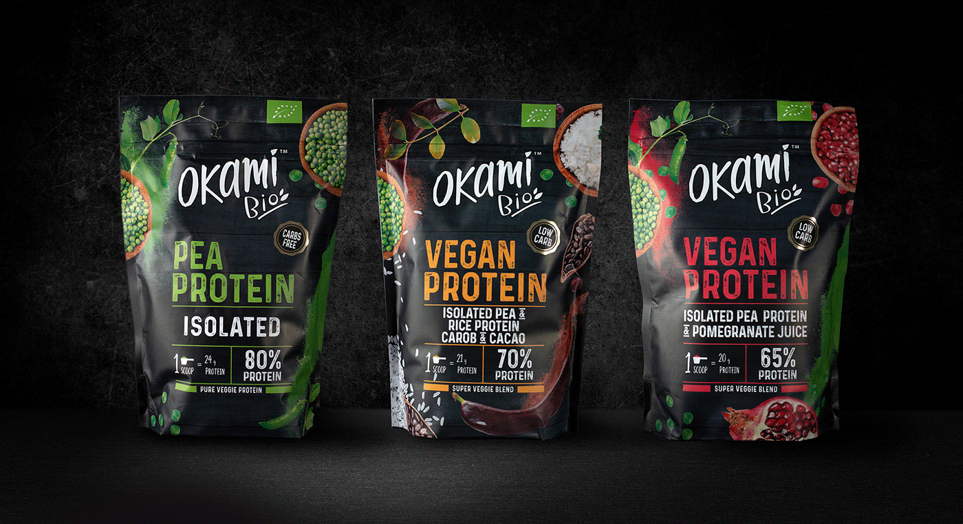
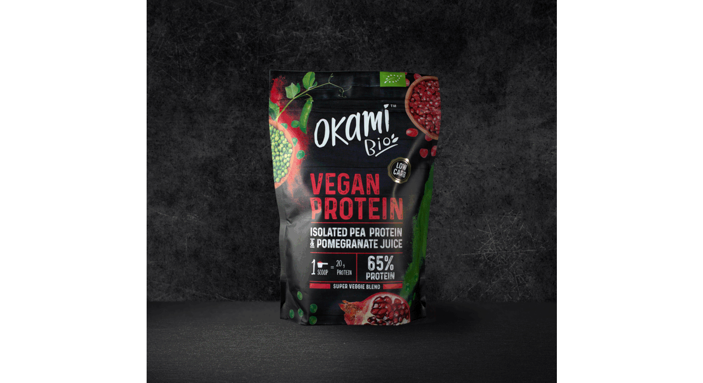
Elegimos un color de gama, el negro. Muy característico de esta categoría y lo combinamos con tonos de colores modernos y vibrantes. Buscamos el equilibrio justo entre la eficacia y la representación de la naturalidad, gracias a ingredientes frescos y jugosos.
We chose a black colour range, a very characteristic colour in this category. But we combined it with modern and vibrant colour tones. We sought the right balance between product effectiveness and the representation of naturalness, thanks to fresh and juicy ingredients.
Planteamos una arquitectura de marca coherente con el resto de portfolio pero incluimos también recursos propios y únicos para estos nuevos lanzamientos.
We proposed a brand architecture that is consistent with the rest of the portfolio, but we also included our own and unique resources for these new launches.
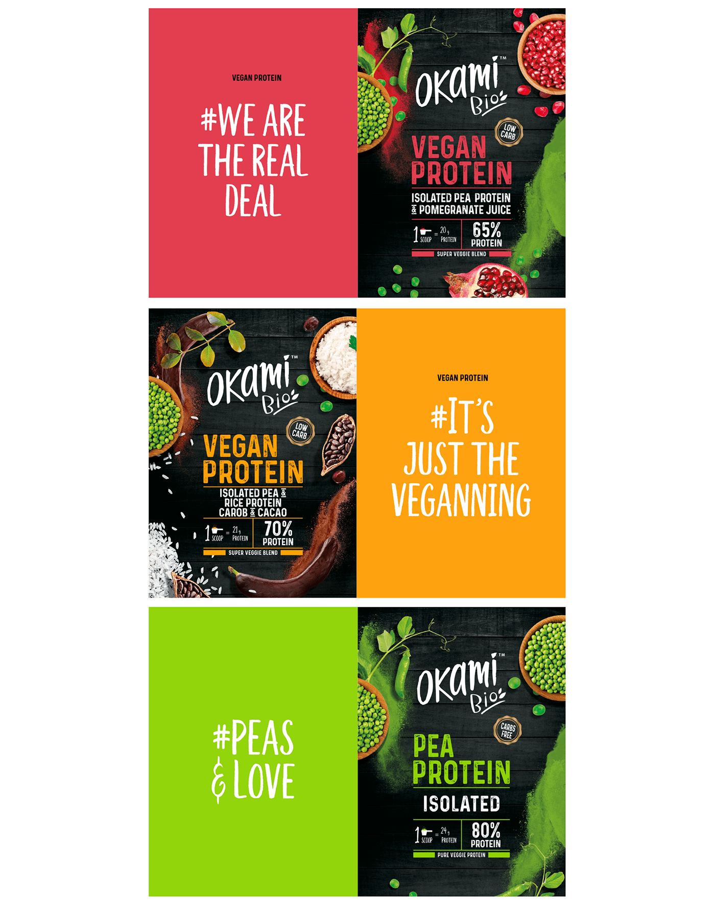

Optamos por emplear tipografías con personalidad, fuerza y energía capaces de transmitir la eficacia de los productos y su potencial. Trabajamos la diferenciación en base a mensajes claros, colores vibrantes y, sobre todo, una presentación de los ingredientes fresca, actual y en línea con las tendencias del mercado.
We chose to use fonts with personality, strength and energy, which were capable of transmitting the products’ effectiveness as well as their potential. We worked on differentiating them through clear messages, vibrant colours and, above all, a fresh and contemporary presentation of the ingredients in line with market trends.


