EL DESAFÍO
Siempre es un reto trabajar el restyling de una marca tan icónica como Granini y con un diseño de packaging que se ha mantenido inalterado durante décadas.
THE CHALLENGE
It is always a challenge to work on the restyling of a brand as iconic as Granini and with a packaging design that has remained unchanged for decades.
Granini tenía claros sus objetivos a conseguir:
1. Tener un diseño de packaging que consolidase la marca como la más natural en la categoría de zumos.
2. Modernizar el diseño utilizando códigos gráficos más actuales y atractivos.
3. Maximizar el impacto de su packaging en el punto de venta, para que la marca Granini realmente destaque sobre el resto.
4. Garantizar a través del diseño un muy buen reconocimiento entre los diferentes sabores.
5. Transmitir y mejorar el carácter premium de la marca y su brand essence basado en la calidad de la mejor fruta.
Granini had clear goals to achieve:
1. Having a packaging design that consolidates the brand as the most natural in the juice category.
2. Modernizing the design using more current and attractive graphic codes.
3. Maximizing the impact of their packaging at the point of sale, so that the Granini brand really stands out from the rest.
4. Guaranteeing a very high level of recognitionamong the different flavours, through the design.
5. Communicating and improving the premium character of the brand and its brand essence based on the quality of the best fruit.
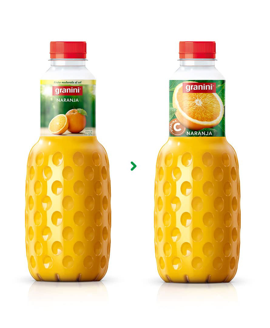
Decidimos dar protagonismo absoluto a la fruta, enseñándola en todo su esplendor y frescura, Iluminándola con una luz natural y unificando su presentación en distintas variedades.
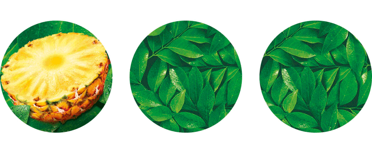
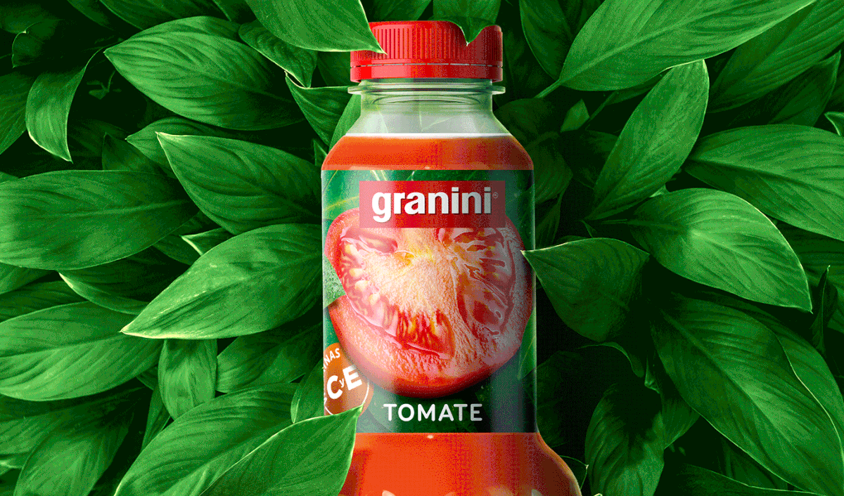
Simplificamos el fondo gracias a una textura de hojas que transmite la esencia de la marca posicionándola en el entorno natural de la fruta.
Simplificamos el fondo gracias a una textura de hojas que transmite la esencia de la marca posicionándola en el entorno natural de la fruta.
We decided to give absolute prominence to the fruit, showing it in all its splendour and freshness, filling it with natural light and unifying its presentation in different varieties.
We simplified the background thanks to a leaf texture that communicates the essence of the brand, positioning it in the natural environment of the fruit.
We simplified the background thanks to a leaf texture that communicates the essence of the brand, positioning it in the natural environment of the fruit.

A la hora de diseñar, tuvimos en cuenta todos los formatos para que la gráfica fuera lo más versátil posible. El resultado es una arquitectura que funciona perfectamente en los formatos más pequeños e incluso en las referencias “multisabores”, cuya complejidad es superior a los monosabores.
When designing it, we took into account all formats so that the graphic was as versatile as possible. The result is an architecture that works perfectly in the smallest formats and even in “multi-flavour” references, whose complexity is greater than mono-flavours.

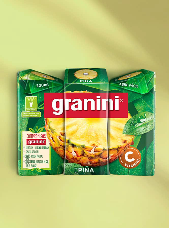
En otros formatos, por ejemplo en el tetrabrick, exploramos nuevas formas de mostrar la fruta. En este caso pudimos dar mucha más visibilidad al colchón de hojas donde se apoya la fruta. Su naturalidad garantiza el impacto en el punto de venta.
In other formats, for example in the tetrabrick, we explore new ways of displaying fruit. In this case we were able to give much more prominence to the cushion of leaves on which the fruit rests. Its naturalness guarantees the impact at the point of sale.