The Rolling Mystic in Tucson, AZ, approached me to do a logo project with a pretty significant challenge. He does not have a business name. At first I did not want to do the project, because how could I create a logo with no business name?! But it was a challenge I wanted to take. We went over his business and his customer base, what he does, and what his brand values are. He summed up that his core three values were Growth, Transformation, and Spirituality. So we got to work. He provided a mood board of some different designs he loved that he wanted to pull inspiration from, and while I don't normally like pulling design inspiration from other designs, this was a field entirely new to me and I didn't want to mess up the significance of the symbols he provided me.

I began by picking a color palette, based in color theory and with inspiration from life around me. I found a bonsai tree which featured a rich red color in the wood and calming green leaves, and based the palette on those two colors. I then chose a neutral in green to further signify growth. A reddish orange represented spirituality, and I chose the dark accent from a teal color which I shaded until I landed on one that felt pleasing. This color represents Transformation. And of course the my main green color signified growth as well. He absolutely loved the color palette and I agree that it suits him and his business well.

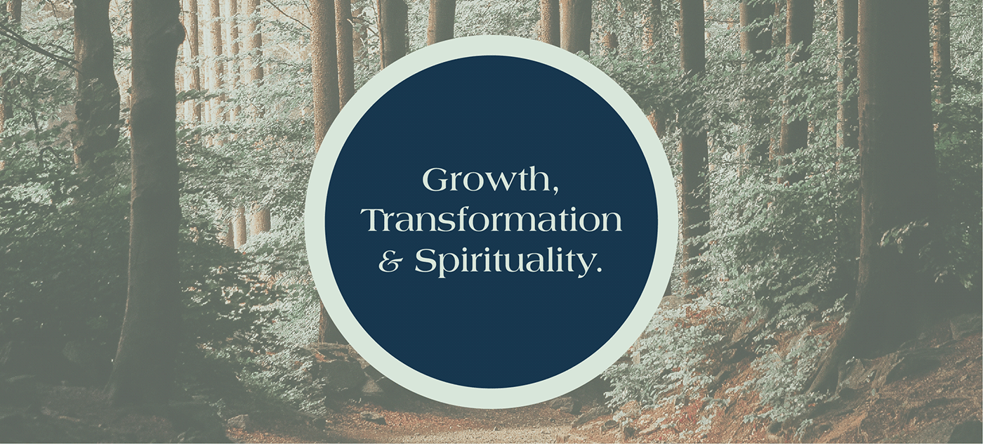
Growth, Transformation, and Spirituality.

I started by creating the alchemy symbols shown at the base of the tree. These each signified important spiritual concepts for him and his clients, and I spent hours researching one night to understand what they mean and their significance.
Each featured a dissecting line, and so I put them together on the same shared line instead to bring them together. Although he really liked this design (above), he wanted something more "contained" and asked to see it with a continuous line cutting through a larger circle, to mimic the alchemy sign at the center on a larger scale. I put this together and then went through the tree's leaves to add detail and additional lines.

He fell in love with this version of the logo, and although it was a challenge, it was very satisfying to put all his ideas together in a way that made sense for his business and also contained all the important elements of his business's core values. He even got this design tattooed on his body!

About two days after delivering the final logo and color palette for this basic logo and branding package, he also asked if I would do some font research and pick typography for his brand, as he had not settled on a name, but wanted cohesive type for his website and collateral. I researched many of his competitors to find what was already being used and what stood out to me. I finally landed on a display font that I felt really echoed the few branding assets we had put together for him thus far, and then picked an alternate of that same font for Subheadings, and a sans serif for his body copy. It was overall a project that stretched my creative bounds some, helped me break rules, and helped me serve a local business.


