


About the project
Chaban is the flagship line of premium quality dairy products from the Nalchik Dairy Plant, marked with the Halal badge.
The brand's products are distinguished by a unique composition, as they are made from the milk of pedigree cows grazing in the alpine meadows of the Elbrus region, and the purest spring water.
The assortment includes more than 100 names of both classic and unique Caucasian products.
A task
Develop a packaging design for processed cheese that:
1. Maintain brand awareness in a new category
2. Will highlight the brand on the shelf among competitors
3. Introducing an appetizing food zone into the packaging design, since it is an important element in this category
Solution
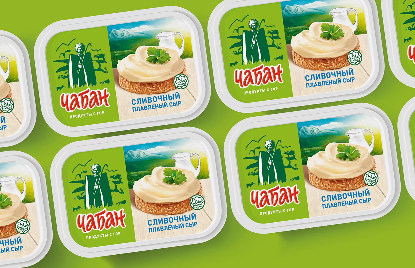
Chaban is one of the most significant brands for NMK (Nalchikovsky Dairy Plant), so we decided not to radically change the design and maintain continuity.
We kept the green brand color and the logo depicting the shepherd himself. These are recognizable features of the brand, its DNA, which should not be changed, but, on the contrary, should be strengthened.
There are many brands of processed cheese on supermarket shelves that use green in their designs. It was important for us that the Chaban brand was noticeable on the shelf among competitors and communicated its advantages.
We added a food zone: an appetizing cream cheese sandwich decorated with a leaf of greenery, as well as a creamer in the background as a reference to the composition, and placed it all against the background of Elbrus - the place where this cheese is produced.
The positioning of the brand - products from the Elbrus region - is supported by the inscription “products from the mountains” - natural and tasty products from an ecologically clean region with a unique ecosystem.
The brand began to look fresh, modern and relevant.


