The Brief
Technology and services business Amigo decided to rebrand. After toying with a new name (some versions of which we explored) the company ultimately decided to stick with Amigo, but wanted to revamp their logo.
Technology and services business Amigo decided to rebrand. After toying with a new name (some versions of which we explored) the company ultimately decided to stick with Amigo, but wanted to revamp their logo.
The name hails from a previous era when the software they provided was for refer-a-friend programs. Now they engage more with large enterprises and new logo was needed to represent their three service areas more accurately.
The Solution
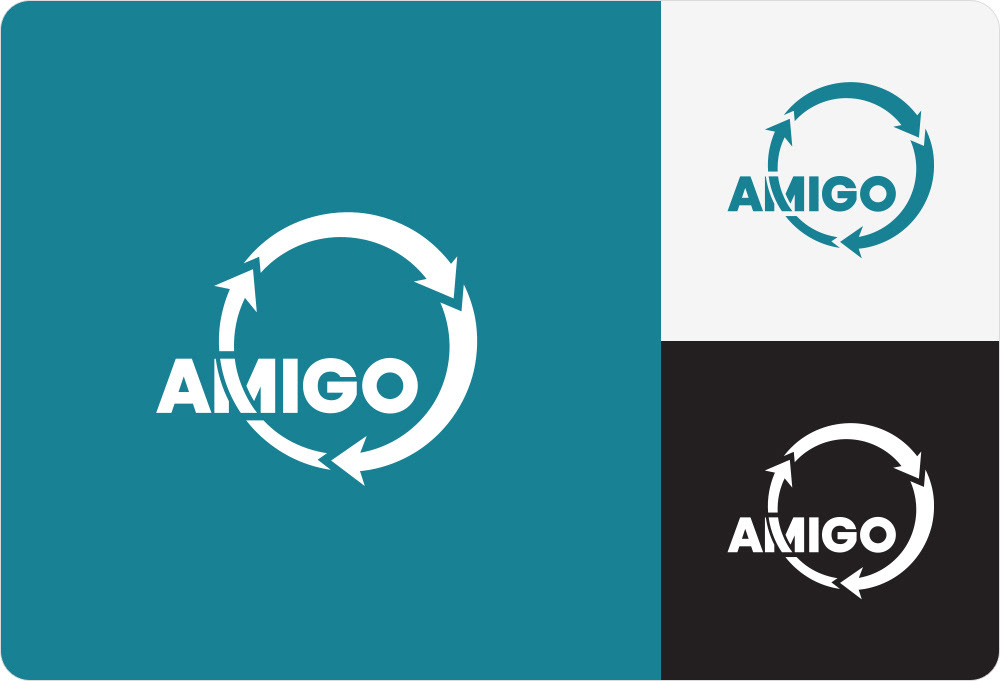
After a great discovery session, it became clear that the nature of the new company name revolved around a three-step cycle (decide, build and run).
After a great discovery session, it became clear that the nature of the new company name revolved around a three-step cycle (decide, build and run).
This cyclic lockup treatment works really well as a logo mark as the text is balanced nicely in the centre. I then generated a scalable version of the logo. This ‘icon’ variation would only be used in very small applications, and as a supplementary icon to the main logo.
Full project: barnard.co/work#/amigo/


