The Brief
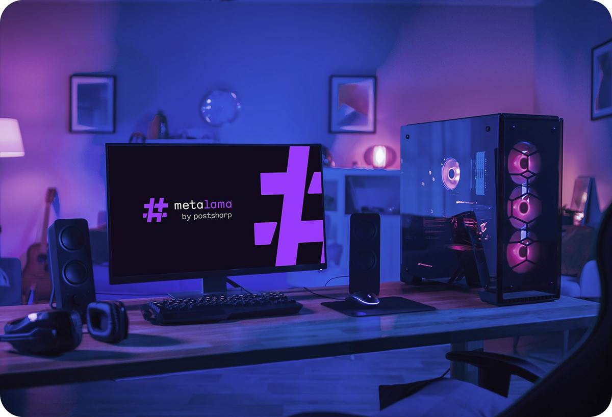
PostSharp and Metalama are two frameworks that help software developers improve their code quality and productivity through meta-programming. President & Principal Engineer Gael Fraiteur needed help branding the new product, Metalama, in a way that harmonised with the current branding for PostSharp, which already had a lot of traction in the market. So we’d need to stick to the current colours and fonts, but introduce a new icon for Metalama, which would be the flagship product moving forward.
PostSharp and Metalama are two frameworks that help software developers improve their code quality and productivity through meta-programming. President & Principal Engineer Gael Fraiteur needed help branding the new product, Metalama, in a way that harmonised with the current branding for PostSharp, which already had a lot of traction in the market. So we’d need to stick to the current colours and fonts, but introduce a new icon for Metalama, which would be the flagship product moving forward.
The Solution
One of the requirements from Gael’s brief was that the logo shouldn’t be too playful. It was very tempting to come up with illustrated concepts that depicted a llama, but in the end I would need to find a solution that reflected the industry, but would be taken seriously.
One of the requirements from Gael’s brief was that the logo shouldn’t be too playful. It was very tempting to come up with illustrated concepts that depicted a llama, but in the end I would need to find a solution that reflected the industry, but would be taken seriously.
The ‘sharp’ # symbol in the parent company name represented the C# programming language that the framework is used for. And I managed to find an abstract llama shape inside a stylised version of a # symbol. By introducing small separations in the design, we could keep the overall shape of the symbol, while revealing the llama icon in a subtle way.
You can view the case study video on TikTok here: Metalama - Case Study
Services
Logo Design
Logo Design
Testimonial
"Designing a logo of a new product under an established brand demands the right balance of creativity and humility. James rose to the challenge with unmatched professionalism." - Gael Fraiteur
"Designing a logo of a new product under an established brand demands the right balance of creativity and humility. James rose to the challenge with unmatched professionalism." - Gael Fraiteur
Full Project: https://barnard.co/work#/metalama/


