
One day I was offered to develop a logo for an umbrella brand named SPOT (contact person - Andrey). Basically, it represents a media business associated with information and social websites on the Internet. So it was substantial to develop a logo to be used in many variations.
A logo should embody some action, be bright and at the same time be quite simple.
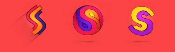
Here are some of the concepts I offered:
In my first logo concept I try to present the letter S in the latest trends with long shadows to imply a metaphor of a progressive and dynamic company.
The mark could be presented in different colors to identify different company vectors.

I'm trying to reflect legerity, action, and speed of the brand.

The last logo concept is based on mosaic consisting of elements of different colors to imply different sub-projects of the company. The mark turns out to be dynamic and impetuous.

Andrey approved of the last concept and asked me to do some variations that would be depicted equally good, clear, and undistorted irrespective of the logo size.
I'm drawing some more sketches:
Andrey: "Let's decide on the second variant (that fancy mark that reminds a sugarplum or yin and yang) and elaborate it."
No sooner said than done:
I'm drawing it on vector editor and in color. I'm selecting a font to substitute the lettering with no trouble.


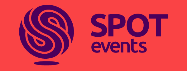


Andrey: "This variant is perfect. We'll settle on it."


