
Time Diptych - Peacock
25" x 16" Pencil on Panels
2013
Time Diptych - Waterfall
25" x 16" Pencil on Panels
2013

Time Diptych - Cardinal
25" x 16" Pencil on Panels
2013

Time Diptych - Salt Lamp
25" x 16" Pencil on Panels
2013

Time Diptych - Matches
25: x 16" Pencil on Panels
2013

Time Diptych: Cardinal
7" x 7" Detail from Panel 1 of the 25" x 16" Diptych
2013

Time Diptych: Matches
6" x 6" Detail from Panel 2 of the 25" x 16" Diptych
2013

Time Diptych: Waterfall
9" x 9" Detail from Panel 2 of the 25" x 16" Diptych
2013

Time Diptych: Salt Lamp
7" x 7" Detail from Panel 2 of the 25" x 16" Diptych
2013

Time Diptych: Salt Lamp
7" x 7" Detail from Panel 1 of the 25" x 16" Diptych
2013
Time Diptych: Berkshire
10 by 10 inch detail of 16 by 25 inch diptych
2014

Time Diptych: Peacock
4" x 4" Detail from Panel 2 of the 25" x 16" Diptych
2013

Time Diptych: Peacock
5" x 3" Detail from Panel 1 of the 25" x 16" Diptych
2013
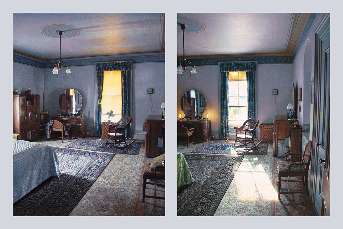
This latest series is an attempt to capture time, or the poetic phrase, “the sad beauty of time passing,” something I believe we all experience in life, an emotion that gives existence much of its intensity and meaning. It’s not an easy sensation to describe, so I’m hoping this work will allow the viewer to experience it in a clarified visual form.
The work portrays sections of the interior of our house that I’ve spent the last seventeen years adjusting, a work of art in itself. (Reference: Against the Grain by J. K. Huysmans.) I'm actually drawing a place I've carefully created and arranged, so in a way, the image is generated twice. Each diptych is comprised of two panels of the same basic view altered only by the passage of time. What I find interesting is that the art itself can only exist in the viewer's mind. It is the amalgamation or comparison of the two images that creates the specific emotion, not each individual panel. Gauging and balancing this convergence is everything.
On the 12 by 16 inch cradled hardboard panels, the images are rendered initially with a pencil grisaille, then by layers of sprayed UV varnish and colored pencil, allowing multiple colors to overlap, similar to what we see in nature. All the pencil colors are pure bright hues. Grays and browns are formed by the overlapping tones. The wood color, for instance, is comprised of blues, purples, greens, reds, and yellows, no brown; the wall color in certain sections is eight different hues.

