__
The briefing brought the challenge of a fluid and unbureaucratic reading of 2 words in one,
ensuring simplicity in the final result.
A very interesting challenge, especially given the priority use of the campaign being OUTDOOR media,
which implies a high reading speed.

__
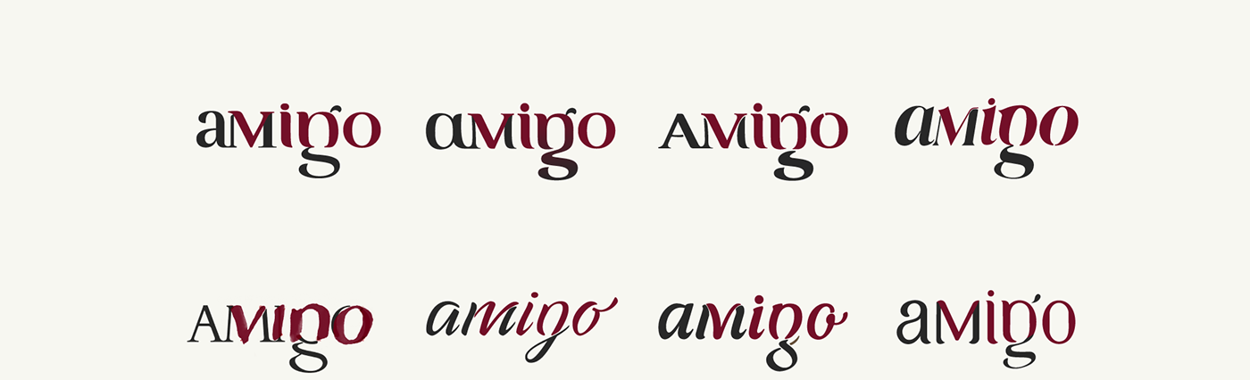
Through preliminary studies, we sought to find a way that all teams felt comfortable so that we could continue with production.
For this, we experimented with a series of typographic bases, and explored their developments.
__
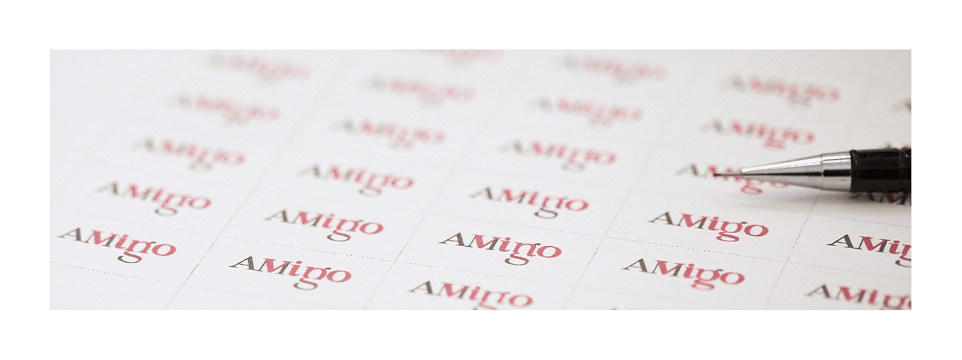
After all the research produced and aligned, we focused on refinement and the reading quality.
We built a visual calibrator, where we could contemplate how each detailing would react or interfere with the lettering.
__
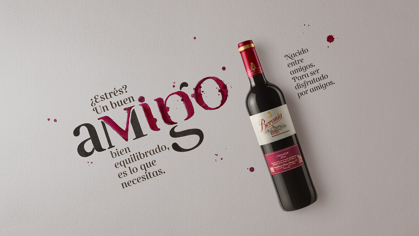
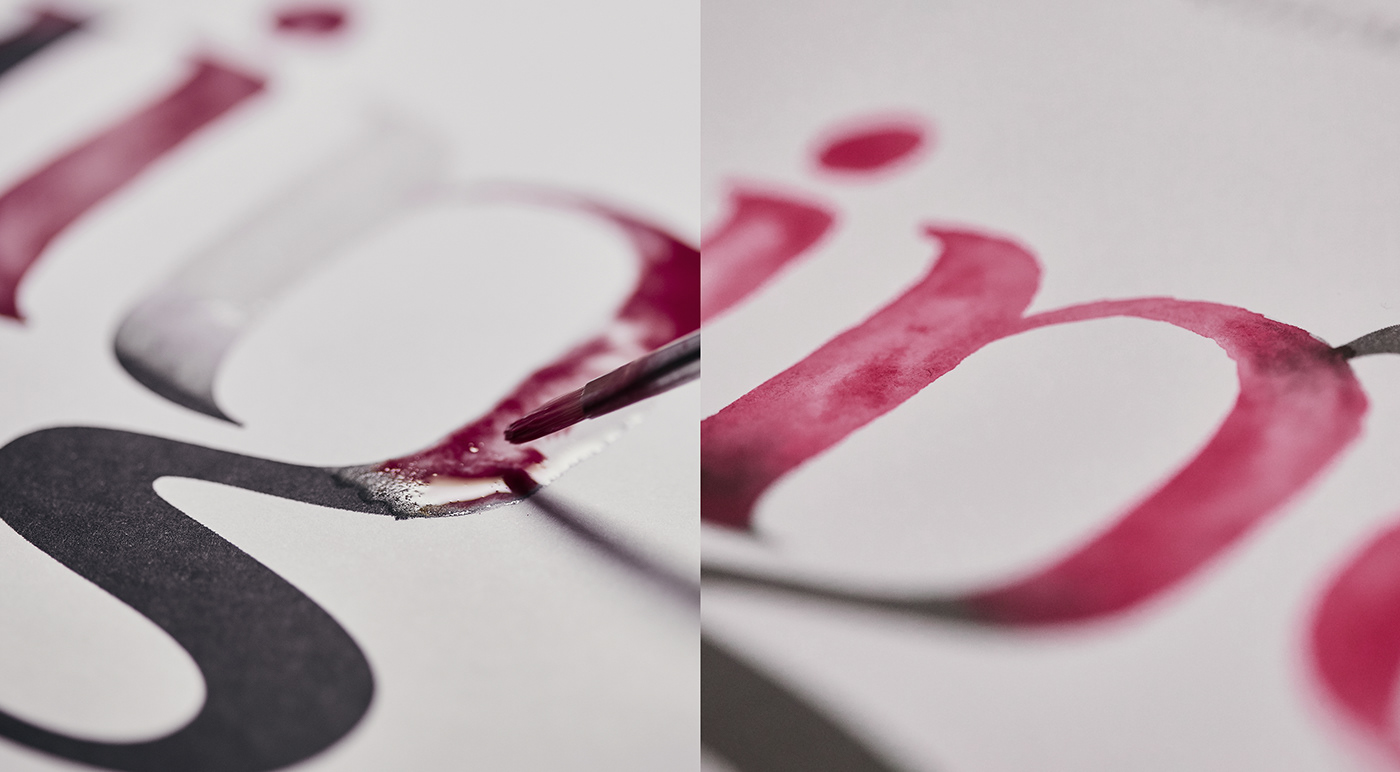
With the final resolution for the lettering, we worked on the final part of the campaign.
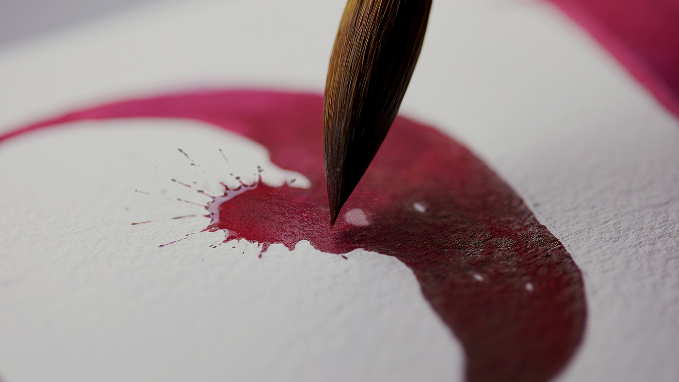
We produced the word WINE with real Beronia Wine to bring the product as part of the whole campaign.
That's why we chose from papers that worked well with wet techniques , and photographed how the "paint" mixed and reacted on the watercolour papers.


__
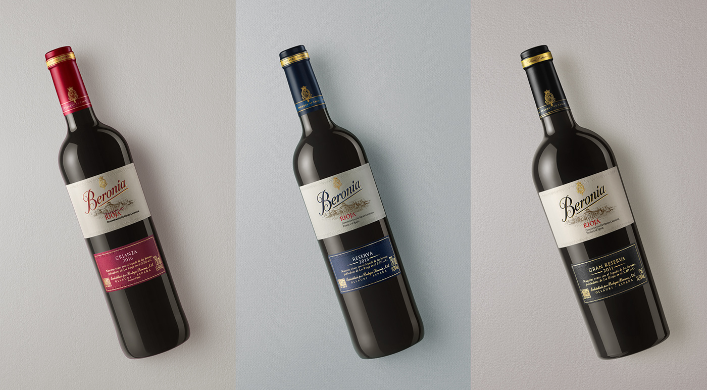
Beyond the production for type and watercolouring, all of the product shots were carefully taken.
Every detail of the label, and its different paints, embossing and golden finishes were photographed taking care and importance of the product for the art.