Project Indigo — Nokia Packaging Rebrand
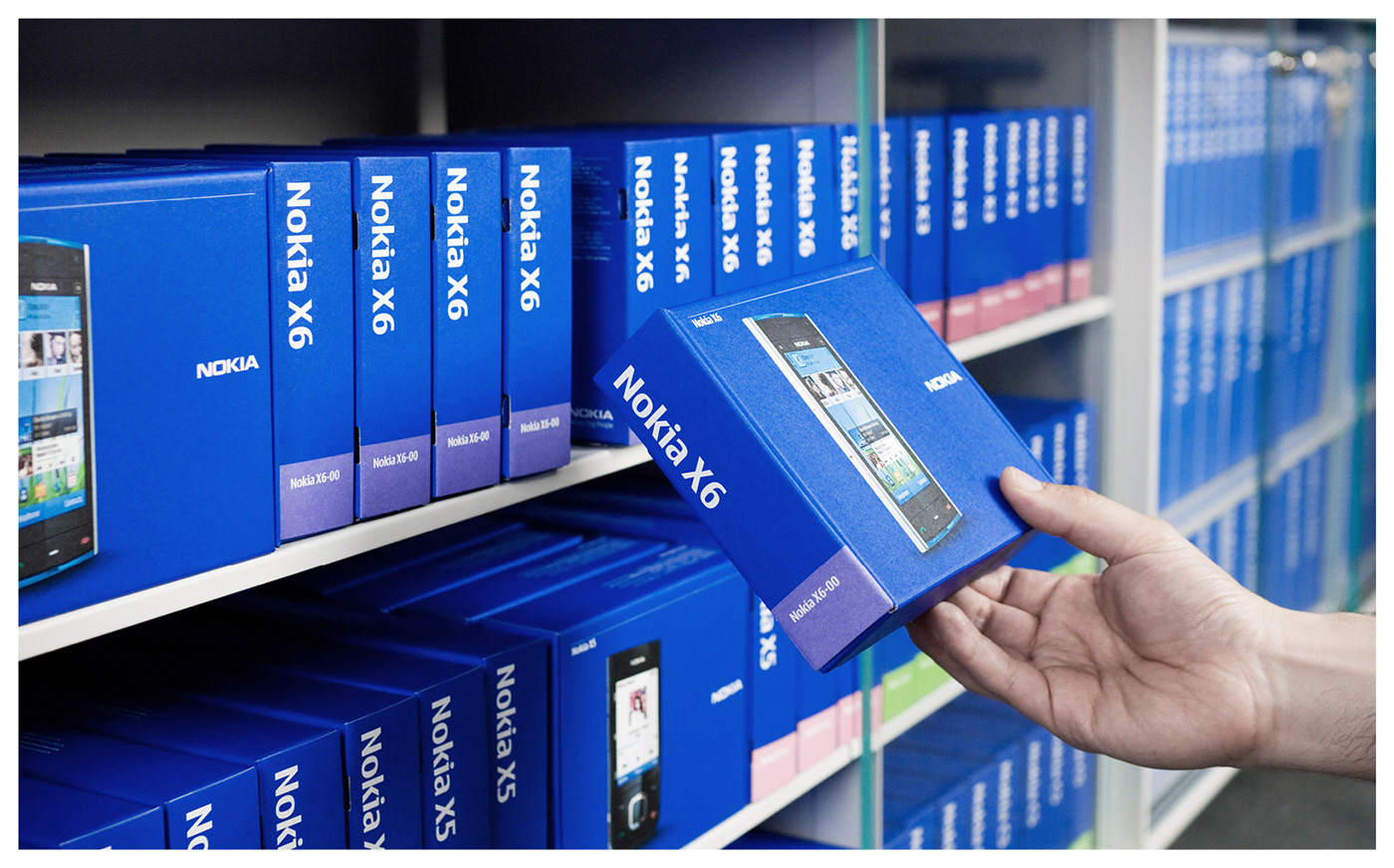
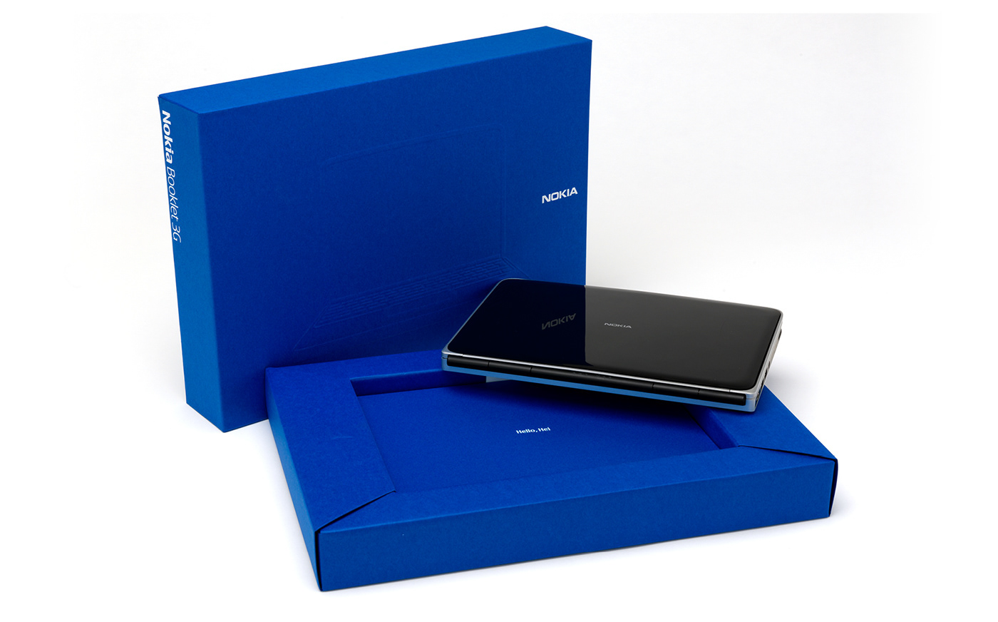
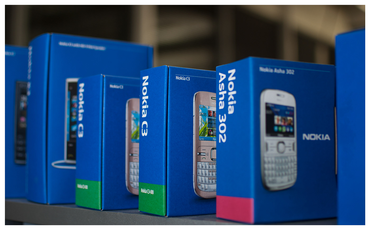
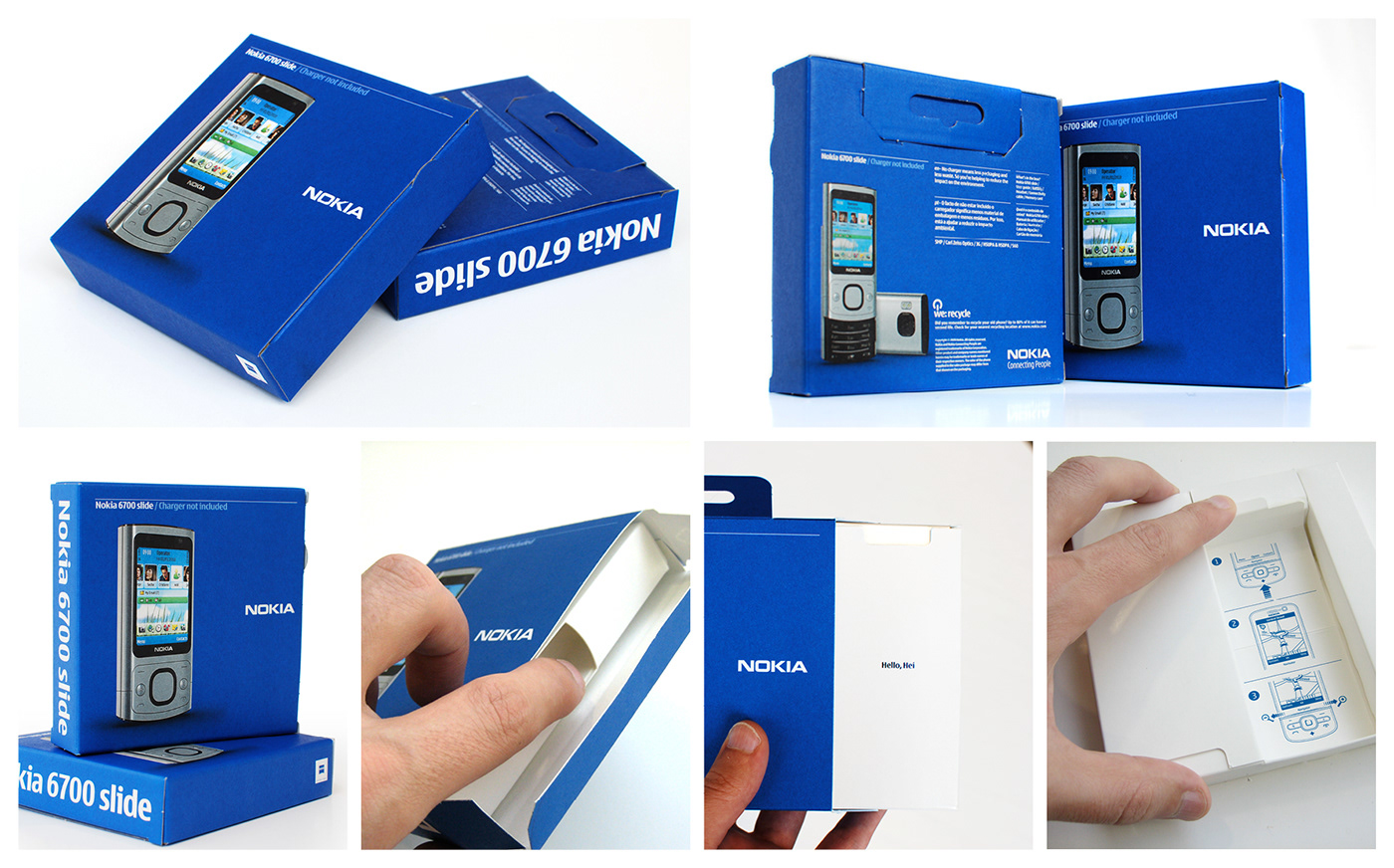
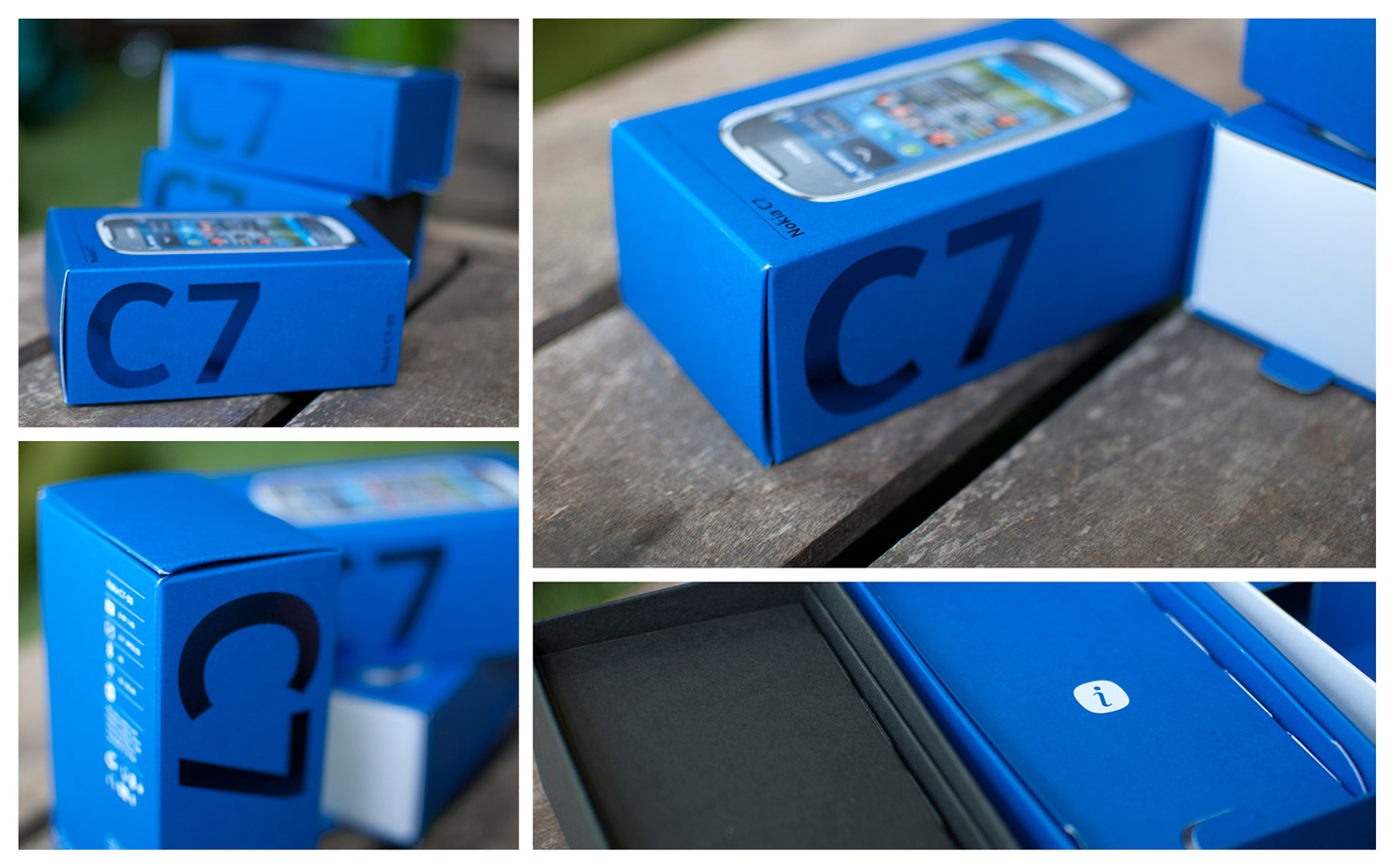
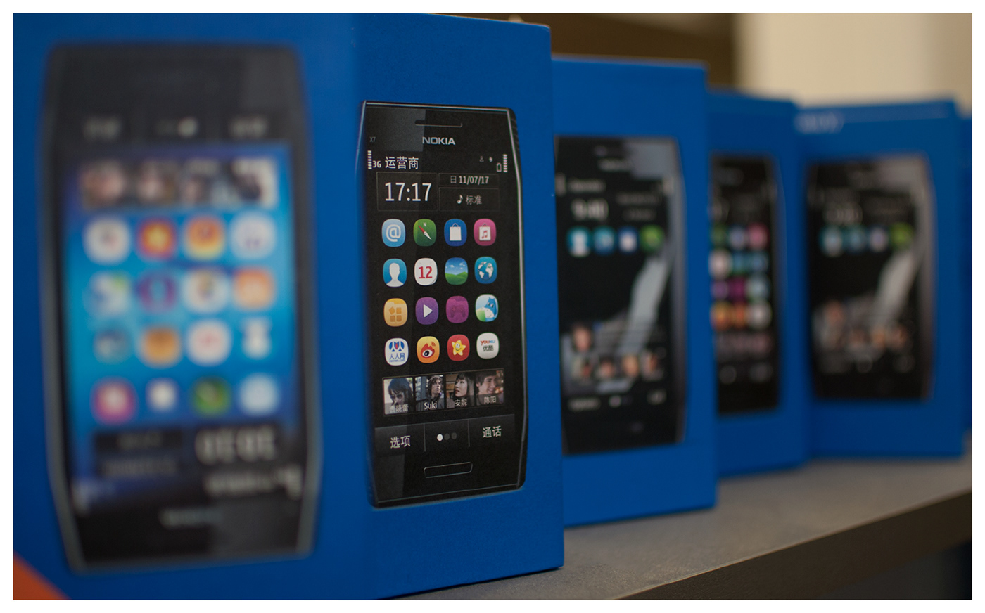
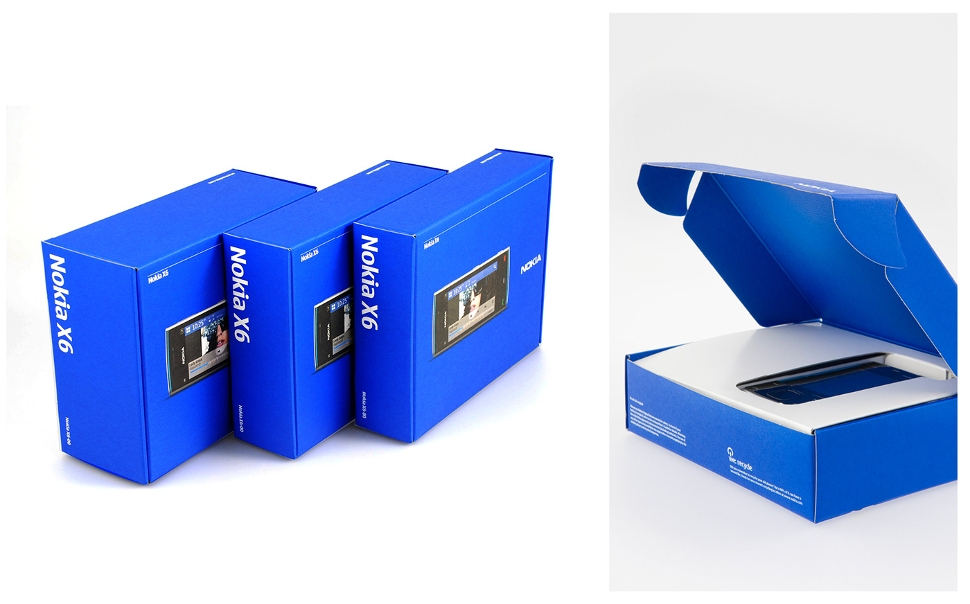
The redesign of the Nokia packaging created a powerful new look and feel based on the company’s most ownable and recognisable brand assets: the Nokia indigo blue and the Nokia typeface.
The result was a bold design that put the Nokia brand first creating a block of colour to identify brand in-store, reclaiming shelf presence and presenting customers with a coherent and connected family of products.
The packaging simplifies consumer communication by presenting the Nokia solution ingredients at a glance: gorgeous device renders, multiple views, services shown on-screen and clear technical specifications.

Portfolio view before rebranding