

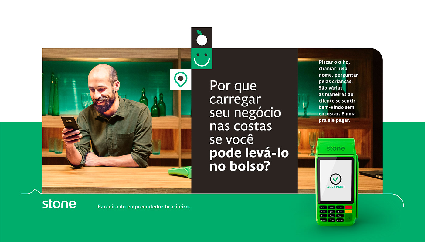
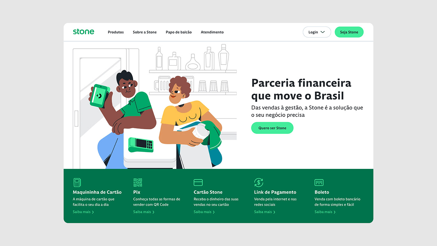
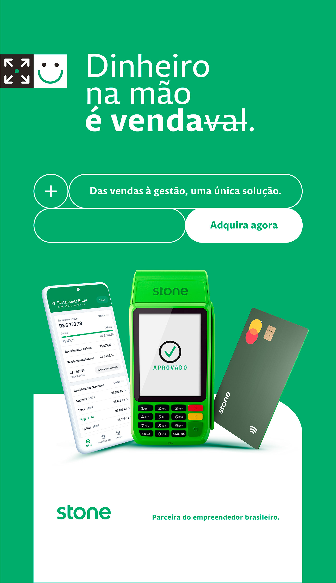
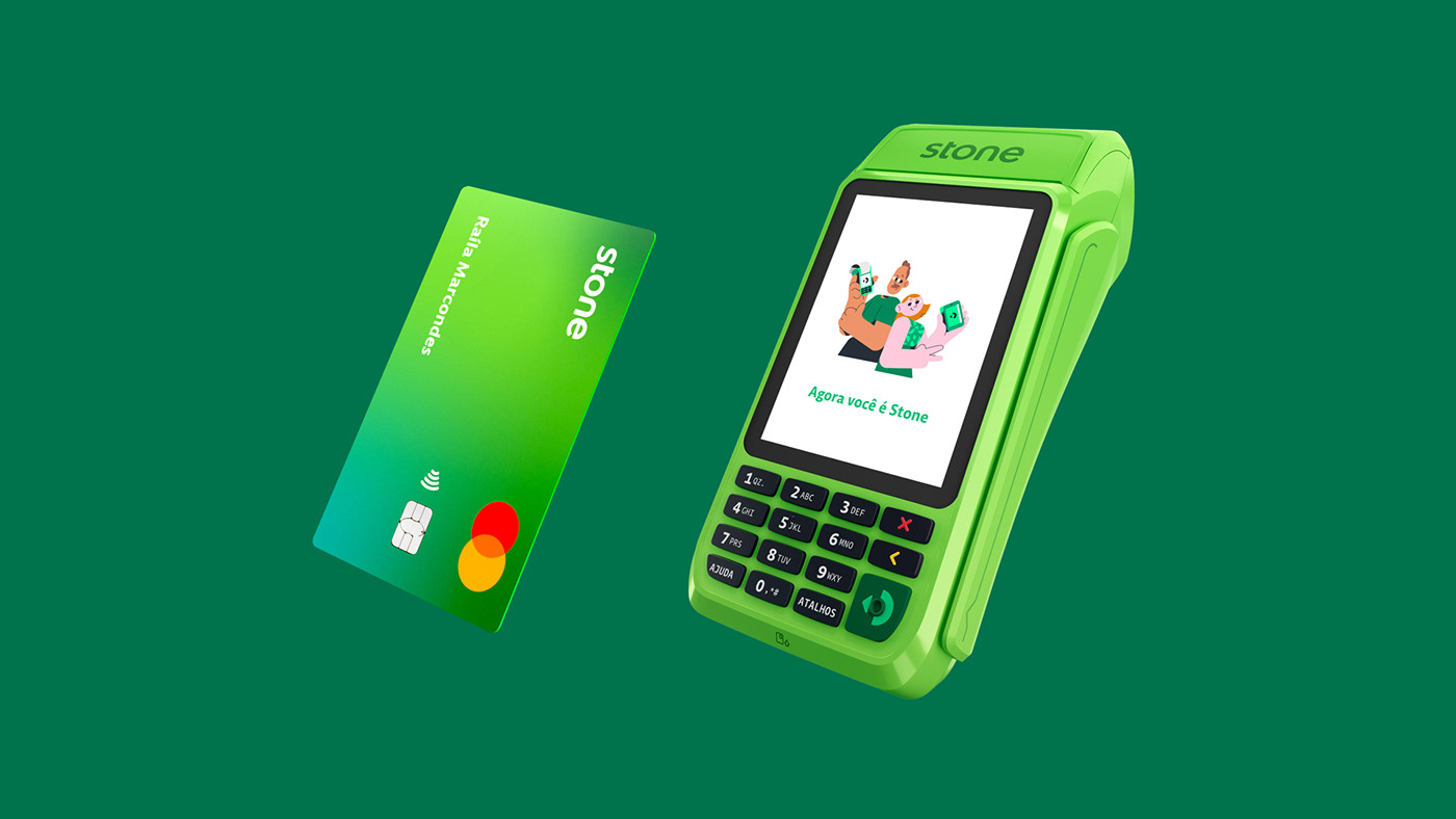
Stone is a Brazil-based, global fintech company, well known for it’s signature green POS payment terminals. Their products and services help Brazillian entrepreneurs all over the country boost business. The green “maquininhas” are used every day by millions of end costumers and Stone’s business partners.
Human Centered Technology
Reaching places where traditional banks fail to serve, the relationship with its clients is a that of profound personal relationship, from the classic “cafezinho” to the informal business advisory and customer service.
With great opportunities at hand, Stone decided it was time for a rebrand. Their talented in-house branding team got right to it. And trusted us to collaborate on a type pallette inspired by customer stories and the role the company’s people and tech plays in making their businesses’ thrive.
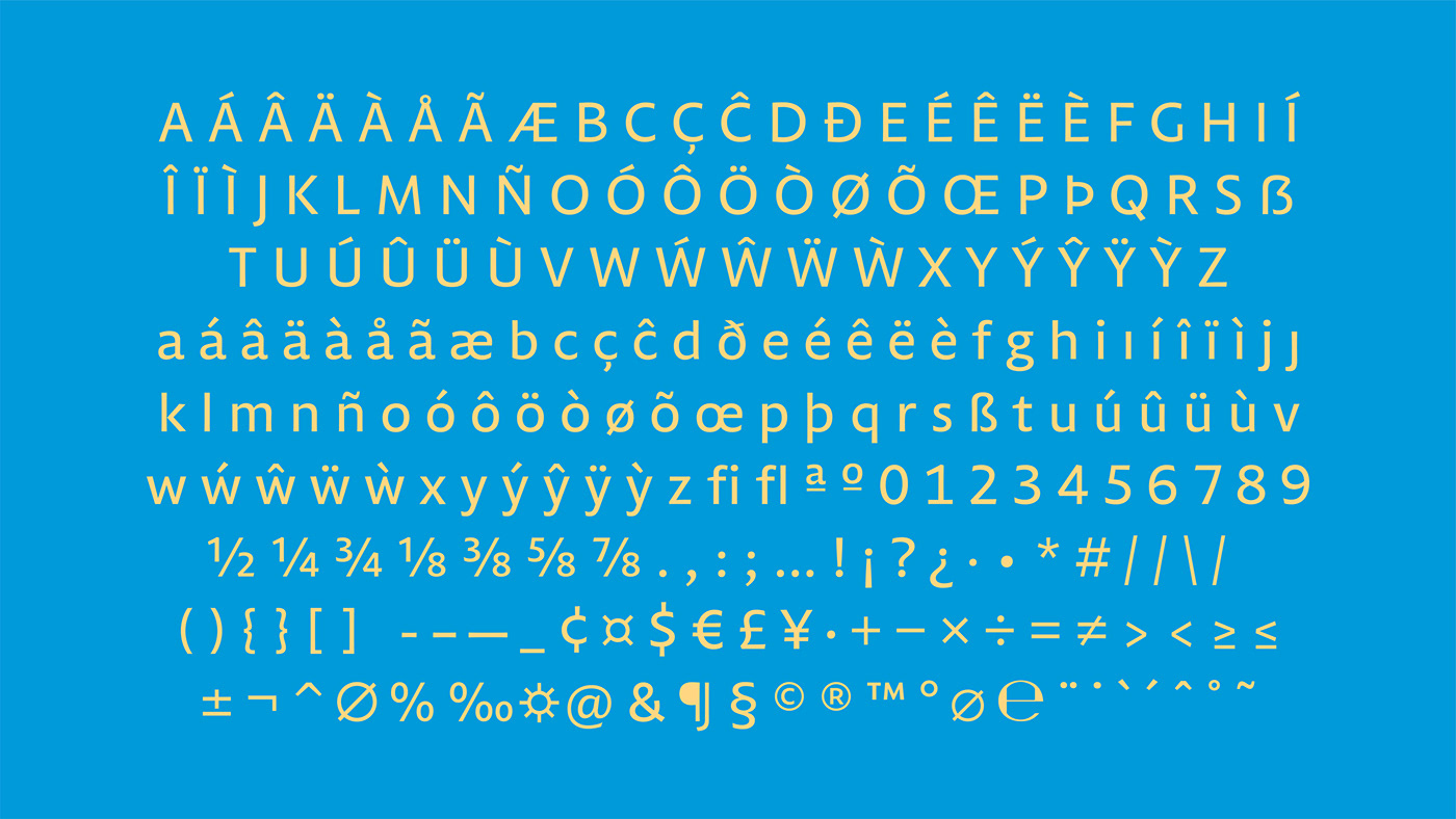
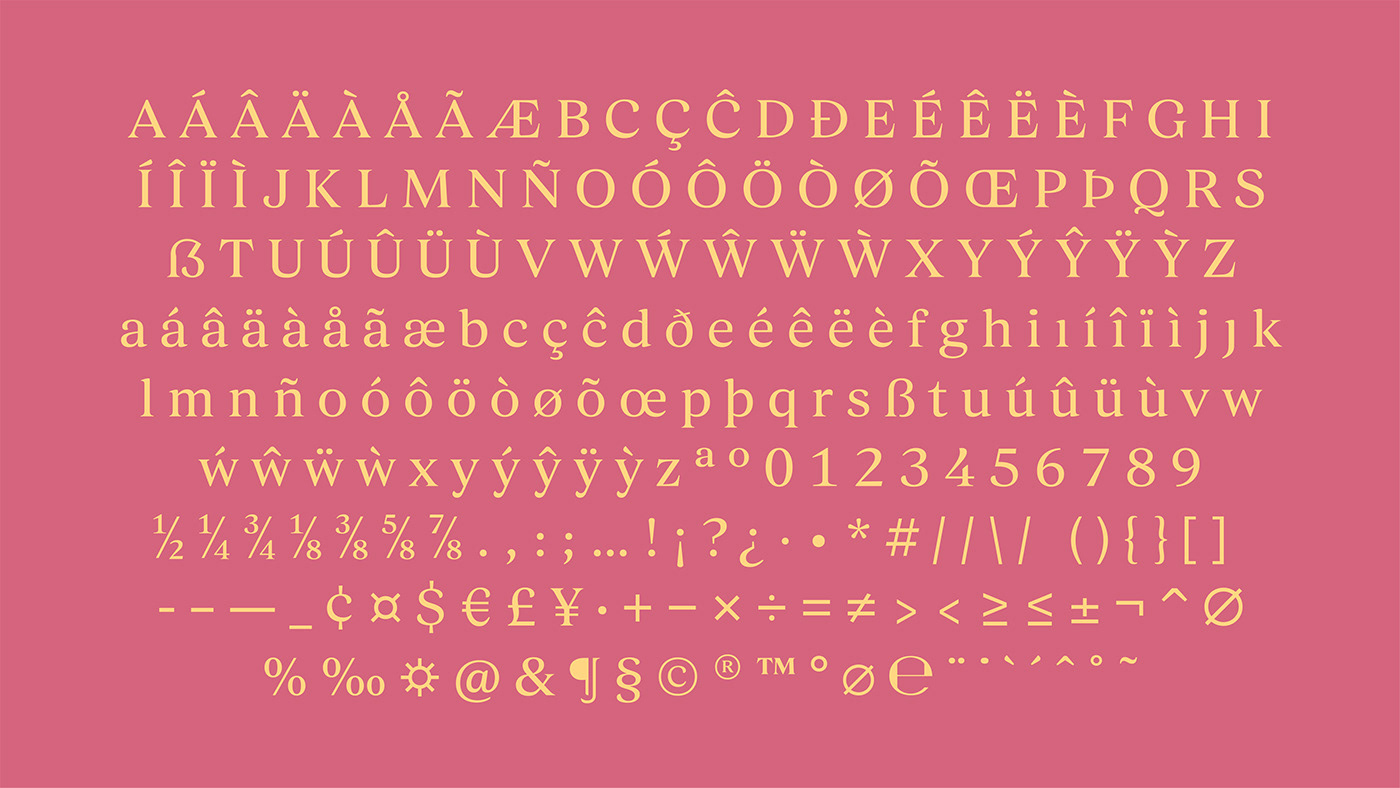
Multiple accents, represented in letters
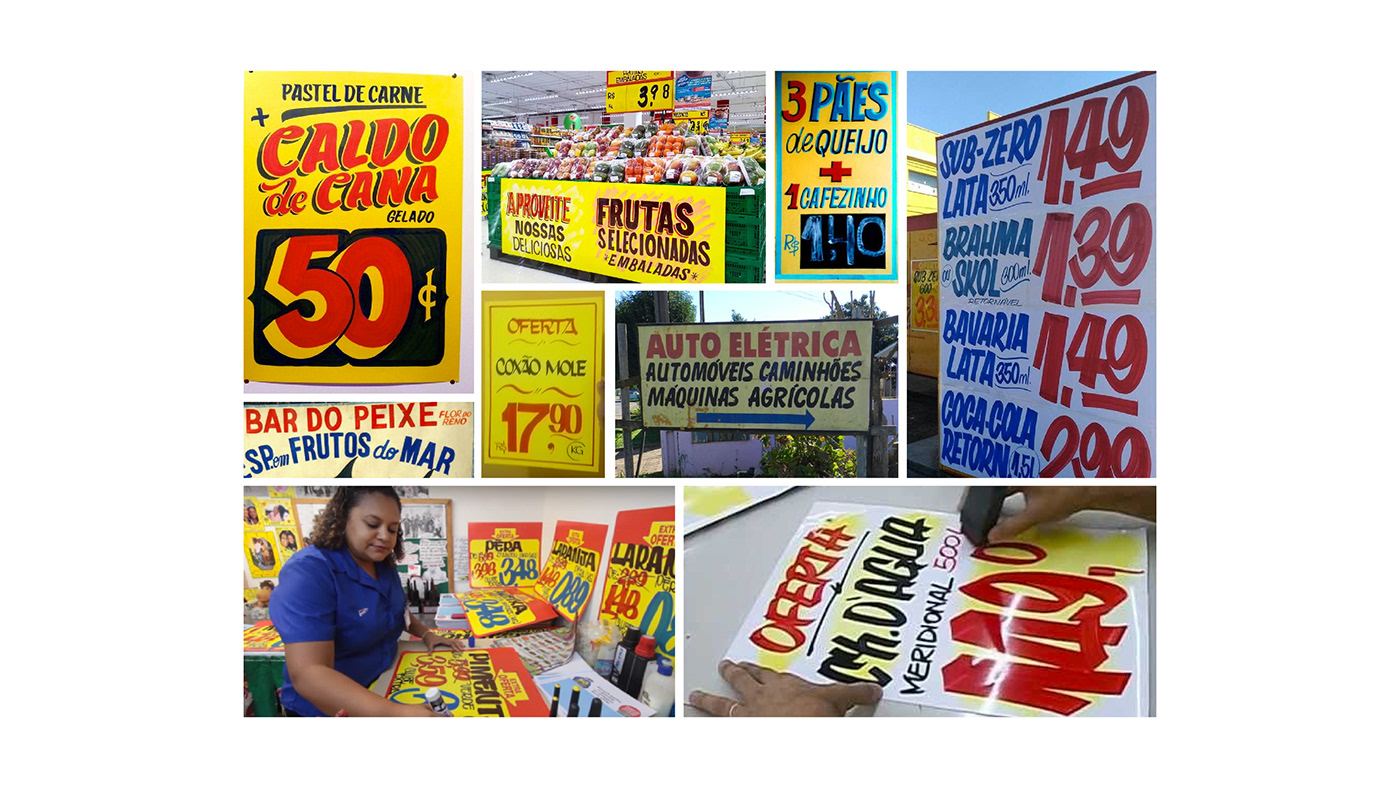
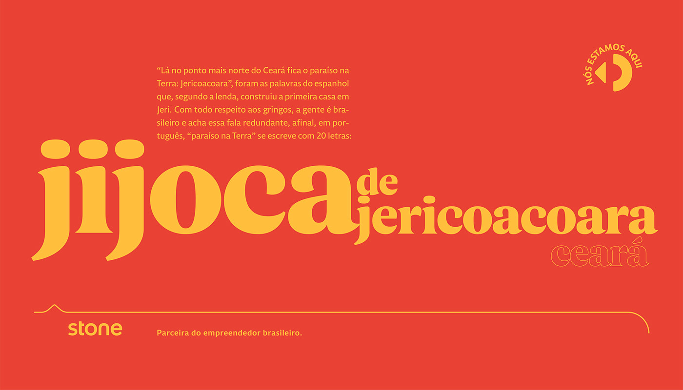
The main question we set out to answer: how to represent the brand values and plurality of cultures in Brazil, but not let it turn into a cliché. We gathered inspiration from the country’s five regions and used them to make type that felt like it had existed forever. Vernacular hand lettering - a classic marketing tool both in small towns and big capitals - was a big inspiration. Stone is, in their own words, a “tech company with a human touch” after all.
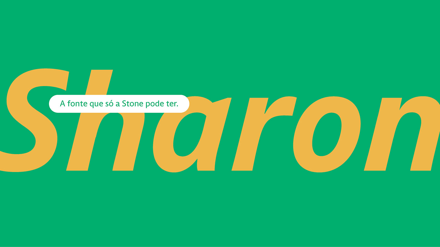
The in house team set us up with plenty of references and guidelines on how the type needed to perform. They even named the font themselves, Sharon (yes, pun is intended). Stone’s design team knew pretty much what the wanted to get out of this project, so every talk we had with them about creative directions were really fruitful. The UX team was involved from the get go, providing valuable feedback on the performance in the product layer.


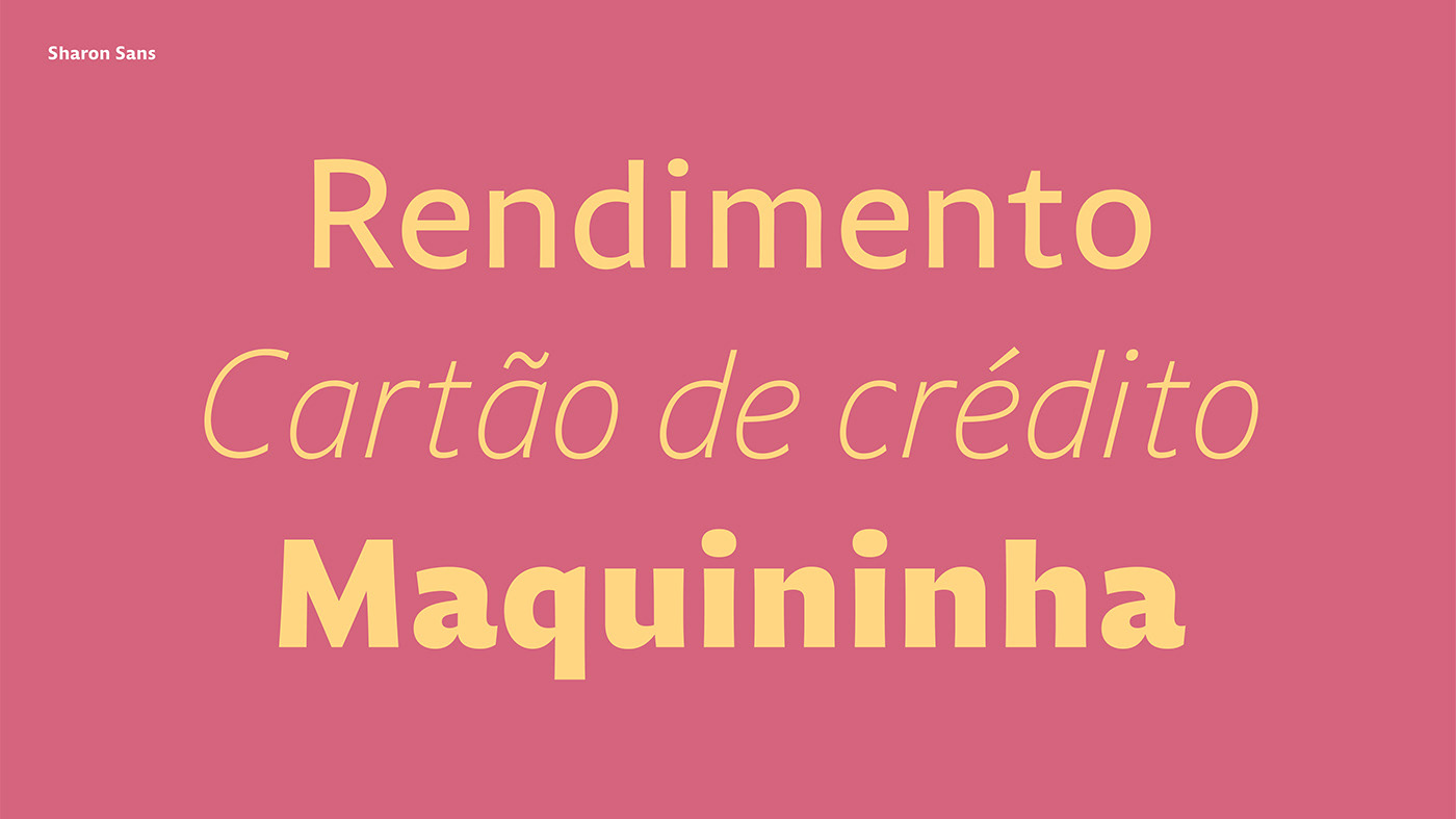
A typographic palette: Sans, Serif & Mono
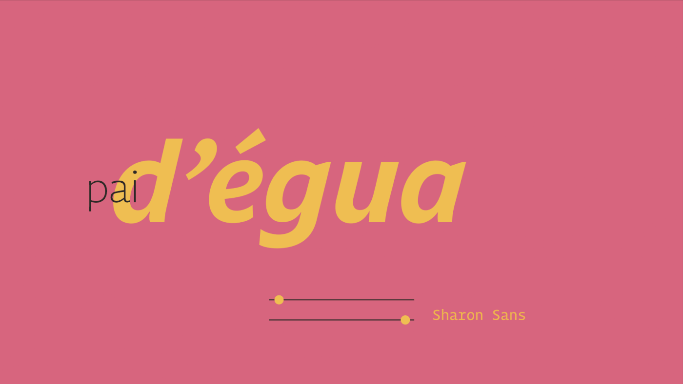
Sharon Sans, designed for the brand’s heavy lifting, was designed as a humanist sans. It began as a direct interpretation of the vernacular inspiration and as the project progressed we left all that was necessary to make it unique while functional. Contrary to modernist trends, humanist shapes are known to have high legibility, because of the open aperture and its ductus (the skeleton of the letters) that resembles the human hand. We also designed it with a bit of flair, curved stems, to make the texture more interesting.
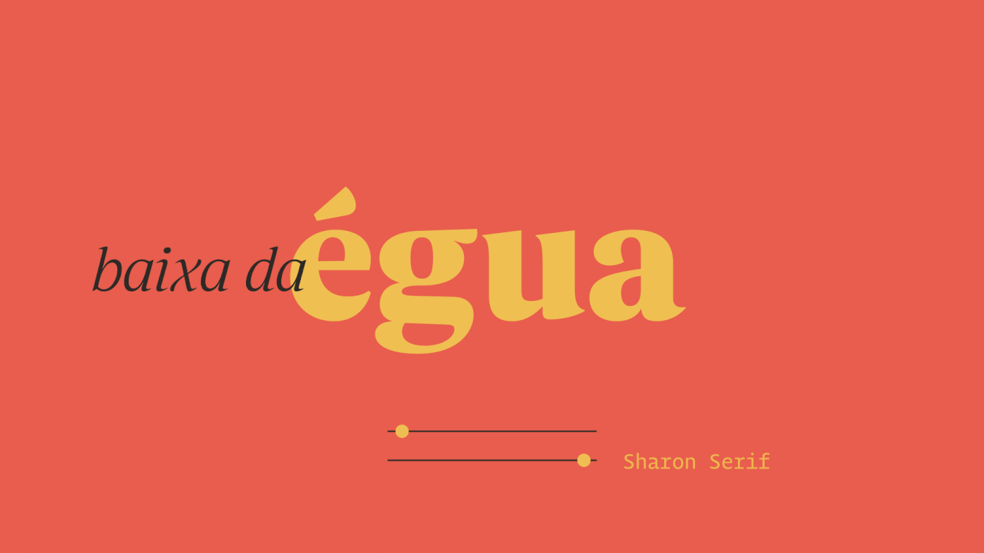
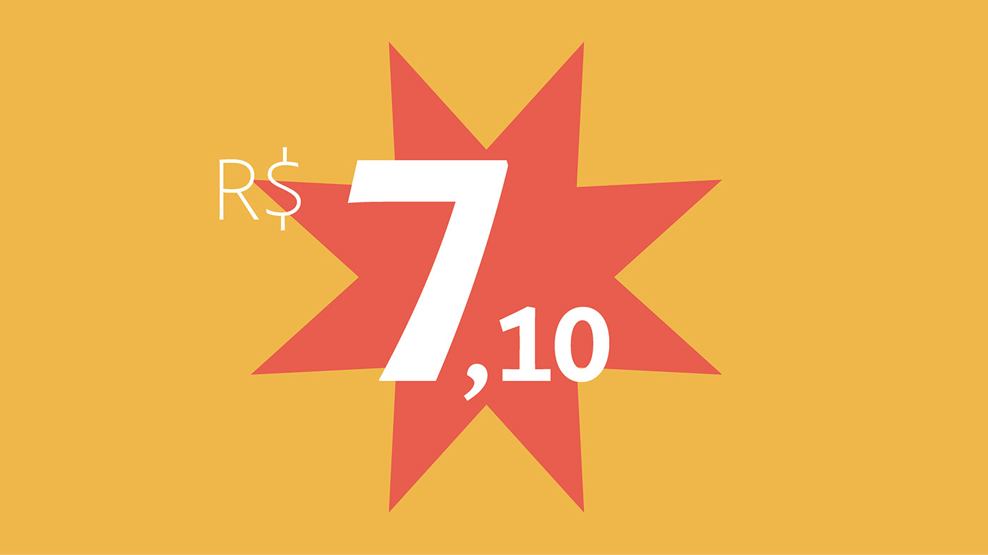
Sharon Serif turns the personality knob right up, with warm personality inspired by the brush. We depart a bit from the ductus, in order to get more variety of shapes and it becomes steadily more friendly as the weight increases. Italics, as always, were a joy to design, with its cursive shapes and letters that are distinctly eye candy, like v, w and ampersand.

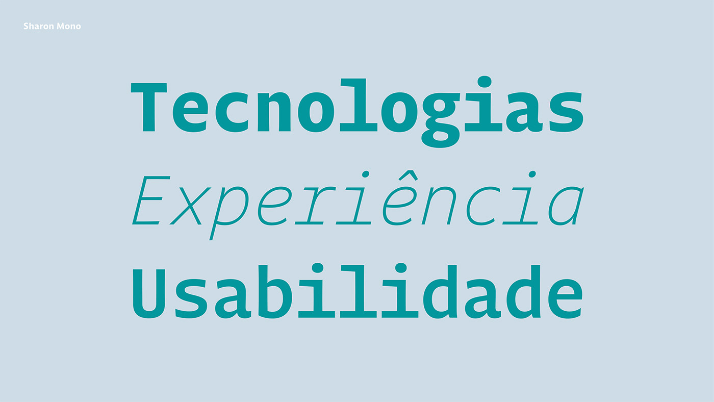
Sharon Mono is a monospaced version of the Sans suite. While the spacing resembles machine language, typewriters and barcode readers, the humanist warmth is always there to remind us who is (still) in control of them. People. Yep. We rule.


Project Credits:
Rebranding and Visual Identity: Stone Lab
Type Design: Plau – Rodrigo Saiani, Carlos Mignot & Felipe Casaprima.
Team Plau: Aline Caruso, Ana Laura Ferraz, Carlos Mignot, Felipe Casaprima, Gabriela Fiks, Gabriel Menezes, Rodrigo Saiani & Valter Vinícius Costa.


