The inscription got a new color, while the emblem was completely changed. The Speed wing was replaced by a smooth curved line in red and blue, placed in the upper right corner of the logo. The ribbon got the name “Speed mark” and is placed on all the company’s airplanes, representing the speed, power, and safety.
The use of the Union Jack color in the logo is complemented by the tails of the aircraft’s pained in the pattern of the British flag, which looks patriotic and reflects the company’s value of its roots and legacy.
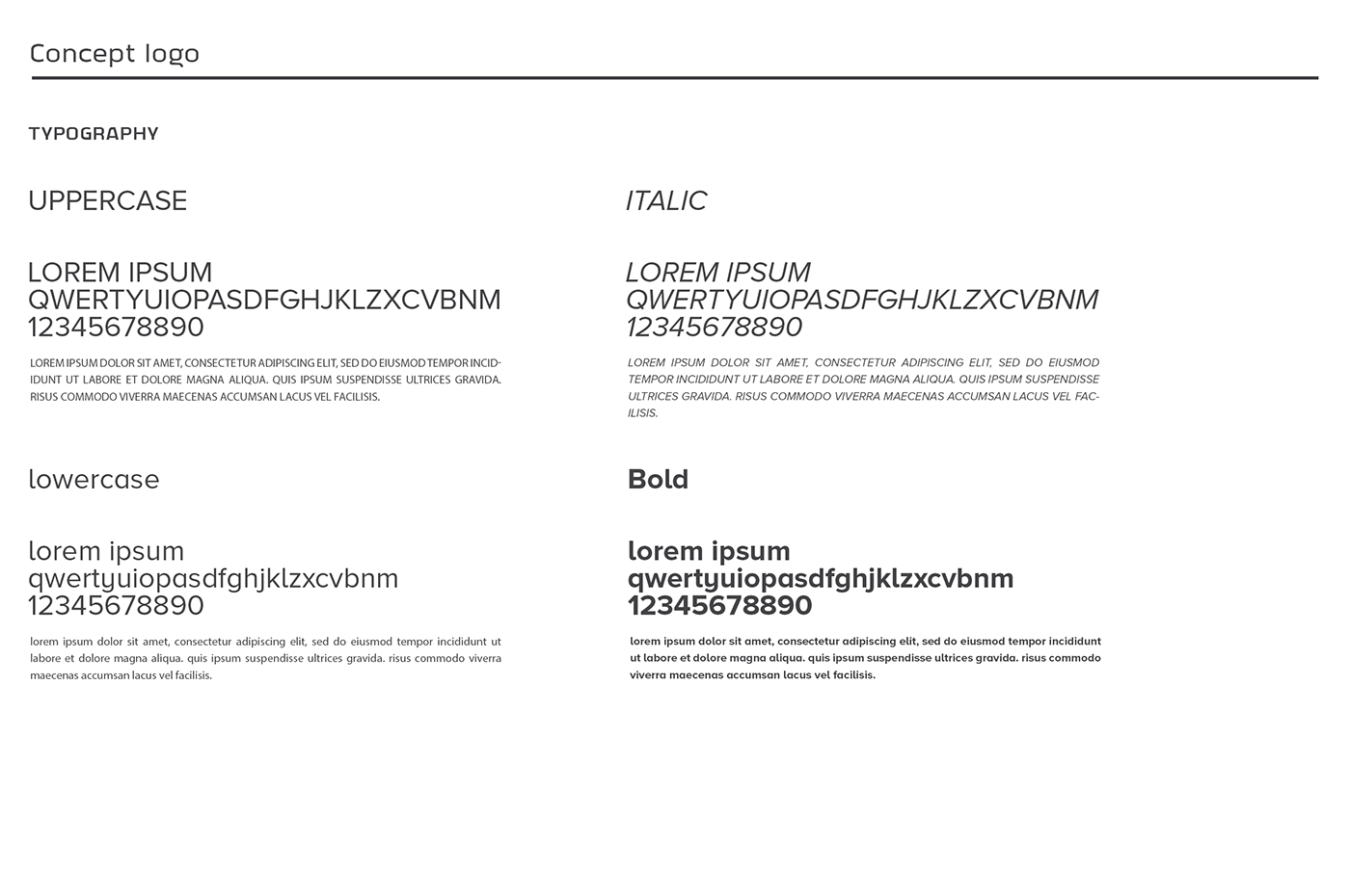
The blue wordmark in all capitals is executed in an elegant and modern typeface, which is Proxima Nova font, with fine and delicate serifs and clean neat contours of the letters.
The inscription is perfectly balanced and makes the whole logo look timeless and confident, evoking a friendly sense and representing a professional and reliable company