
Brief:
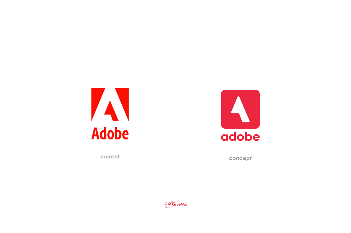
As a Brand Identiy Designer, I was given the task of rebranding the Adobe logo as a concept. The main objective was to create a fresh, modern design while still preserving the brand's essence. The letter A, which symbolizes the Adobe name, needed to remain the central focus. Additionally, I wanted to simplify the previous logo design and create a more straightforward approach.
Challenge:
The Adobe logo is an iconic symbol that is recognized worldwide. The challenge was to create a new logo that stayed true to the brand's identity and heritage while bringing a new perspective. I had to ensure that the new design was modern, clean, and simple, yet recognizable as the Adobe logo.
Solution:
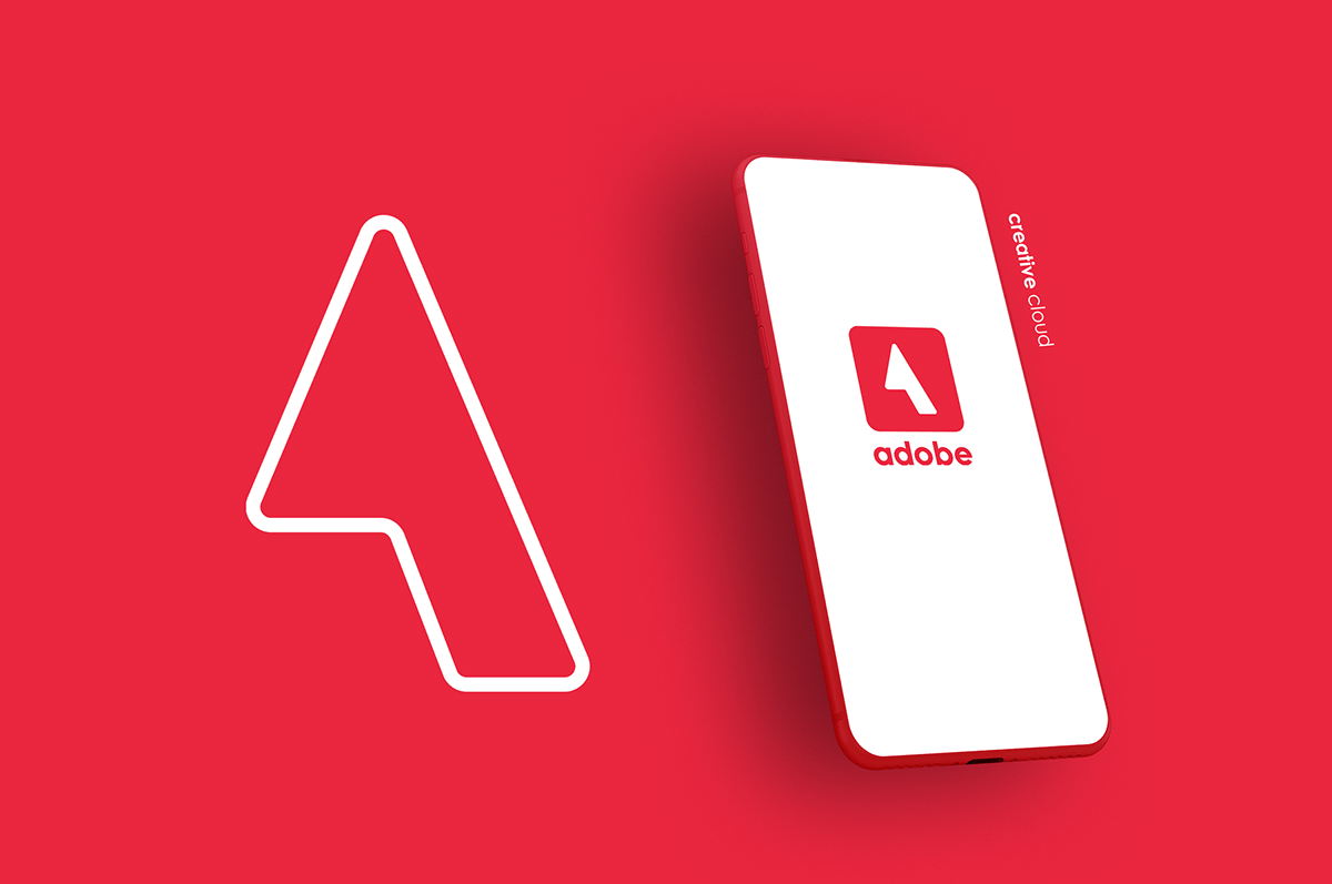
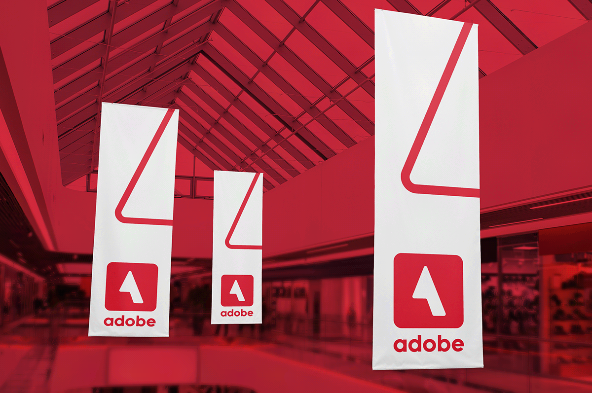
To create the new Adobe logo concept, I began by removing the black color from the previous design and sticking with the red and white theme colors. This brought a more modern and fresh look to the logo while still maintaining the brand's identity. I also simplified the letter A, creating a more straightforward approach while still keeping it recognizable. The new design resulted in a modern and minimalistic logo that is still recognizable as the Adobe brand. By simplifying the logo, it created a more robust brand identity that can be applied easily to various applications and mediums. Overall, the new logo concept brings a fresh look to the brand while staying true to its heritage.