
Symbiosis is the harmonious coexistence in nature of different organisms in mutually beneficial relationships. This creative interdependence is perfectly demonstrated by bees: they are nourished by plants and pollinate them in return. Inspired by this unique biological phenomenon and these amazing creatures, Symbeeosis was born.

The company grows, harvests, packages and markets mountain tea, herbal beverages, and organic and biofunctional honey. Their products are all natural, sustainably grown or cultivated, and enhanced with natural extracts. Their motto, “love yourself – love your planet”, reveals their commitment to a healthy, productive, mutually beneficial, and non-exploitative relationship with the natural ecosystem.

The conceptual framework for the brand’s visual identity is founded on nature and the idea of symbiosis – the combination of potentially disparate, but ultimately complementary, elements. The design is informed by notions of interdependence, collaboration, coexistence, and recurrence.
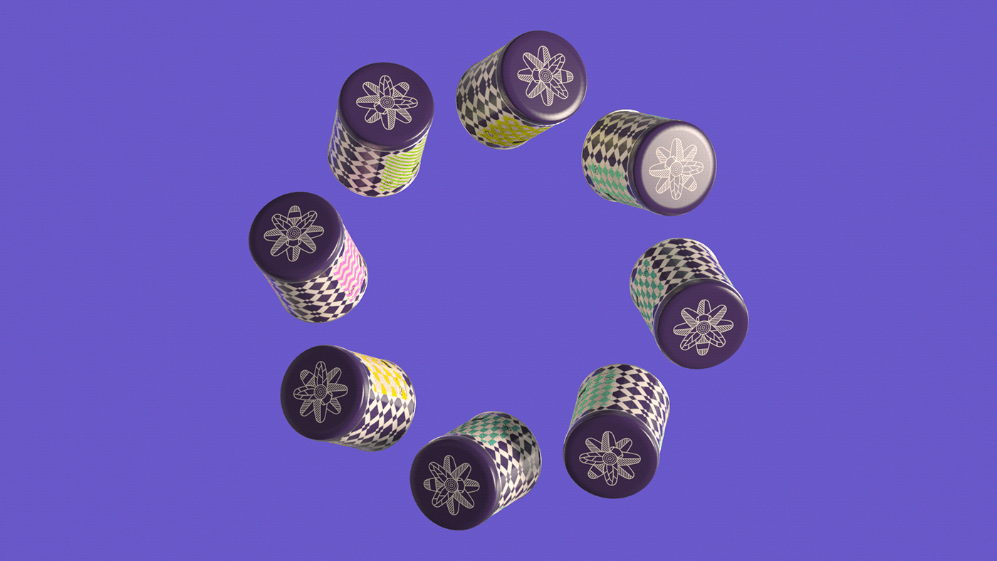
The logo was inspired by the brand name and the thinking behind it, as a visual expression of pollination – perhaps the most characteristic example of symbiosis in nature. The shapes of the flower blossom and the bee are superimposed and then merged to create a shape that is both new and recognizably a naturally occurring form.
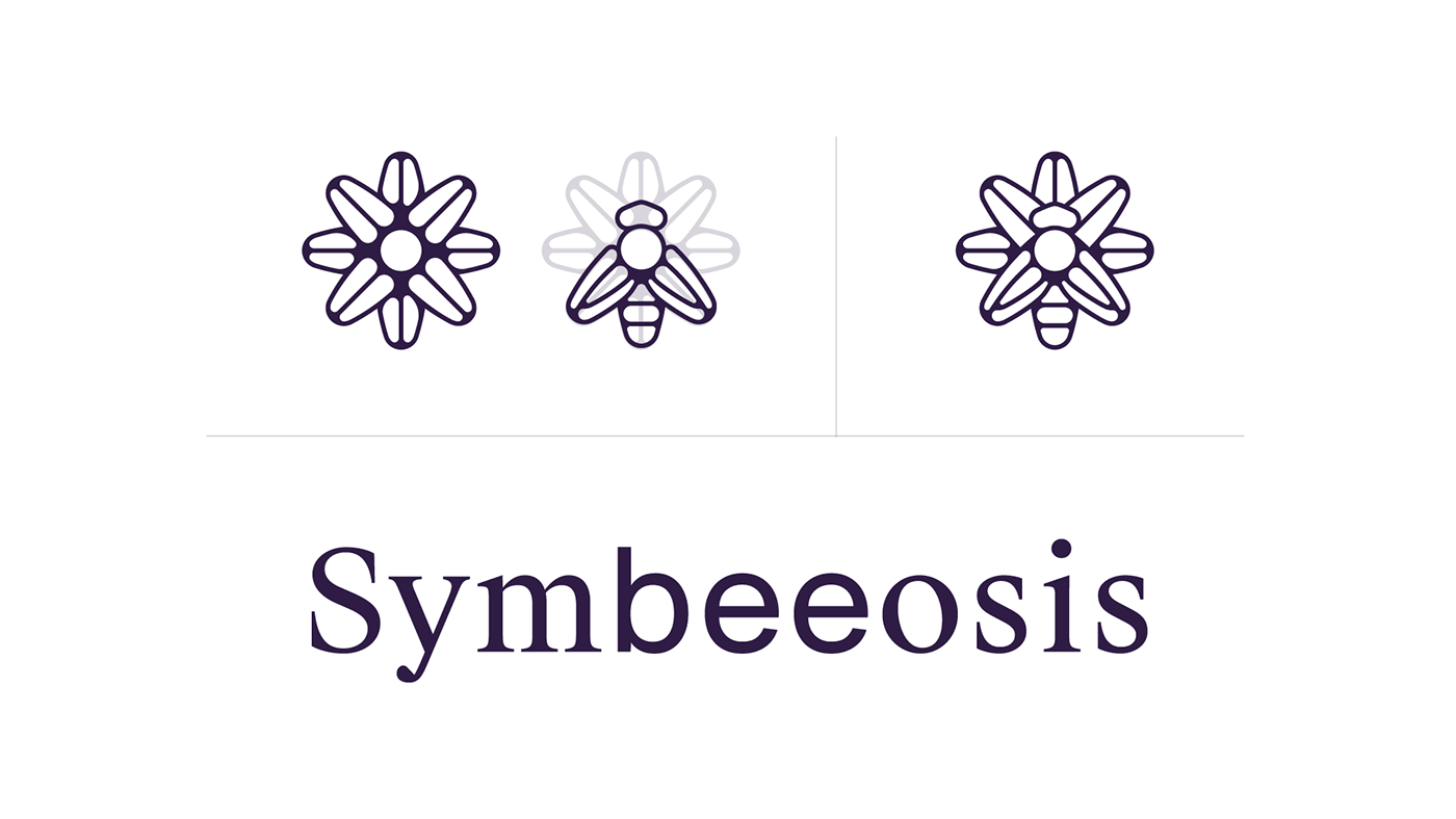
The typography for the brand name is a combination of two different fonts: a classic, elegant serif font and a more modern, forward-facing sans serif font. The two fonts express how the company employs state-of-the-art technology and methods to preserve and enhance the best all-natural ingredients.
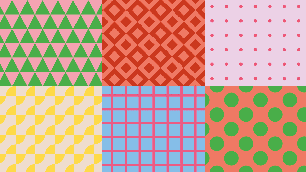
Patterns, visible regularities of form, are common and recurring in the natural world (waves, rows, trees, spirals, etc.). Different organisms or events create different patterns that coexist, contributing to the colorful variety of the natural environment.
Using such patterns, we established a system of geometric forms that, combined with a distinct color palette, leads to an expanding visual system. Symbeeosis has a board but carefully selected color palette.
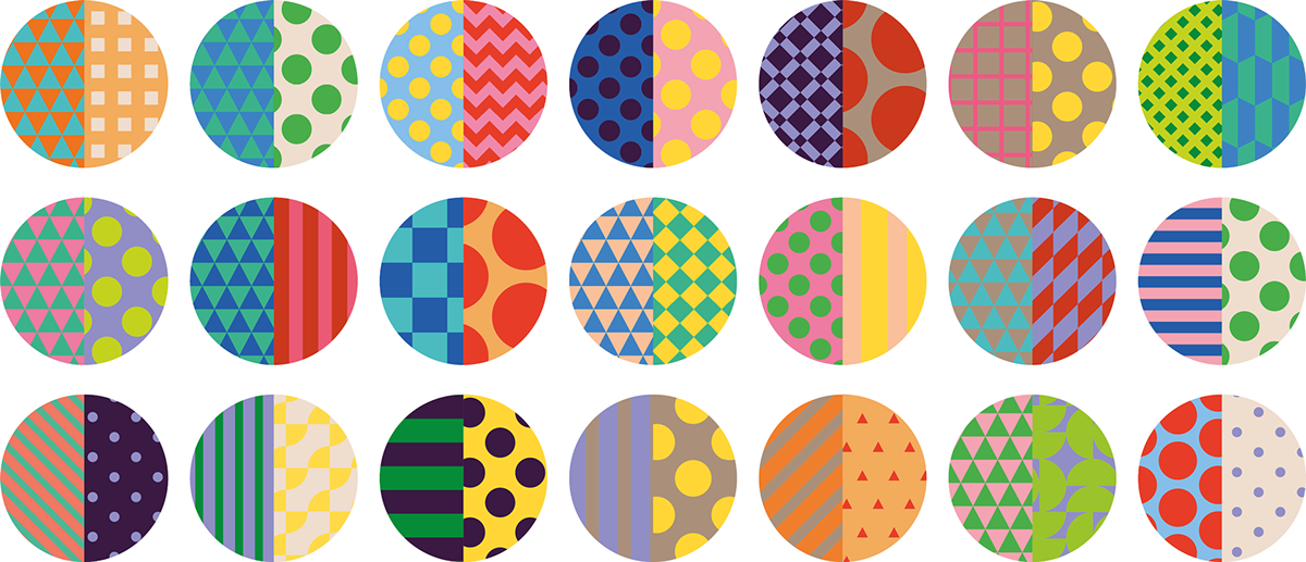
Creating compositions and layouts by splitting patterns and content in halves is a great way to achieve memorable and consistent design outcomes and at the same time strike a perfect balance between functional and expressive design.
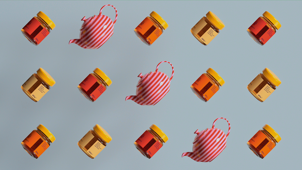
Each product category has its own product pattern, which is then combined with a “flavor pattern”. Product patterns are the same across flavors, and flavor patterns are the same across products. So, each packaging is a combination of two patterns that visually state the product type and flavor. The “split” design of each container is another reference to coexistence and collaboration.


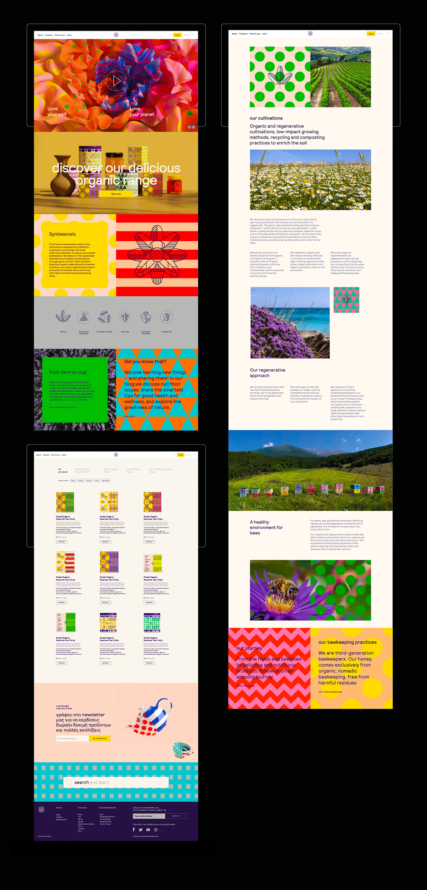
These concepts and elements are also apparent on the website & e-shop design. The brand advocates for a return to natural ingredients and principles by modern and sustainable means. It wants to target younger, more sophisticated audiences, who see themselves as eco-conscious but not as traditional.
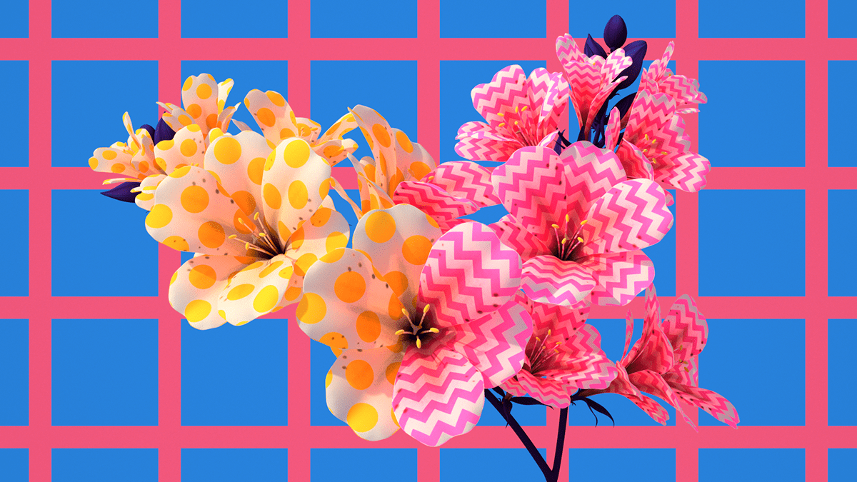
In order to visually represent this “nature meets future” stance, we created a series of digitally manipulated animated images with an abstract, surrealistic approach, were unusual elements come together to form naturally occurring shapes.
These unexpected, “blooming” forms add visual interest to the website, function as eye-catching social media assets, and help differentiate the brand from competition, which tend to be one-dimensional and solely nature oriented.


MADE BY BEETROOT

#beetrootdesign
Check our Instagram


