/ Branding / Packaging Design / Brand Identity / Naming
The Brief.
Entrepreneur and actor Jean-Paul Vuillin set out to create his own champagne brand that would be targeted at high net worth individuals in the UK. Along with his business partners he identified the club scene as the perfect channel for a premium and luxurious champagne launch.
Our brief was to create an premium brand that would appeal to the ‘indulgent, flamboyant, image conscious consumer who enjoys luxurious experiences and brands.
The Approach.
There are certain steadfast rules when launching a champagne but we felt it was important to break with convention in order to differentiate the champagne from its more traditional counterparts. Using the brand positioning of 'Social Magnetism', the Knight Champagne' was born!
The naming strategy came from the knight chess piece known for its more unconventional moves.
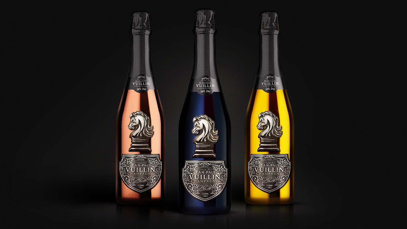
Our task then was to create the bottle designs and the outer boxing for the range which includes Blanc du Blanc, Rosé and Vintage.
The Result
The three bottles are hand sprayed in raven black, gold and rose gold. The embossed and tarnished detailing in the metal plate labelling is reflective of the quality and the crafting required to produce a super premium champagne.
The Knight emblem is also pressed from the metal plate labelling creating a powerful and distinct brand icon positioned to stand out when placed in an ice bucket.
Client: JPV Champagne
Design Agency: Slice Design, London UK
Website: https://slicedesign.co.uk