/ Branding / Packaging Design / Brand Identity
The Brief.
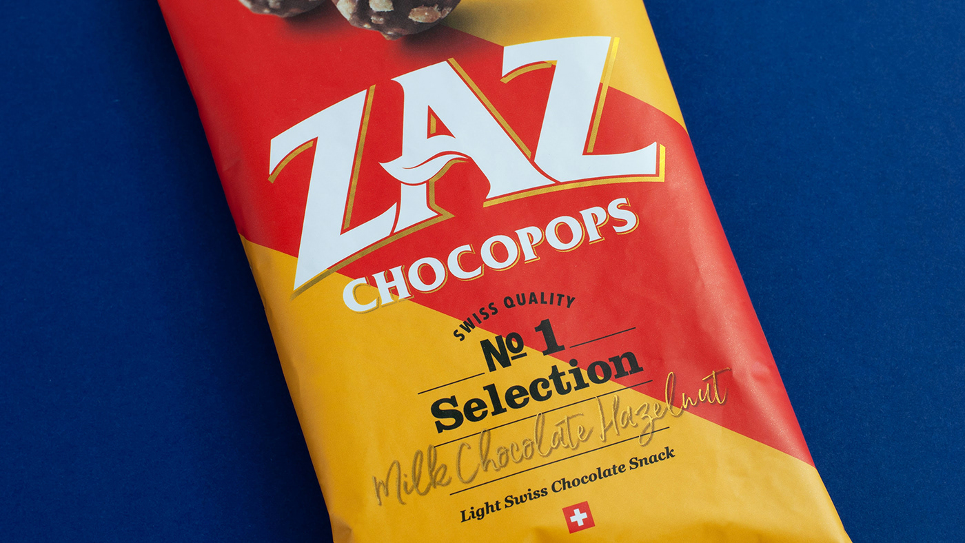
Slice Design was briefed to create the branding and and packaging design for the new range of Chocopops. The design needed to reflect the premium quality of the product and ZAZ’s mission to enable consumers to feel on top of their snacking routine without compromising on taste.
New Zaz Chocopops are a delicious delight made of air popped corn covered in crispy better-for-you caramel, creamy Swiss chocolate and crunchy nut pieces.


The Approach.
Based on a positioning of ‘King of ingredients,’ the regal design utilises a striking sash and gold foiling for bold impact on shelf. It was important to communicate that the snack was 100% natural and contained organic ingredients.
We opted for a vibrant colour palette and large product cameo that exudes appetite appeal, paired with bold on pack iconography to dial up the natural claims and increase shelf standout.
The Result.
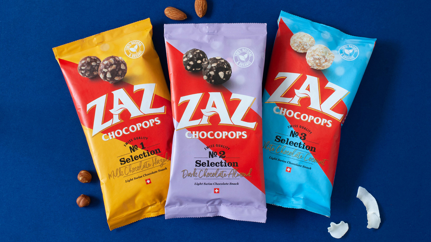
The pack design was rolled out across 3 flavours: Milk chocolate hazelnut, Dark chocolate almond and White chocolate coconut.
Mix numbers were introduced to the packs to enhance “Specially Selected” and red sash was boldly used across the centre of the pack as a nod to the regal roots of Zaz and to create a bold standout architecture. Guilt free snacking has never been this divine, any time of the day!


