oigo
uncomplicated audio
uncomplicated audio
HOW TO TRANSFORM AN AUDIO STUDIO from a little town in the south of Brazil into a strong, relevant and competitive brand? The first step was to get to know the company better. After an immersion in its reality, the main differentiating points were identified: solving problems easily, having no bureaucracies, acting closely to clients in order to understand and fulfill their needs the best way possible and working dynamically. The company could also provide a great networking of different voices and musicians of a variety of styles. Crossing that, with the results of multiple researches, such as, scenario, audience and competitors, the main drivers for the brand were identified: proximity, flexibility and practicality. After discovering these differentials, it was time to design a brand that reflected it all.
listening turned into a brand
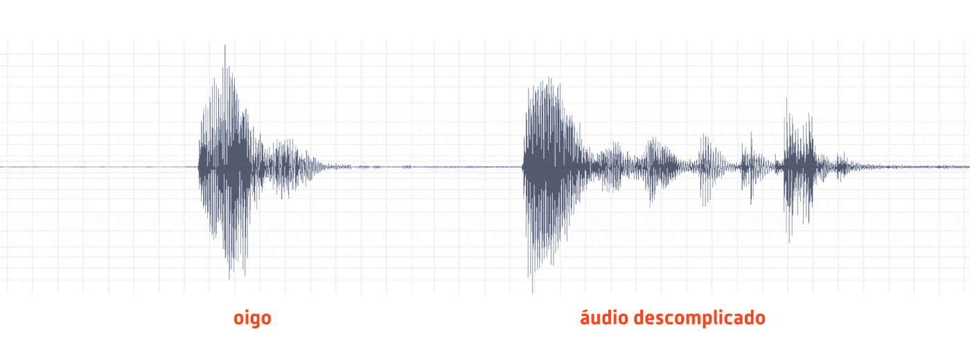
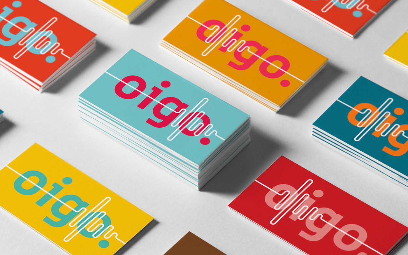
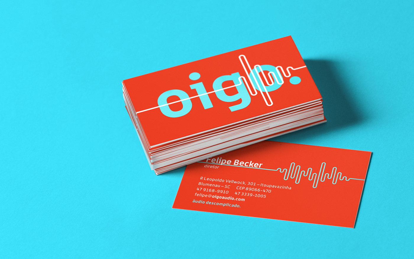
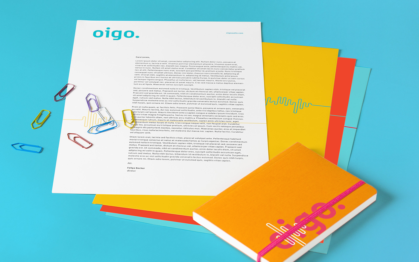
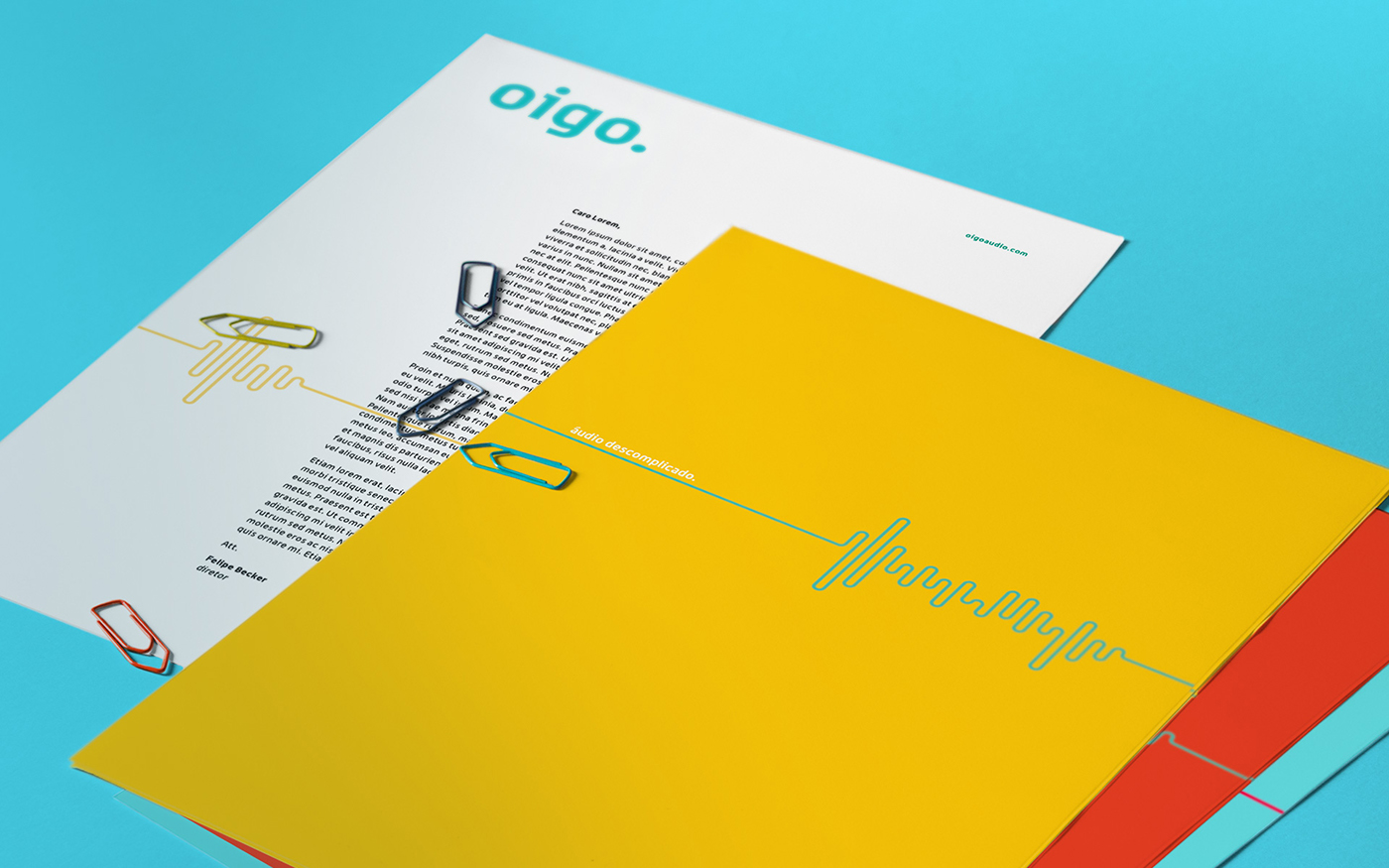
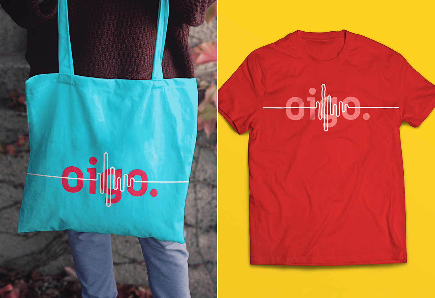
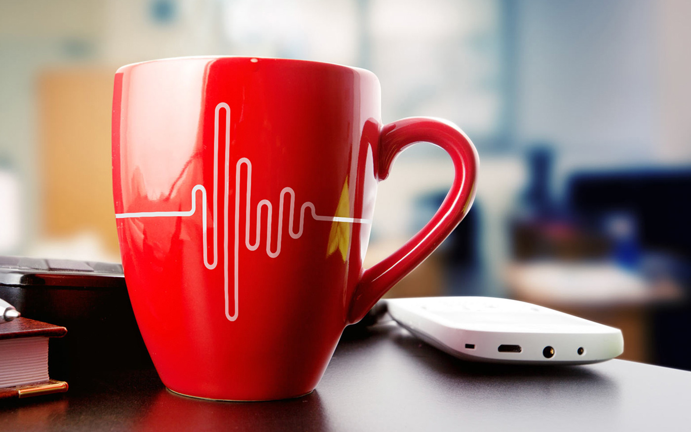
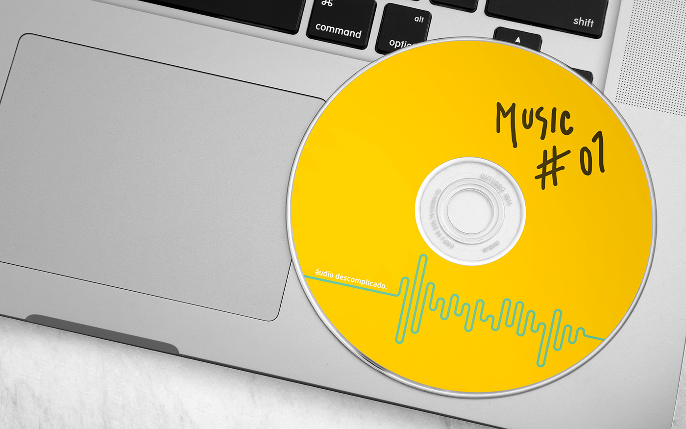
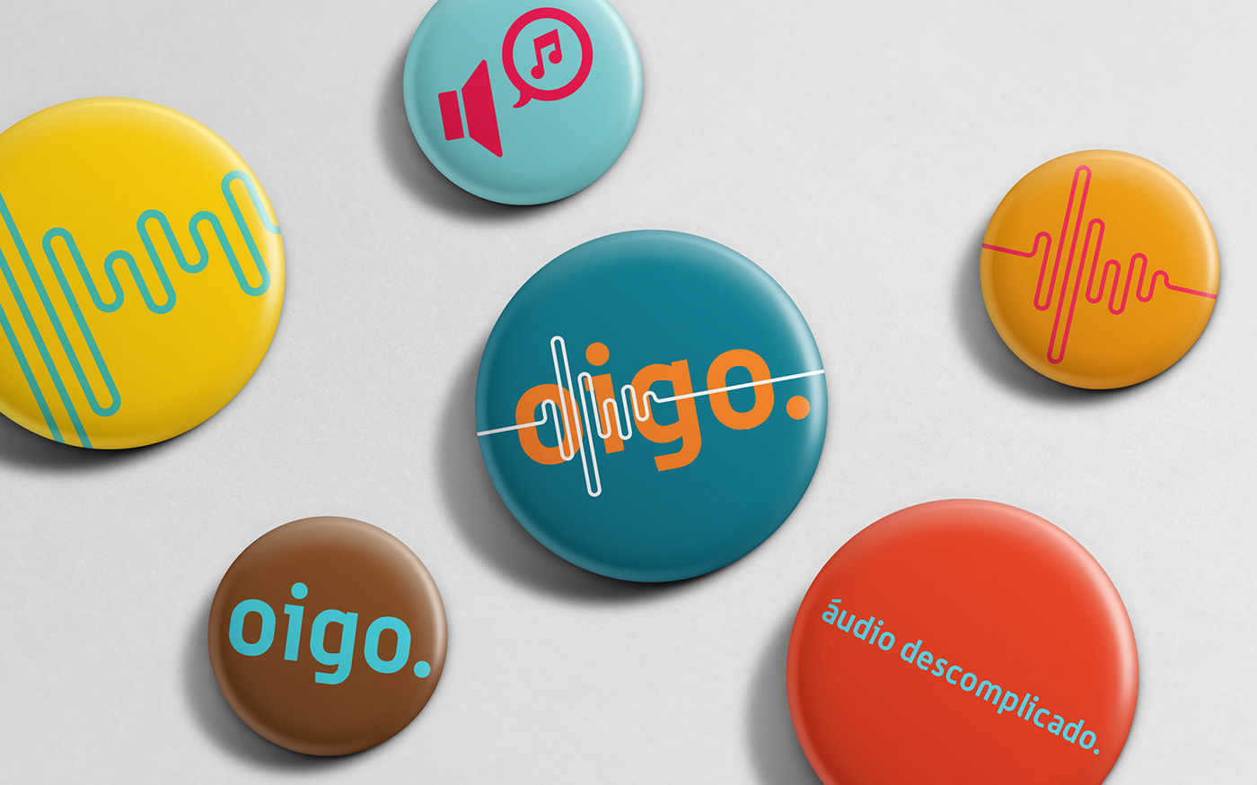
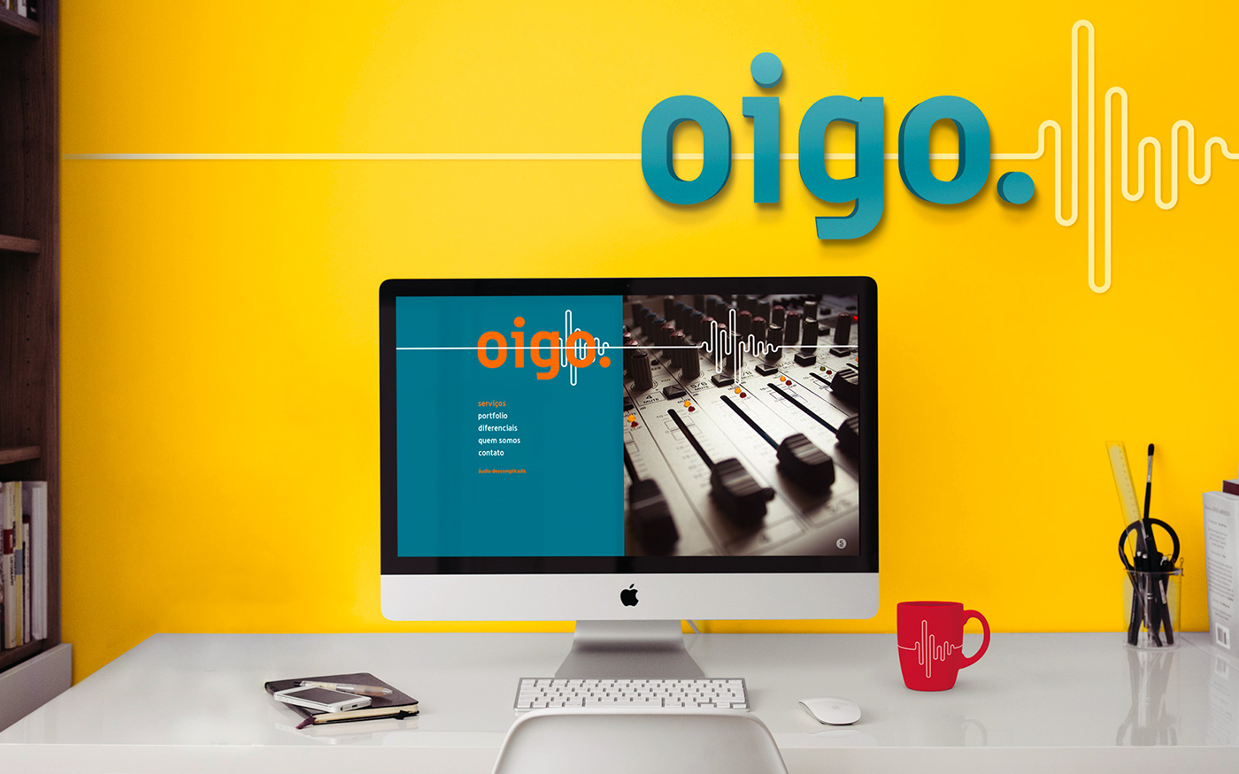
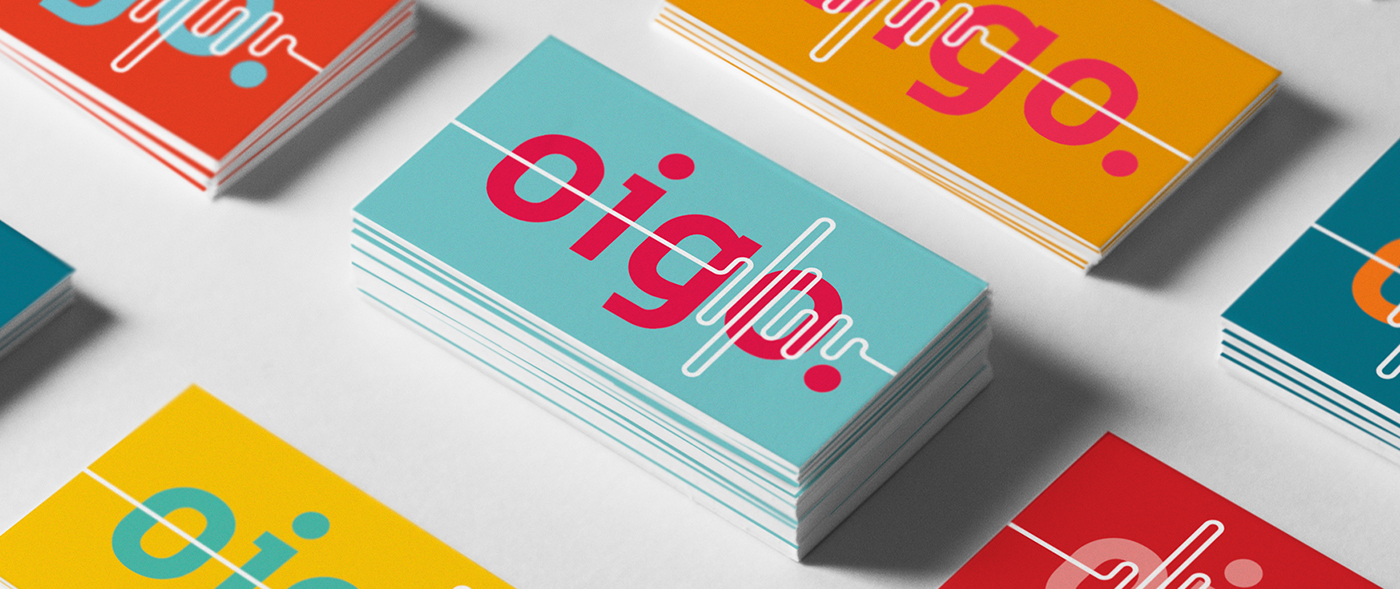
Through the complete strategic project, the name ‘Oigo’ — that comes from the verb ‘oír’, ‘to listen’ in Spanish,— came to life. It can be understood in two different ways: the listening of music, jingles, sound productions — the core business of the company; or listening to people, briefing, being practical (direct) and close. The tagline completes the name, pointing out the brand’s positioning: Uncomplicated audio, making it clear the way Oigo works. The variety of voices and different musical styles are represented by the chromatic variations' flexibility. The use of the waveform as a symbol, which represents the technical side of audio productions, can be customized and unfolded in many different ways (for example, each worker at Oigo has a waveform of their own in their business cards and e-mail signature).
Through the complete strategic project, the name ‘Oigo’ — that comes from the verb ‘oír’, ‘to listen’ in Spanish,— came to life. It can be understood in two different ways: the listening of music, jingles, sound productions — the core business of the company; or listening to people, briefing, being practical (direct) and close. The tagline completes the name, pointing out the brand’s positioning: Uncomplicated audio, making it clear the way Oigo works. The variety of voices and different musical styles are represented by the chromatic variations' flexibility. The use of the waveform as a symbol, which represents the technical side of audio productions, can be customized and unfolded in many different ways (for example, each worker at Oigo has a waveform of their own in their business cards and e-mail signature).
efficient process, notorious results
The project, developed by Saad, strategically identified and aligned what Oigo had to offer to the market, reinforcing the brand’s positioning: the optimization of their clients’ time through an efficient production process. Besides the complete creation of the new brand strategy, the project contemplated specific strategies for areas such as attendance, management and activation. It highlighted the importance of speaking in unison with the customers, transmitting a unique, true and believable message in each of its touchpoints. the result was a complete overhaul of the clients and partners' perception of the brand, increasing its market share and tripling its revenue in the first three years after the branding project. Today, the company sticks out as one of the main players in its market.
The project, developed by Saad, strategically identified and aligned what Oigo had to offer to the market, reinforcing the brand’s positioning: the optimization of their clients’ time through an efficient production process. Besides the complete creation of the new brand strategy, the project contemplated specific strategies for areas such as attendance, management and activation. It highlighted the importance of speaking in unison with the customers, transmitting a unique, true and believable message in each of its touchpoints. the result was a complete overhaul of the clients and partners' perception of the brand, increasing its market share and tripling its revenue in the first three years after the branding project. Today, the company sticks out as one of the main players in its market.
AWARDS AND PUBLICATIONS
Design and Design
Design and Design
Featured on the website. United States.
We and the Color
Featured on the website. United States.
Branding Served (Behance)
Featured by Adobe trusteeship on Behance. United States.