


To a Tea
App Prototype
“To a Tea” is an app designed to help a tea drinker decide which tea to drink at that very moment. The app can also suggest new brands of tea to try, or even teach you how to make homemade herbal teas. The colors and images of the app are designed for the visually impaired, so it makes the app accessible to a greater number of people.
The first thing I needed to explore were my competitors. If I were to make this app, who would take customers away from me? I used this research to figure out what features I should include in my app.

Competitive Audit
After my competitive audit, it was time to map out the app.

Site Map
It was then time to create the identity for the app, including the logomark and type, fonts, colors, and icons.
Finding the colors was a challenge, as I was making this app to be accessible for those with 20/70 vision. In order to use these colors, a lot of research had to go into the colors and whether there was enough contrast between them.

App Colors
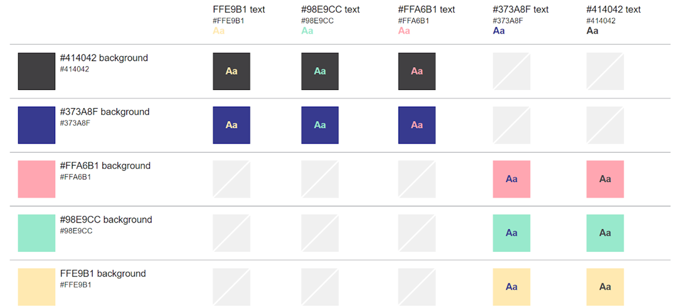
Color Testing
The text for the app also had to be accessible for 20/70 vision. Tedious measuring was needed for this.

App Font

Type Measuring
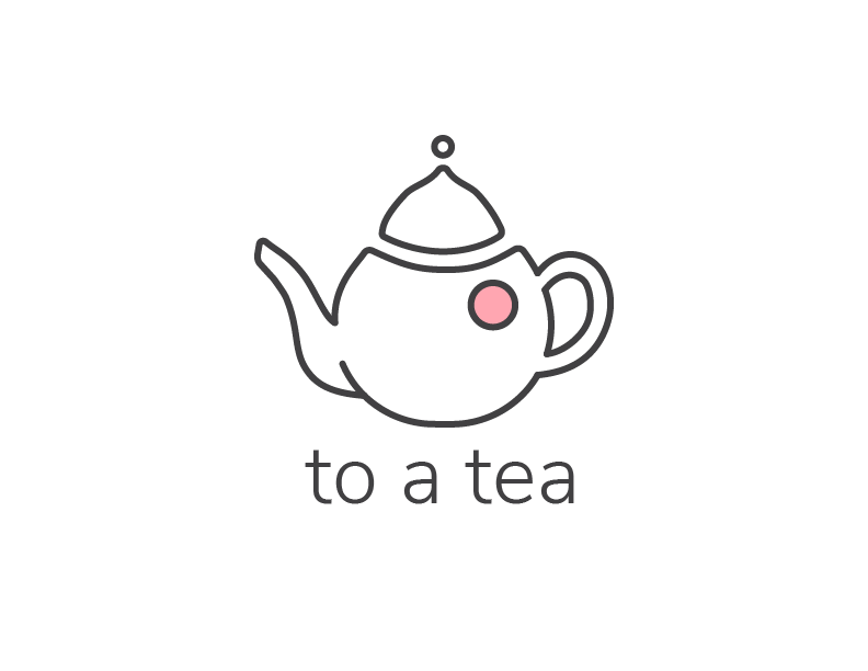
Logo Mark and Logotype

Icons - Off and On
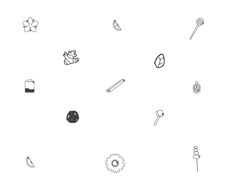
Additional Icons
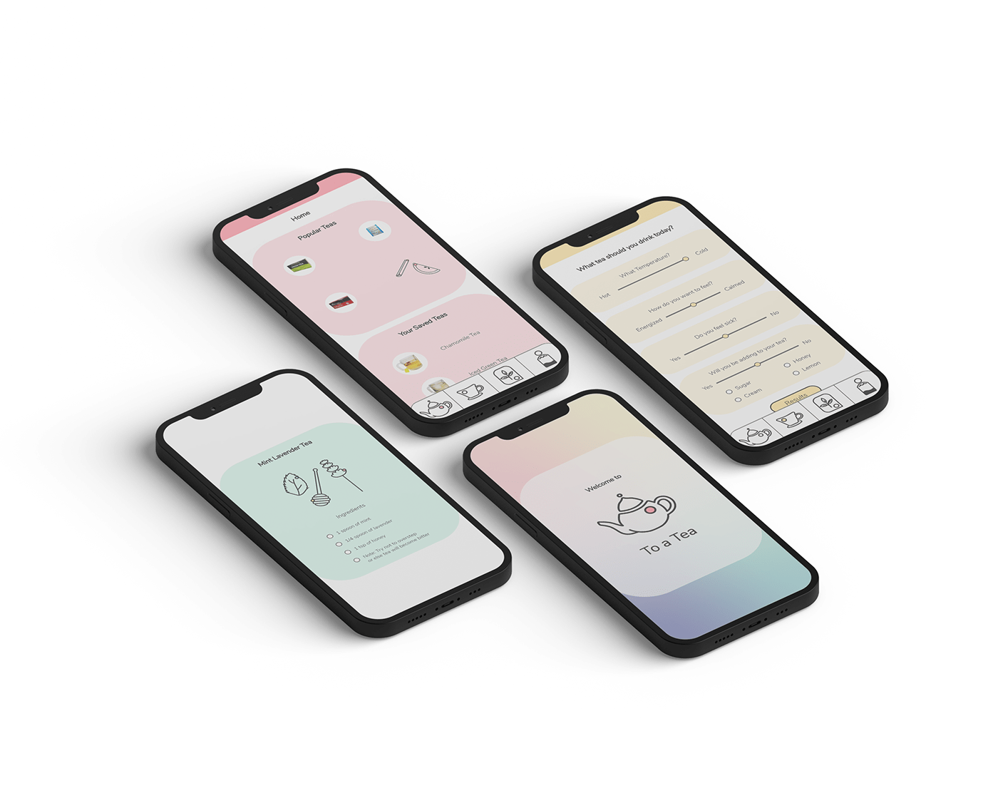
Next, it was time to build the app. Here are some basic annotations to show how the app works.


Here are some images of "To a Tea" in context.

Use "To a Tea" for yourself!


