BRANDING DESIGN 2020
What is this project?
For this project, I created a branding system for my 483F | Interactive Design class website.
Design Concept
For this design, I explored both organic and geometrical forms to express my facial features. Upon initial viewing, the faces seem like shapes combined together with no goal whatsoever. After looking at the portraits, the viewer can discern emotions invoked by the shapes.
Moodboard

Portrait Sketches
I used reference photos of different emotions to create variety in the portraits. I experimented with organic, fluid lines and geometric shapes. I decided on using the geometric portraits because of how distinct the style was.

Poster Drafts
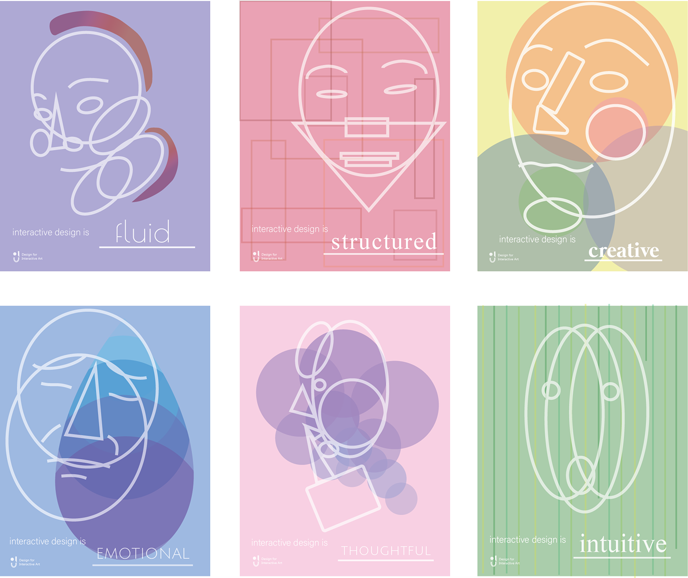
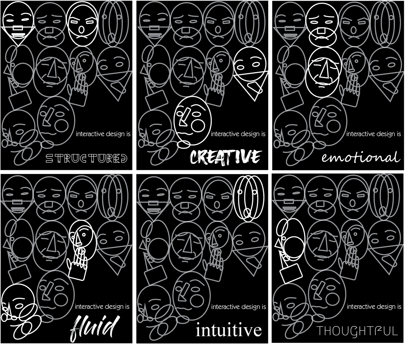
The portraits I created were used for posters. Each face represents a feeling I have towards interactive design. After making 2 sets of posters, I chose the pastel ones. I felt like the colors and icons correlated with the words well.


Coffee Cup Mock ups
Using the portraits and the icons from the posters, I created coffee cups featuring patterns of the faces and their respective words.

483F Logo Mark and Type
This logo was designed for my 483F | Interactive Design class. The logo mark is supposed to imitate the same geometric style of the portraits. I wanted there to be an obvious cohesion between these elements because I feel like branding is most memorable when similar in style. I went with the top design because the contrast between the lines and filled shapes makes the logo recognizable.

Panel Designs
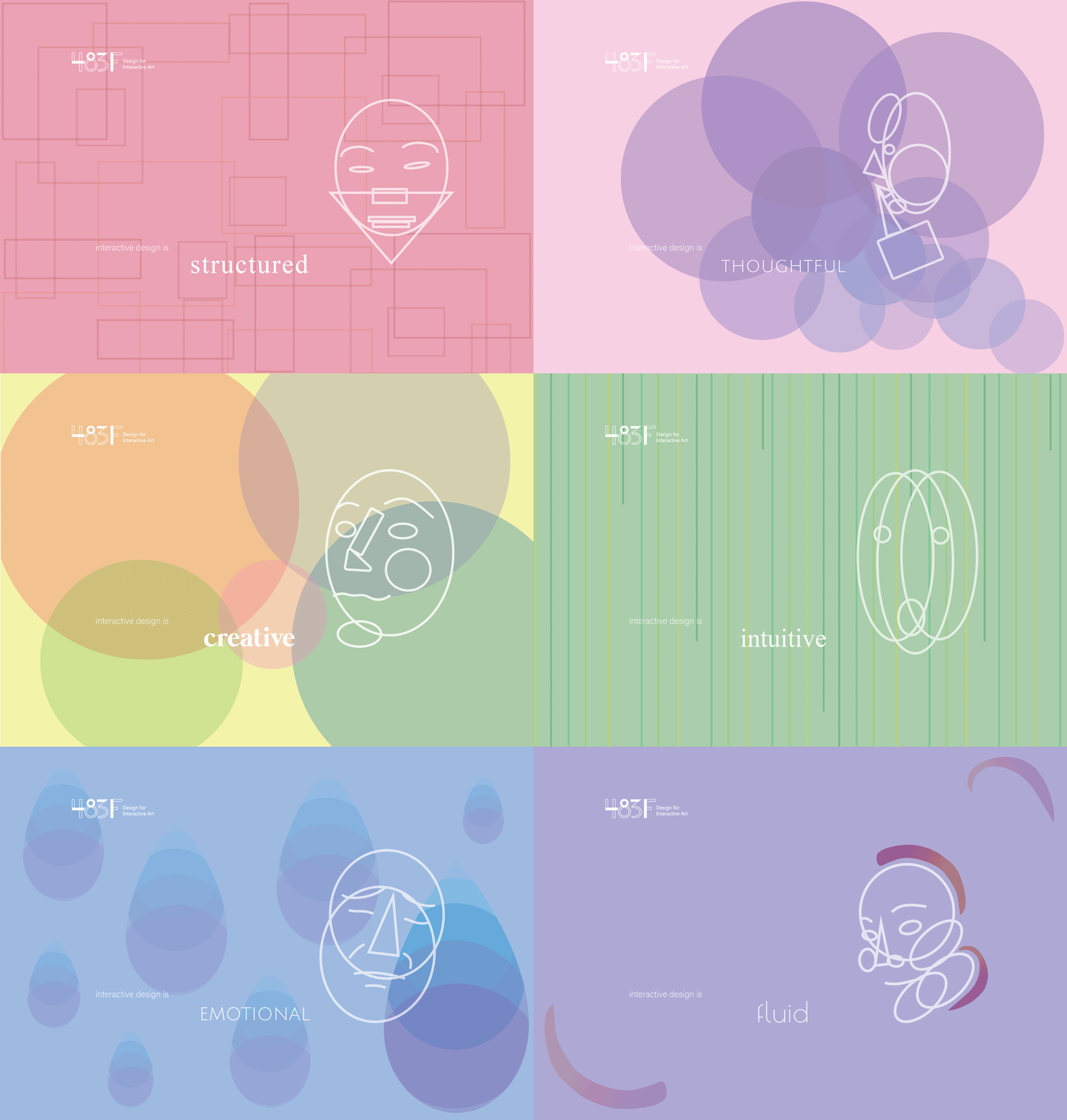
This is the final step of the project. Putting together both the portraits and the logo, I was able to create a recognizable branding system for my class’ website.


