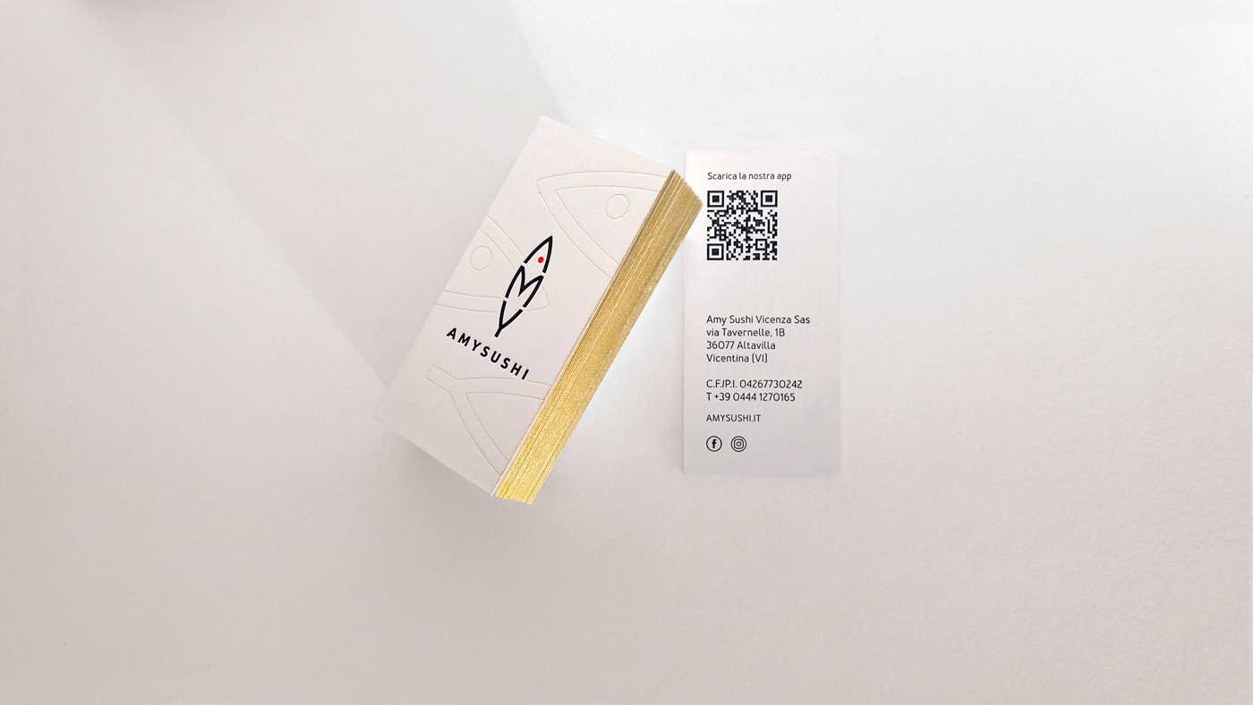
AMYSUSHI - Logo and corporate identity
A project that foresaw the entire rebranding of Amysushi, including the brand’s redesign comprehensive of all elements relating to its corporate identity. In the new logo, the letters A-M-Y, create the silhouette of a fish, while the general emphasis directs the focus on the restaurant’s specialties, that is sushi, as the name itself suggests.
A renovated identity with the aim of better aligning it with the brand’s positioning, except for a single detail which maintains a sense of continuity with the previous logo: the red dot. A symbol reminiscent of its origins.


