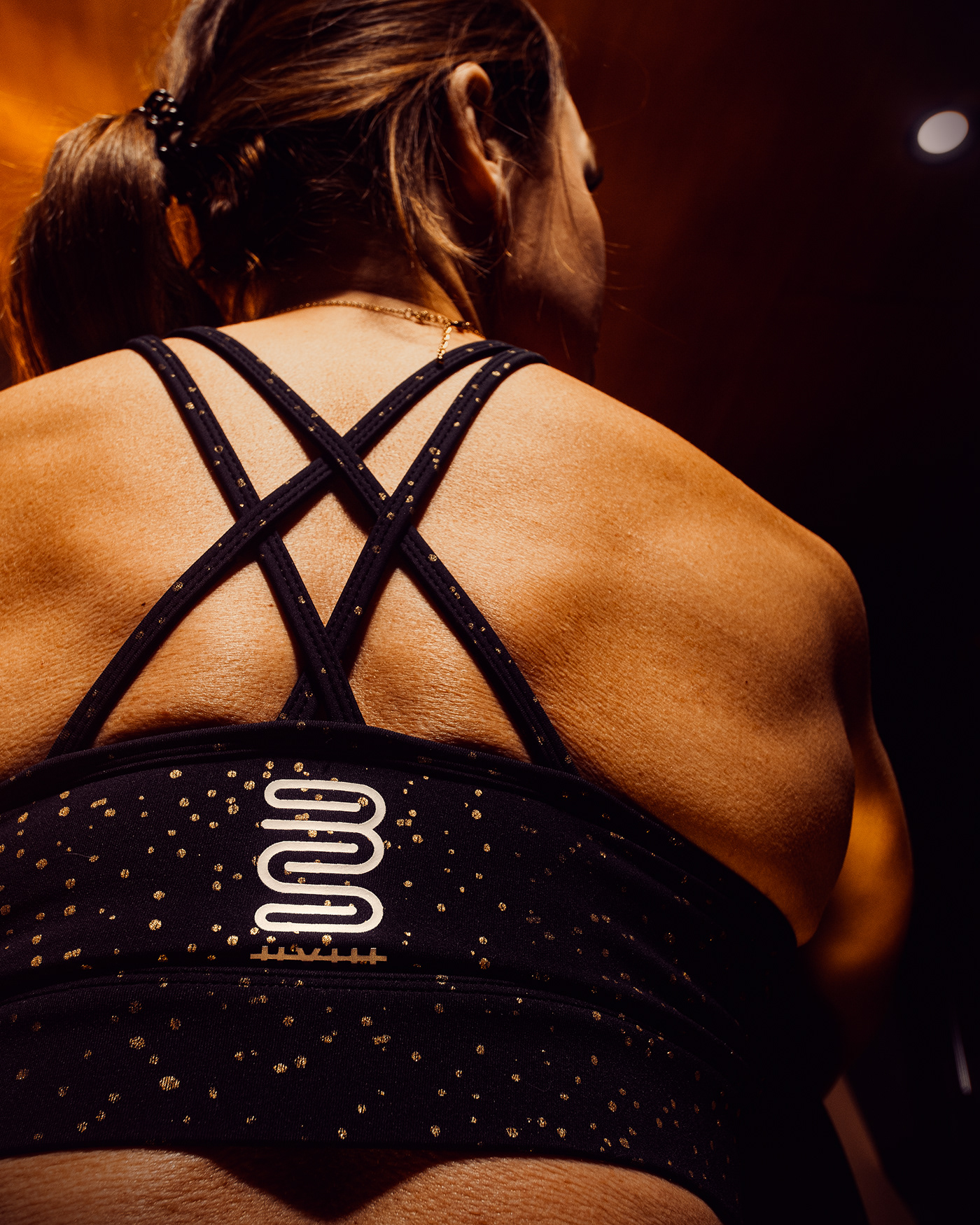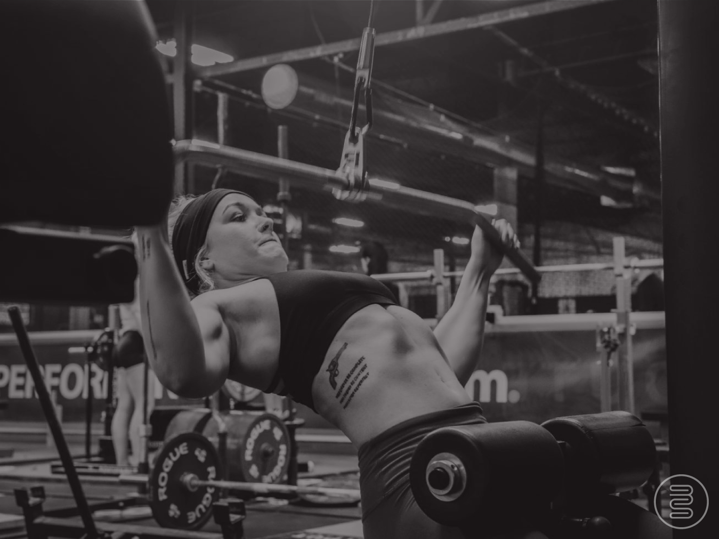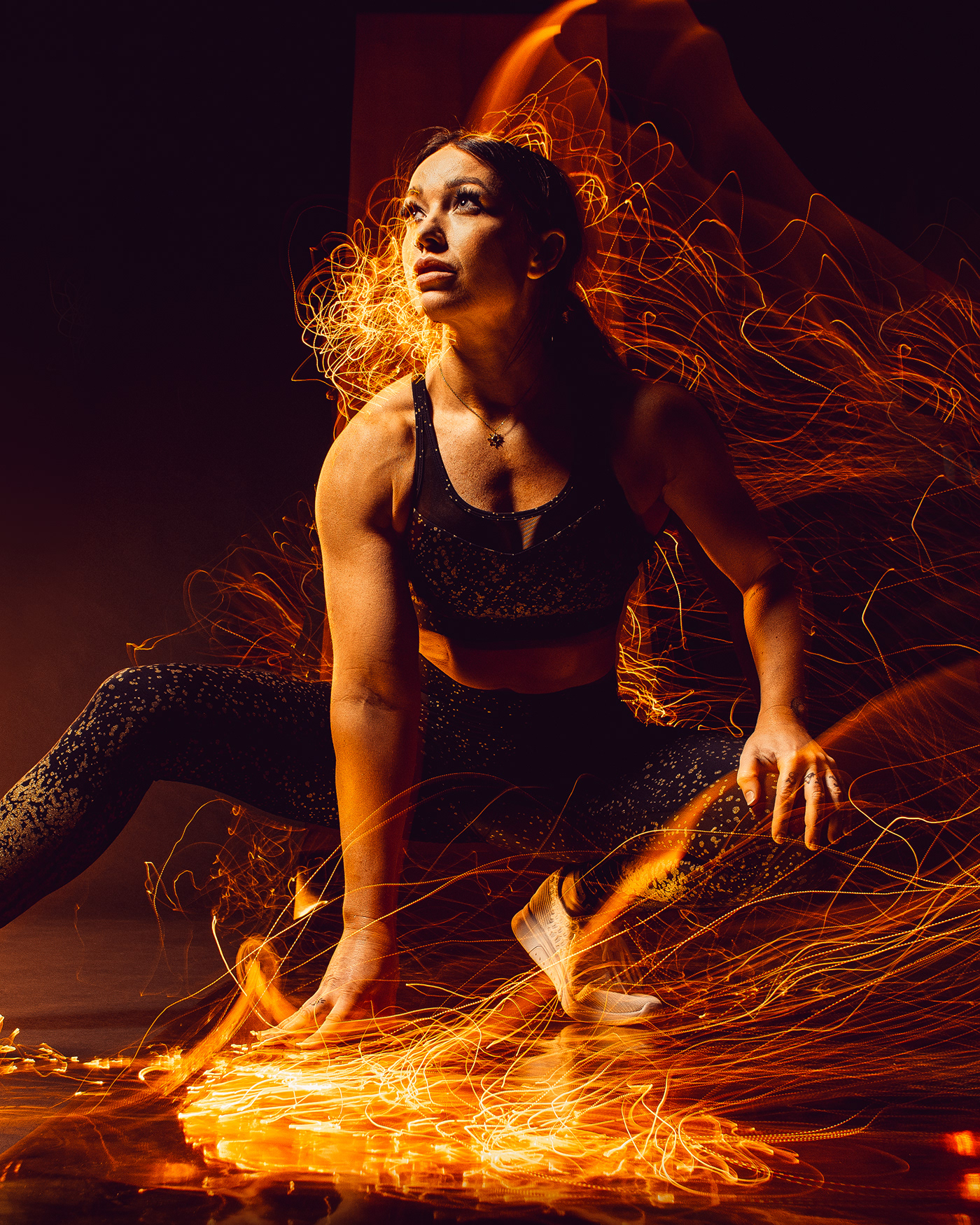
Bonnie Schroeder is first and foremost a BADASS, but she's also a world-class athlete and fitness coach. Bonnie (@bonschro on Instagram) has garnered a dedicated following due to her no frills, no b/s attitude (see what we did there?). Bonnie came to us to help create a new identity for her sponsorship ventures, primarily in the realm of clothing and soft goods.
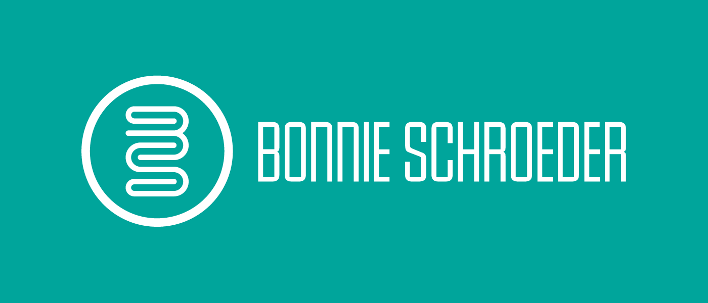
From the jump we knew this needed to be something clean, classy but not overly feminine, timeless, and badass. Bonnie wanted to stick with using a BS monogram of some sort but wanted to move beyond the standard, interwoven, look of most monograms. We flirted with various styles of BS lockups; blocky, heart shaped, rounded, abstract, etc etc. Then we landed on a monoline style that Bonnie really gravitated towards.
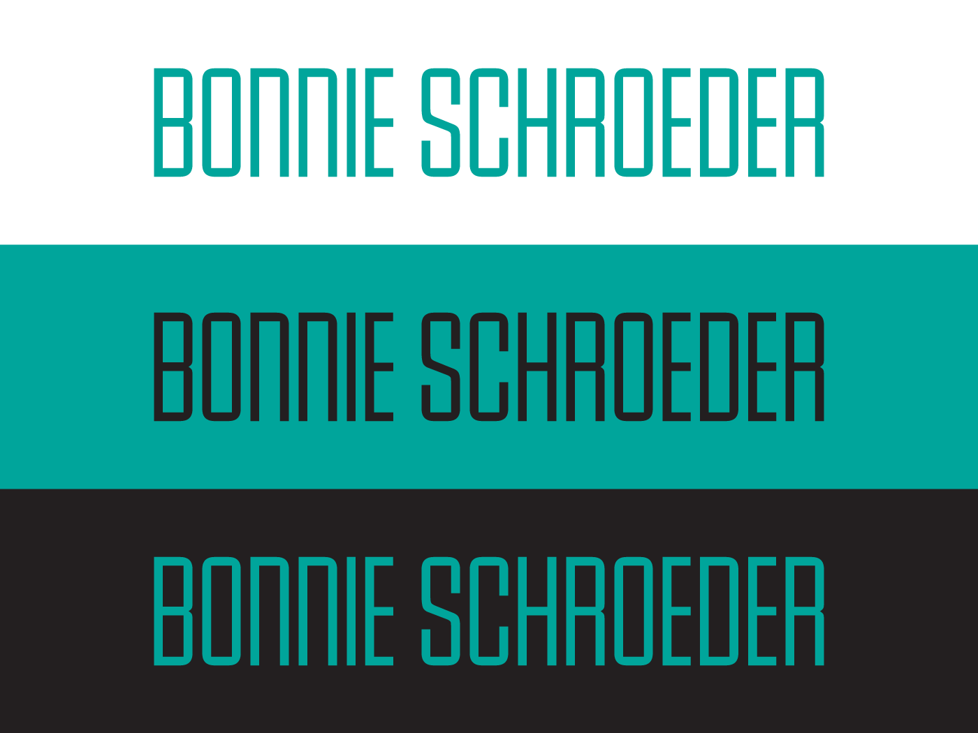
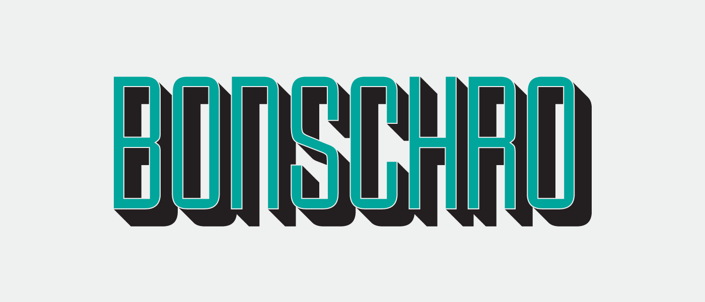
The B & S characters work together in unison, creating a multiple paths but always leading back to center. Much like a fitness/health journey, the path is never a straight line. The mark is strong, yet gentle, and reads as both a B & S with ease making it instantly identifiable. To offset the flowiness of the mark we paired it with a tall, mono-weight geometric typeface, that allows Bonnie's longer name to appear shorter and more impactful at smaller sizes. Truncated to fit her handles and training program, the typeface is moldable to whatever situation may arise or application it may need to fit.
Bonnie is a wonderful person and an expert mind in the field of fitness and women in business. We're proud to be associated with her and of the work we've been able to do for her.