

FULL PLATE
Food Justice is a movement that supports the idea that healthy food is a human right. We believe that the idea of food justice should be more widely known, and we wanted to come up with a way to share the ideas and principles of food justice. Raising awareness is our goal.
FULL PLATE is our solution for spreading information. Our informational video about food justice breaks down the facts and statistics in a visual way. Our website(fullplate.com) is a container for sources of information and examples of organizations that are paving the way for food justice.
LOGO


The concept for our logo leans into the idea that a plate is overfilling with typography. The letterforms mimic 1960s-70s informational typography(think Schoolhouse Rock) as a way to make our mark and mission more approachable and to plant the idea in our audience that they will learn something from their interaction with FULL PLATE.
IDENTITY


For our typeface choices and color palette, we wanted to stick with our theme of approachability. Our colors were selected with idea in mind that a healthy, nutritious plate is a colorful one, and we wanted our colors to reflect that.
ILLUSTRATIONS
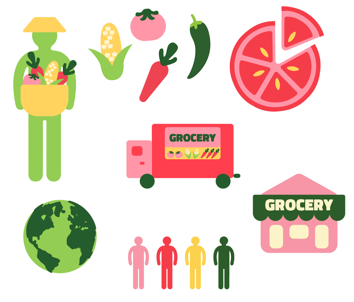
Our illustrations follow a rounded and simple rule. This allows us to keep with our theme of approachability. The simple illustrations also lend themselves to building out the informational video in After Effects.
STORYBOARD

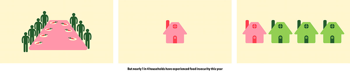
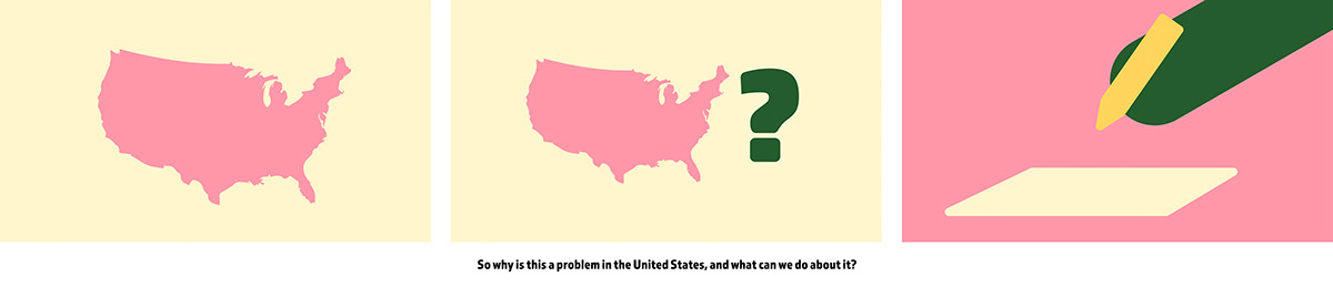

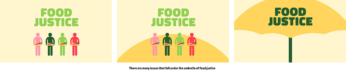
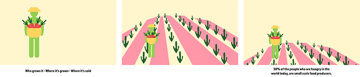


INFORMATIONAL VIDEO
GIFS


WEBSITE


MERCH


PROCESS


PARTICIPATION
KD Kimbrell created our logo, multiple variations of our storyboards, script, and website. Chris Dudley created storyboards and helped edit the script. Taylor Becherer created the illustration styles and had storyboards.


