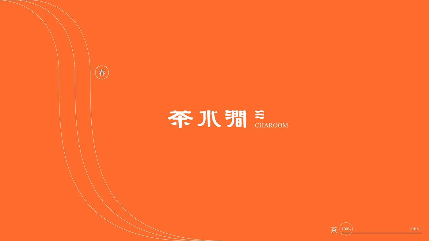
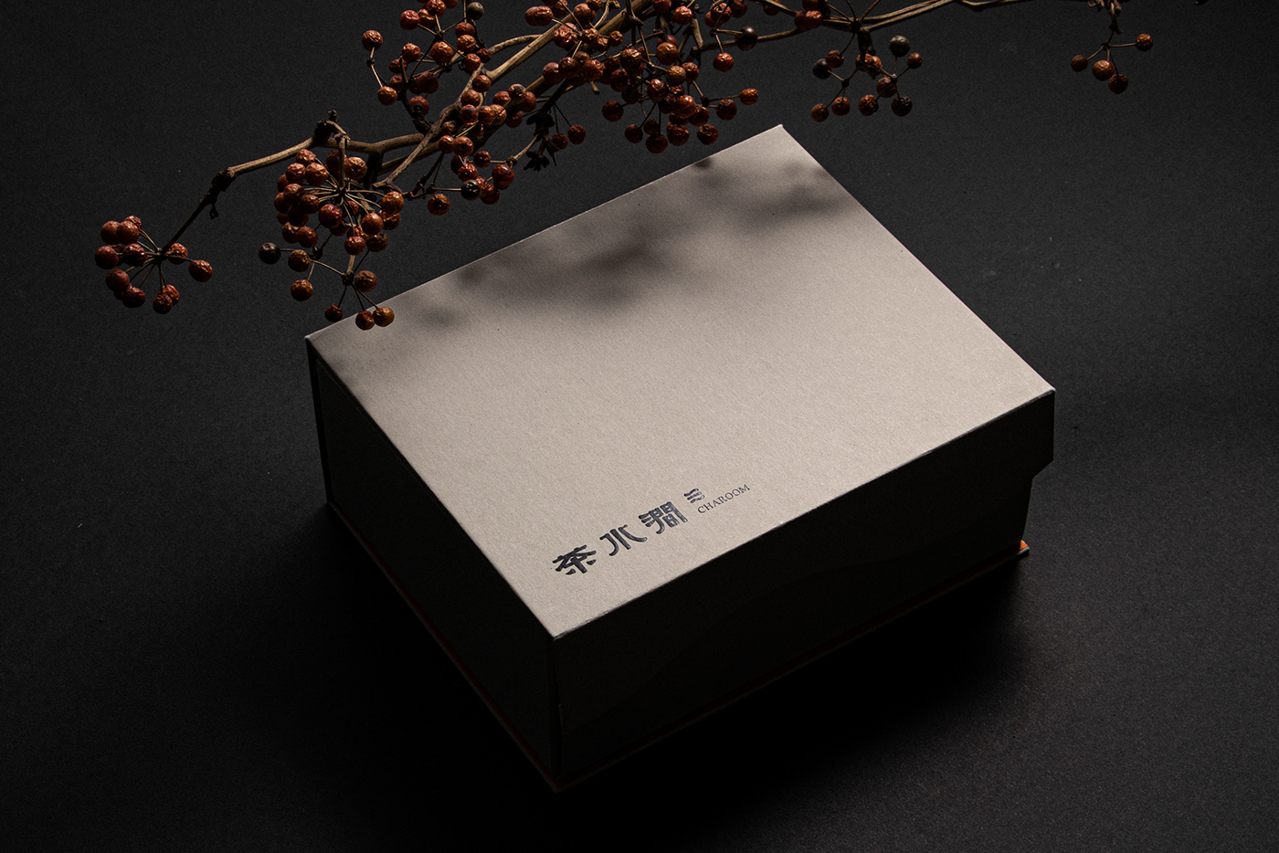
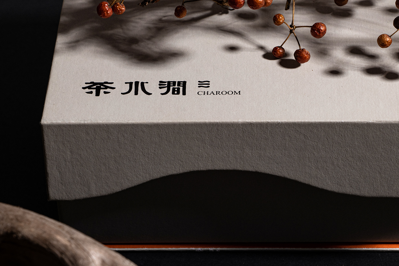
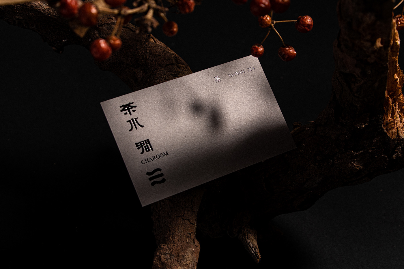
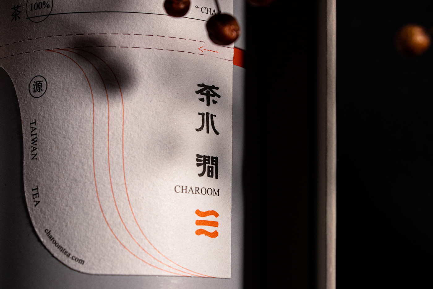
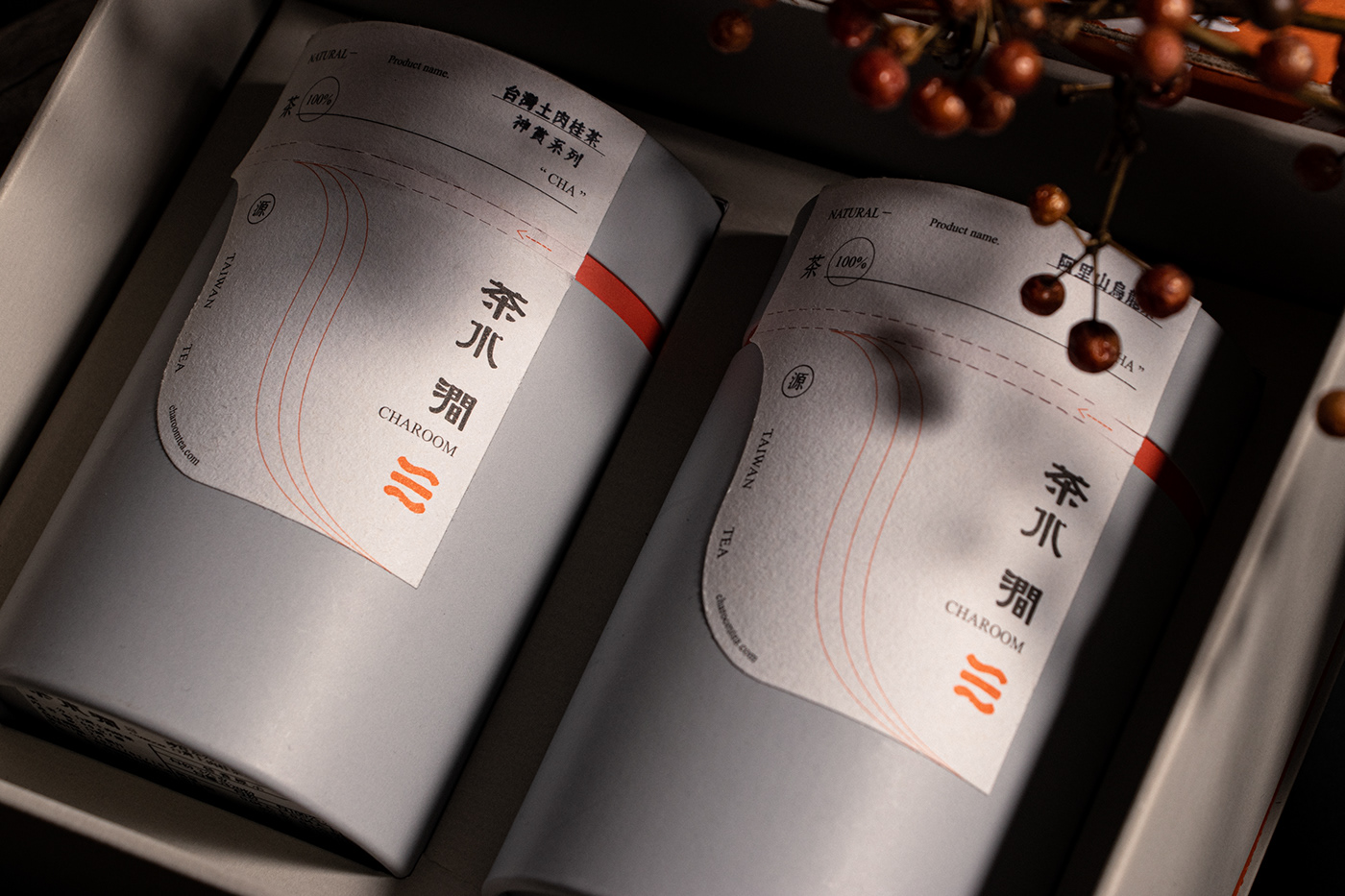
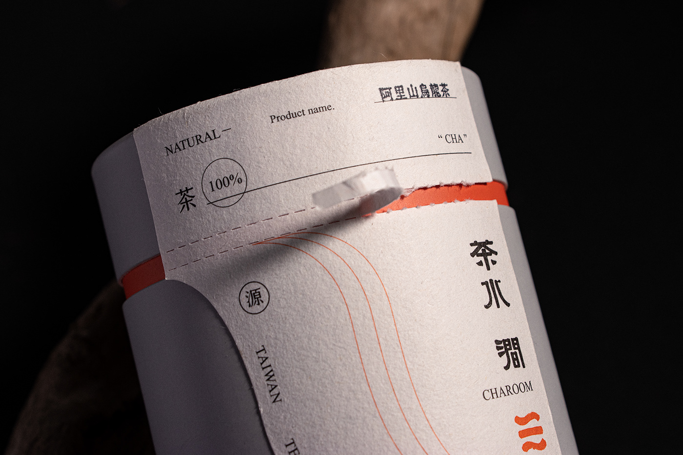
茶水澗 CHAROOM
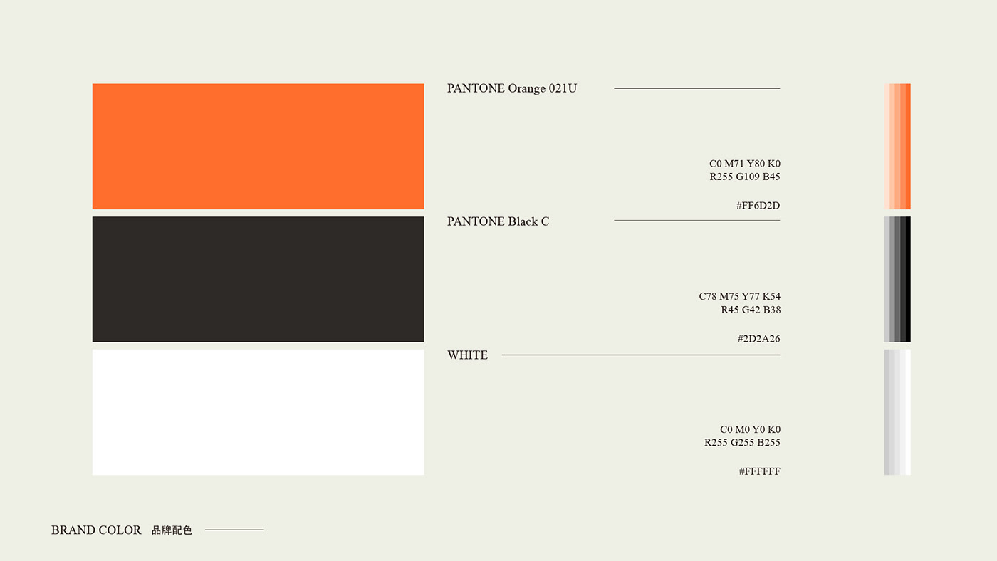
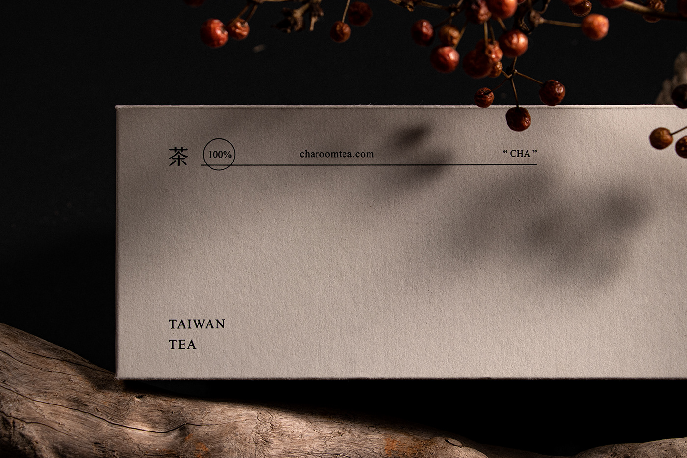
品牌方客戶,致力希望推行年輕化的品茗品牌,從茶水之間找到山水流淌的澗,希望從茶與人之間可以互相交流,在品牌色中選定橘色、黑色、白色,強調活力與質感的並駕,質地與品味的交會,像茶葉以及水的交互融合,倒飲出文化。
─────────────────────
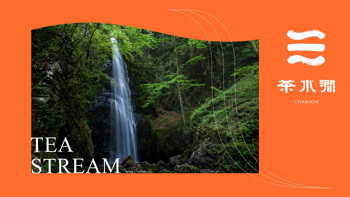
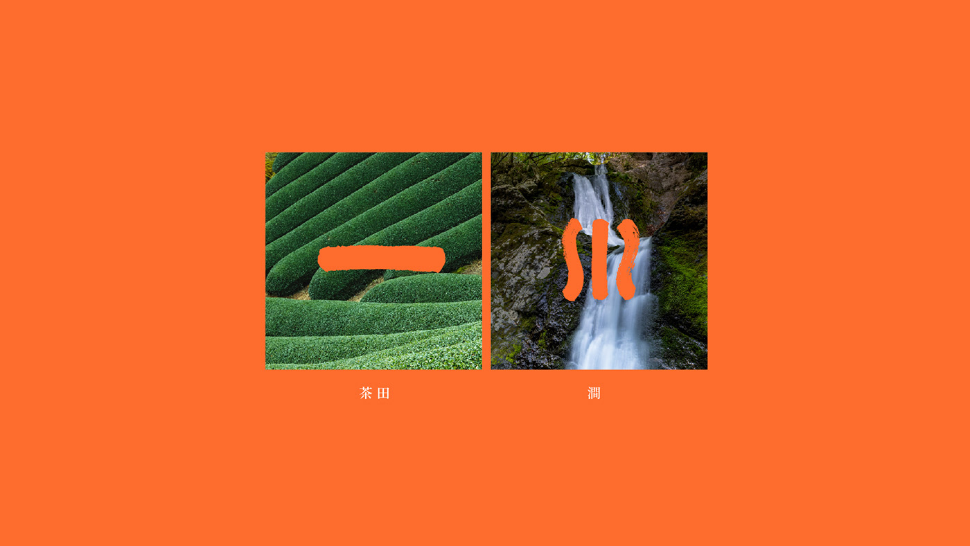
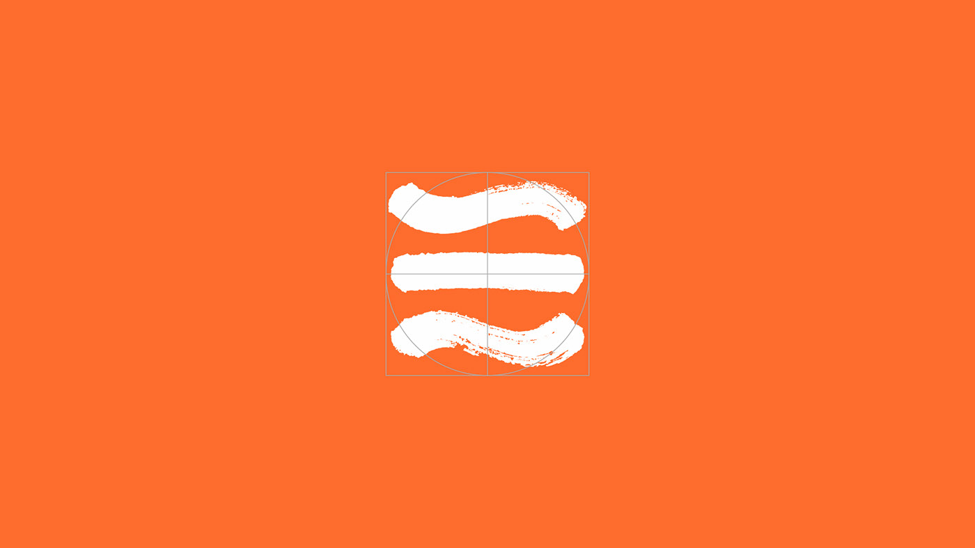
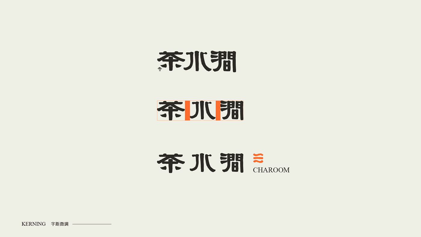
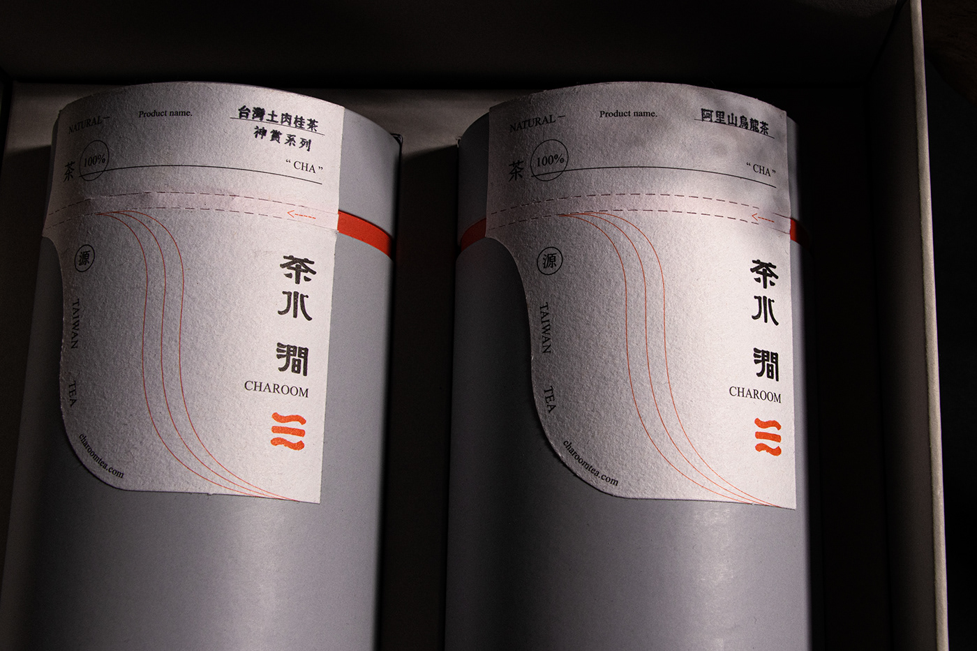
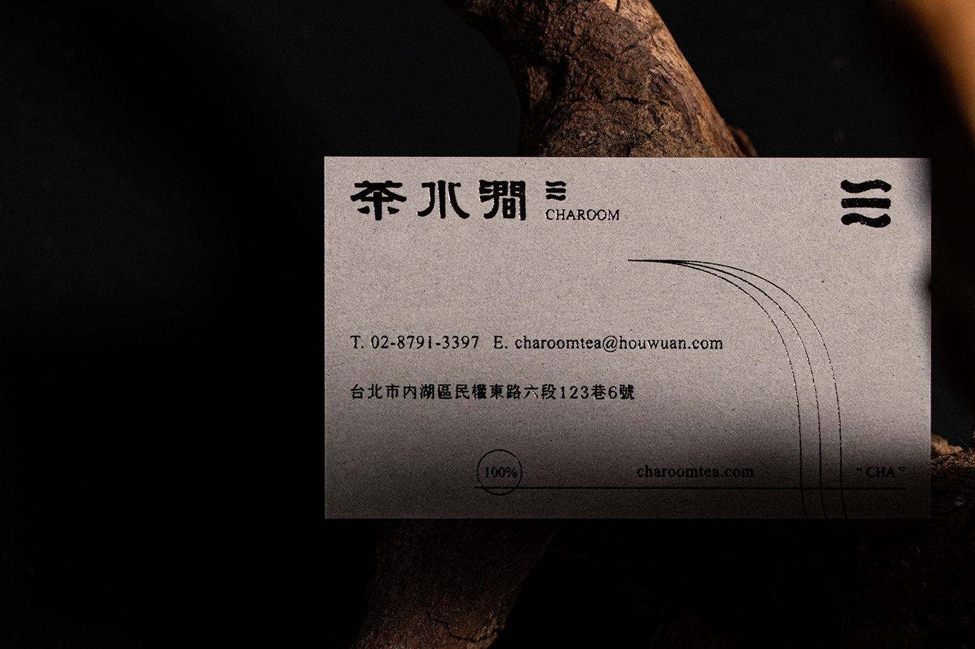
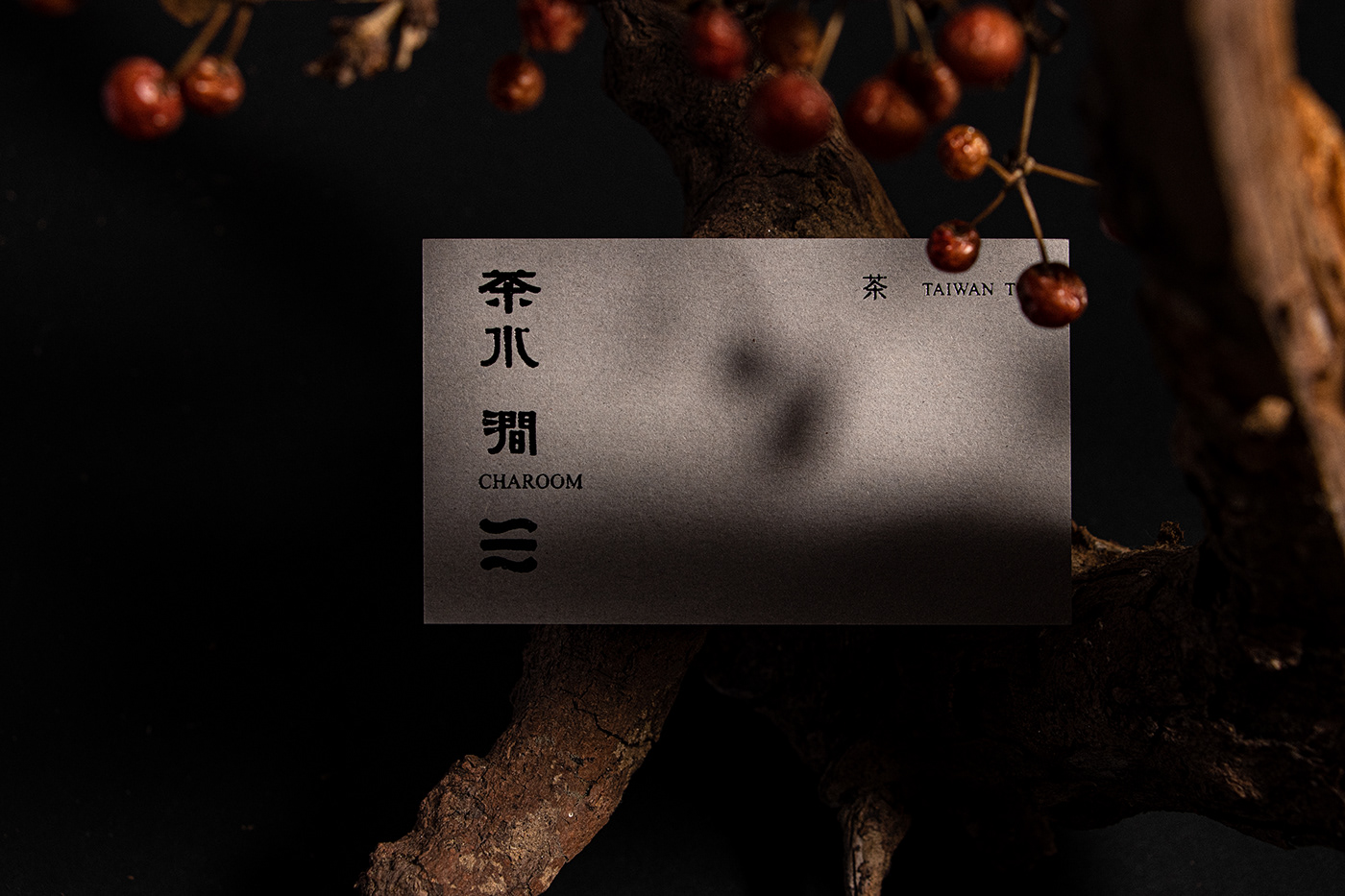
我們從名家的書法微調成主標誌的定義,在輔以襯線英文,符號標誌則從書法的結構飛白,茶田、山澗的意象,設計出三道精神,為春、臺灣、茶,這樣的精神與符號作為視覺符號,延伸出香味的線條,茶香與泡茶的手法的動態線。
As a brand client, we are dedicated to promoting a youthful tea brand that embodies the flowing streams of nature within the essence of tea. Our goal is to facilitate mutual exchange between tea and people, emphasizing vibrancy and texture through our chosen brand colors of orange, black, and white. We aim to highlight the convergence of quality and taste, symbolizing the fusion of tea leaves and water, pouring out culture in each sip.
We have refined the definition of our main logo from the calligraphy of renowned masters, complemented by serif English typography. Our symbolic logo draws inspiration from the structural whitespace of calligraphy, depicting the imagery of tea fields and mountain streams. Three core spirits—spring, Taiwan, and tea—form the essence of these symbols, extending visual cues into olfactory lines, representing the aroma of tea and the dynamic artistry of tea brewing techniques.


客戶|茶水澗CHAROOM
設計|三分設計B126WORKSHOP
攝影|三分設計B126WORKSHOP
印刷Printing|禹利電子分色有限公司
印務Print project|林冠余 Rena
