
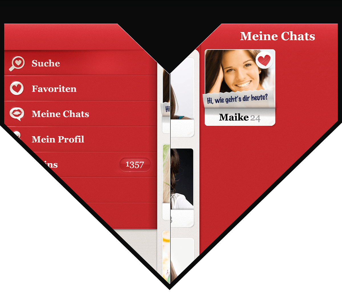
The left sidebar allows quick navigation, while the right one stores open conversations.

The biggest challenge was to find a way to integrate the customer's micropayment system based on virtual coins and to give the iOS application a warm and friendly feel.

I set up several clickable dummies based on wireframes that were created in close communication with the customer in order to validate our assumptions about usage flows.

