


Brand new Italics for the typeface that wants to improve the world
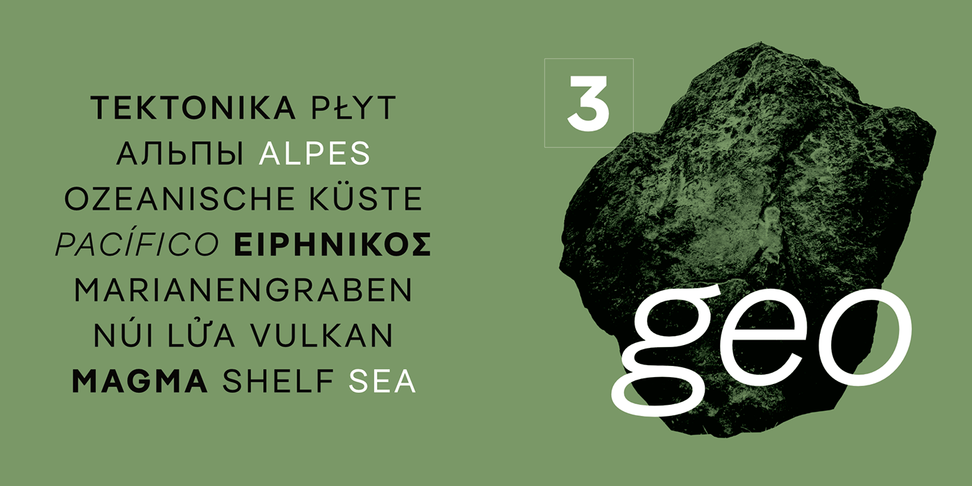
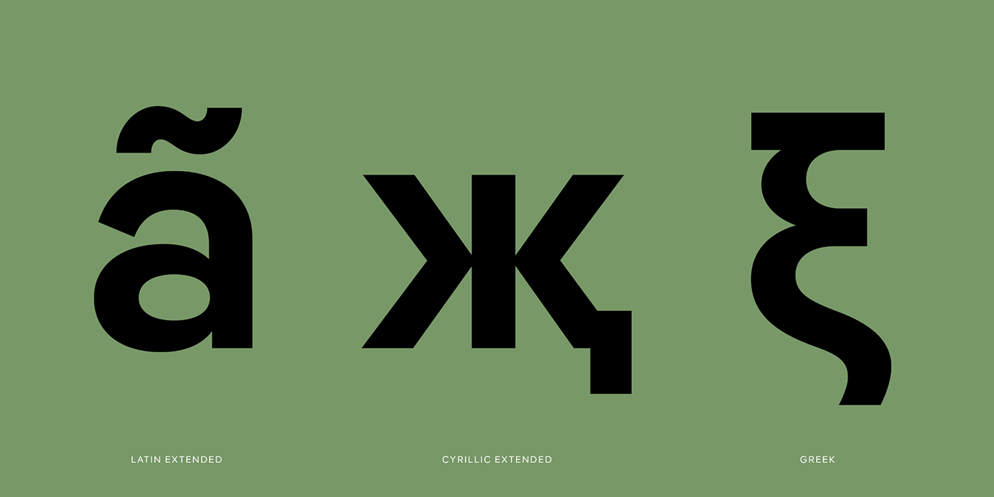
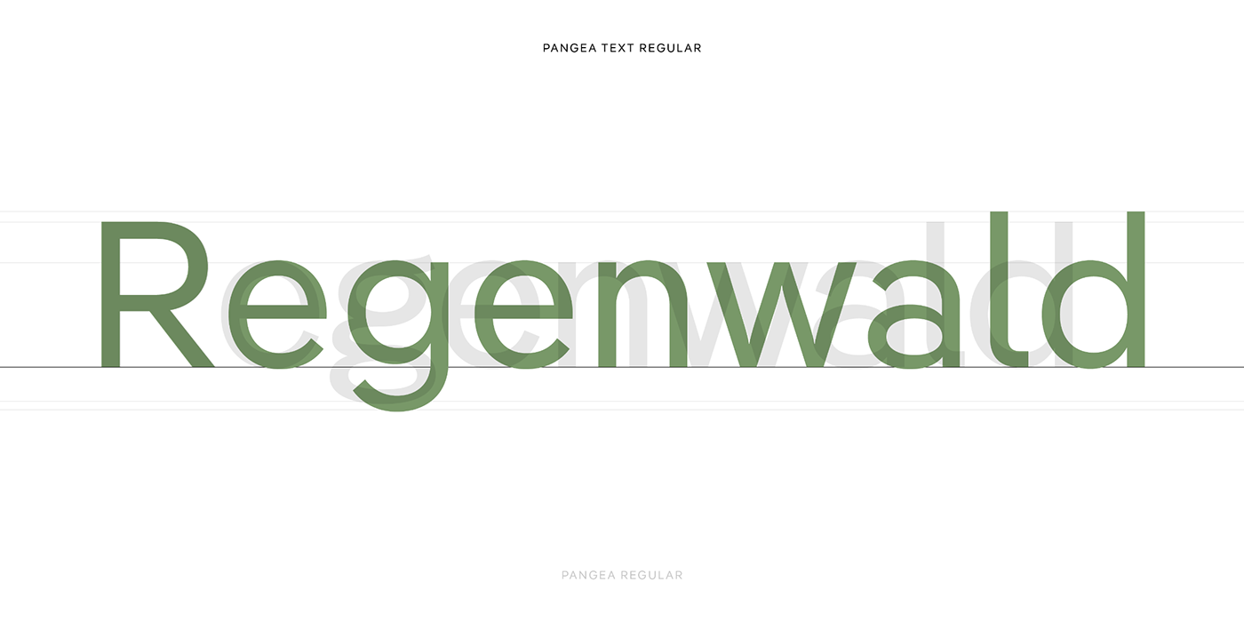
Rarely has a new typeface hit the zeitgeist at precisely the right moment like Pangea, which we released last summer. But what is its secret? Is it the space-saving compactness of its forms? Is it the enormous and continually expanding language support? Is it the nine axes (!) of the variable fonts that are included in the complete package? Is it its flexibility and consistency made possible by two optical sizes? Or is it the fact that a proportion of the profits are donated towards the preservation and reforestation of the rainforest? In fact, it’s probably a combination of these factors that has made Pangea one of the hottest new releases in recent years.
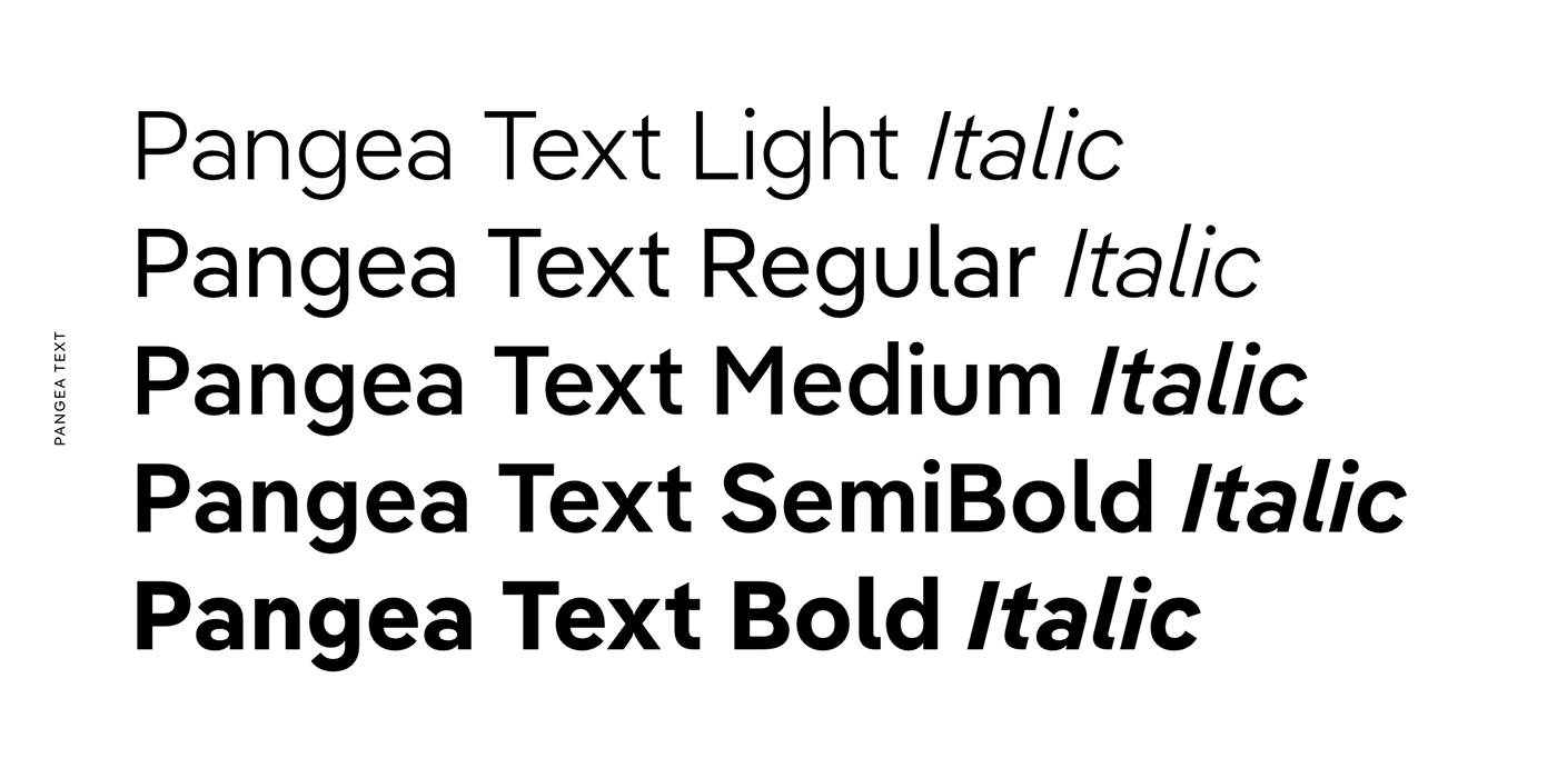
It’s no surprise, therefore, that there was a huge demand for Italics. Designer Christoph Koeberlin has now answered this wish with support from Tanya George and Gabriel Ritcher. From now on, all five weights of Pangea and Pangea Text are accompanied by Italics. At the same time the typeface has undergone further aesthetic, technical and linguistic fine-tuning, which was undertaken by many colleagues across the globe including; Gergő Kókai, Andreas Frohloff, Ilya Ruderman, Irene Vlachou, Donny Trương, Igino Marini und Azza Alameddine. Pangea really is the result of international cooperation and one of the few typefaces that can stake a claim for trying to improve the world.
Just like all the other fonts published by us, Pangea can be tested for free for an unlimited time when you download the Trial Fonts on


