

© 2023 Fontwerk · Type design: Hendrik Weber, Andreas Frohloff, Olli Meier · Design Contributions: Anja Meiners · Mastering, Production: Olli Meier · Marketing: Ivo Gabrowitsch (Concept, Naming, Copywriting, Specimen, Photos), Olli Meier (Artwork, Microsite), Julian Braun (3D Motion Design, 3D Artwork), Giovanni Dubini (Sound Design), Dr. Thomas Maier (Archive), Dorothee Lange (Legal Consulting), Jan Kuhlen (Legal Consulting), Lucy Beckley (English Translation)
RETHINK DIN
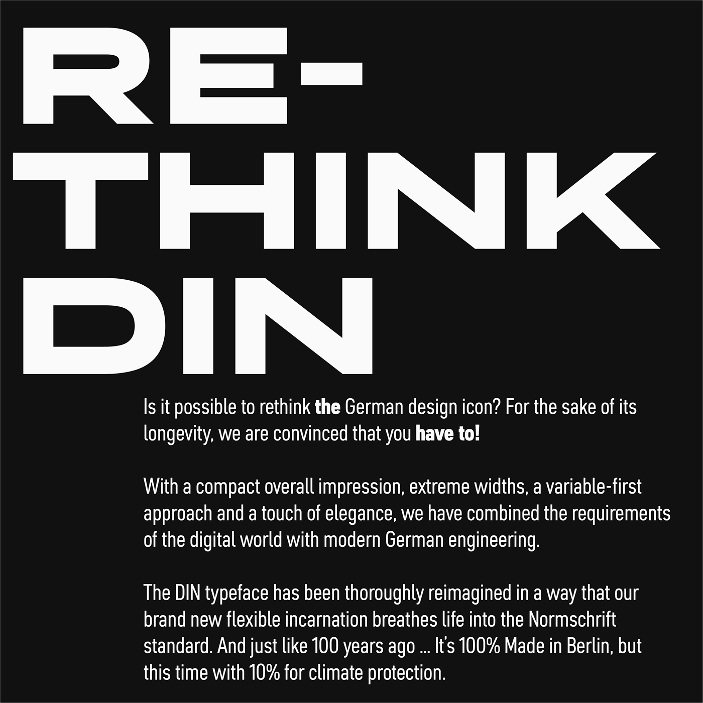
Is it possible to rethink the German design icon? For the sake of its longevity, we are convinced that you have to!
With a compact overall impression, extreme widths, a variable-first approach and a touch of elegance, we have combined the requirements of the digital world with modern German engineering.
The DIN typeface has been thoroughly reimagined in a way that our brand new flexible incarnation breathes life into the Normschrift standard. And just like 100 years ago … It’s 100% Made in Berlin.
VARIABLE FIRST
Just like at the beginning of Berlin’s Standard typeface history, the technical conditions that had arisen shortly before its inception were decisive influencing factors. Yet whereas 100 years ago, the focus was on reproducibility, today the factors that influenced our own design decisions are variable fonts. When approaching our design, we placed this technology at the center of our consideration. In order to make the best possible use of the synergies of design and technology, the designers Hendrik Weber (type director of the top agency KMS Team) and Andreas Frohloff (freelance type director) worked hand in hand with Fontwerk’s Font Engineer, Olli Meier, who also contributed ideas and took on design tasks. The variable width (especially the Condensed and Wide widths) became style-defining in many respects. As a result, the normal width appears more neutral than other DINs derived from the basic form.
USP
The most difficult question to answer was how far one could deviate from the norm. We discarded courageous yet appealing explorations that threatened to lose the concise mix of geometric construction and openness. The typeface should remain a DIN – in all its simplicity and timelessness. The key to its design is its strict geometry and letters, which hang together like a chain. Nevertheless, the desire for an elegant touch germinated in us, Andreas Frohloff had the brilliant idea: “All vertical curves, such as the sides of the o, d or g, are round, have no straight lines and swing easily.” The curves are not eye-catching, but they give the typeface the desired touch of elegance. With these subtle organic forms and a balanced spacing, the business-like character is preserved and we are convinced that we have nevertheless created an independent and sustainable design.
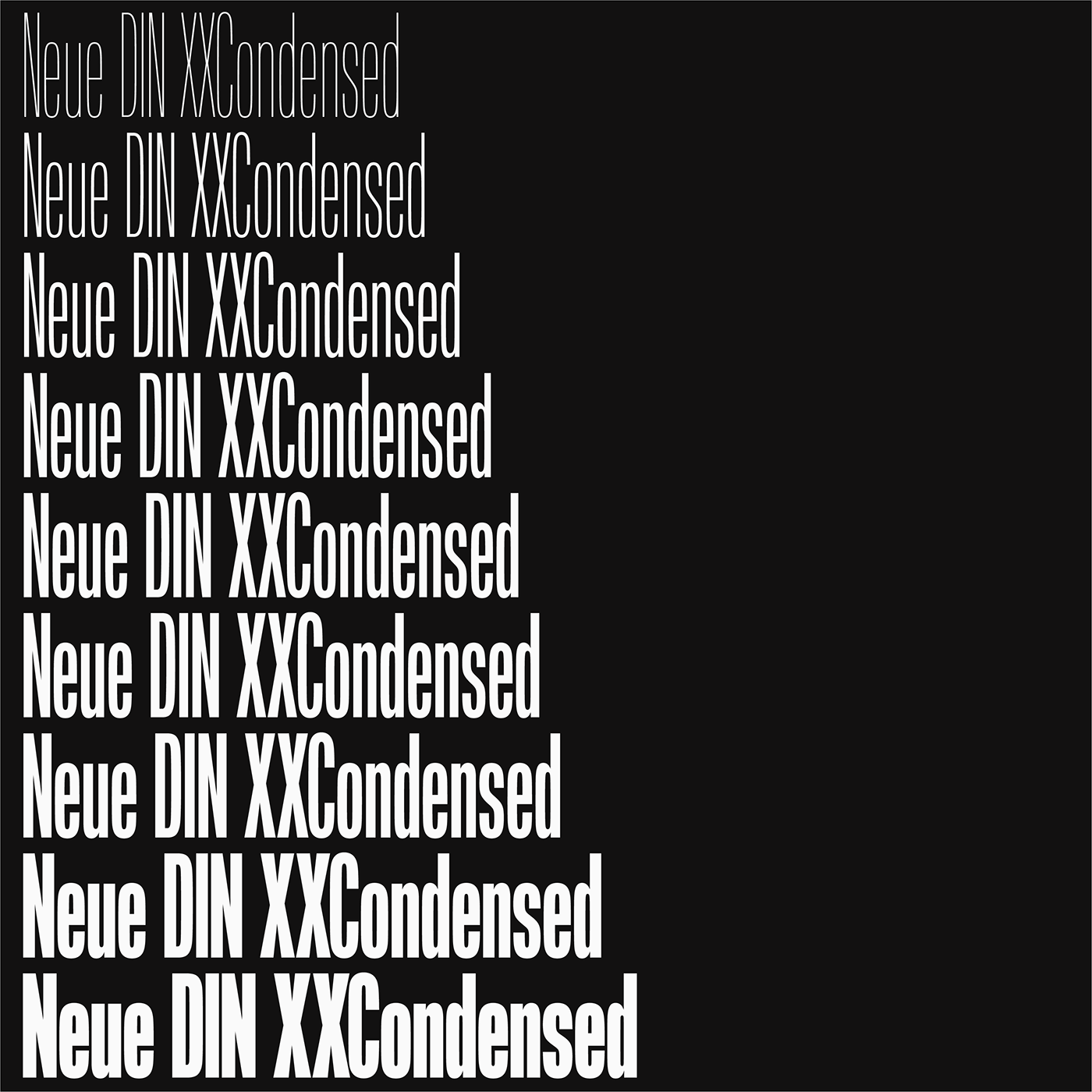
However, the most obvious unique selling point of Neue DIN is the stringent interplay of nine weights (Thin–Black) and nine widths (XXCondensed, XCondensed, Condensed, SemiCondensed, Normal, SemiWide, Wide, XWide, XXWide). The enormous bandwidth paired with the flexibility of the Variable Fonts technology creates a thoroughly new DIN feeling, also because the extreme widths feel unfamiliar at first. But with DIN 1451’s very own engineering approach, they are not only consistent, they are also great fun to use. Maintaining the robust industrial feel in these areas was one of the biggest challenges.
100% CSS COMPATIBILITY
Olli Meier explains the decision for nine widths as follows: “Rethinking DIN also means starting from the web and responsive environments and designing it in such a way that it works smoothly in CSS”. That is why the 81 sections correspond to those specified in the CSS specification (Cascading Style Sheets: Language for designing electronic documents, e.g. on the web). The specification provides for a matrix in which the widths of a font lie on the x-axis and the stroke widths on the y-axis. Here, the Thin cut has a value of 100, the Regular one of 400 and the Black one of 900. The Normal width is 100 percent, the Condensed 75 and the Wide 150 percent. Condensed Thin therefore has a value of 75 on the x-axis and 100 on the y-axis. If you change the width, the line width value remains at 100. In the static world, however, one often makes an optical balance, for example, making the narrow weights lighter and the wide ones bolder. Neue DIN offers 100% CSS compatibility, just as Ludwig Goller’s engineers would probably have implemented it today.
OTHER CHARACTERISTICS
More subtle design differences to its predecessors can be seen in the compact overall impression and the clear reinterpretation of the stroke course, which appears more rigorous and more standardized. Due to the technical orientation of the body shapes, we drew broad counters. We made characters like t, f, r and 1 a little wider. Alternative forms for Q, a, u, r, l, 6, 7, and 9, round dots and arrows, numerals in circles and squares complete the variable overall picture. A special feature — recently proposed by Christoph Koeberlin — is an expansion of the Standard Latin character set, which now includes an additional 100 languages that have often been overlooked. Inspired by his initiative, Neue DIN can be used by at least 3 billion people.
NEUE DIN
The multitude of details and long-awaited flexibility of Neue DIN add a vital new variant to the range of DIN typefaces. Thanks to the interplay of design and modern technology, our new version has evolved into a typeface that moves with the times. Neue DIN is compact, considered and exudes a discreet elegance. It sets the perfect standard for dealing with the demands of today.
☟
VISIT MICROSITE


