

Redesign of Danissimo Brand
For many years, the Danissimo brand produced by Danone has held a prominent position on the Russian dairy market.
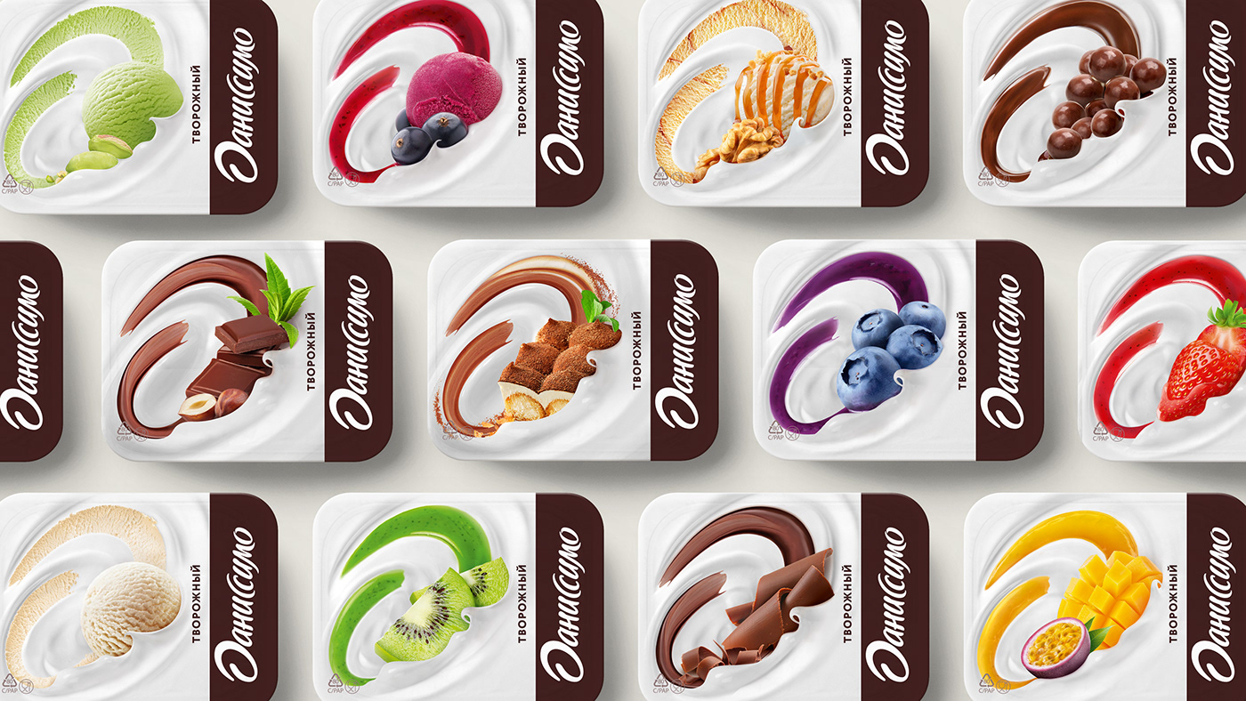
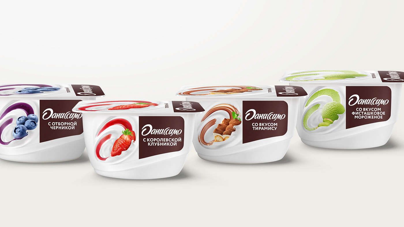
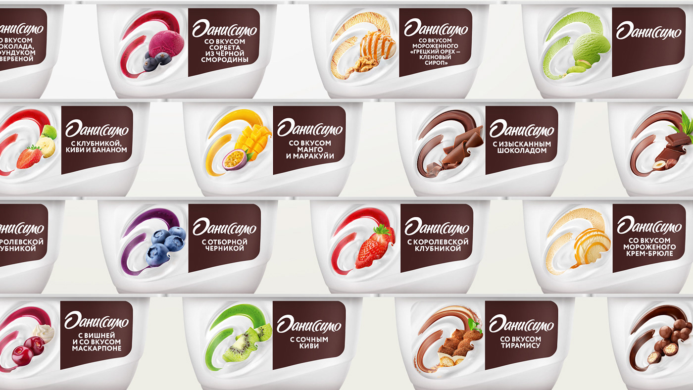
Today, Danissimo is a premium dairy brand with a wide selection of flavors: from chocolate to tropical, from melting curd to yogurt with crunchy balls or a delicate cocktail. The brand is constantly evolving, expanding the line-up, adding new fascinating flavors and products, winning over the hearts and minds of consumers.
In the course of its twenty-year history, Danissimo has changed more than once. By 2020, once again there was a long-felt need to relaunch the brand: to reinforce its premium status and elevate brand identity, bring a number of line-ups to a common denominator, improve visibility on the shelf, take into account a wide variety of flavors, put an emphasis on smoothness and sophistication, as well as the dessert nature of the products – generally speaking, create packaging that will help build a powerful display on the shelf and maintain the brand’s leadership in the Dairy Desserts category.
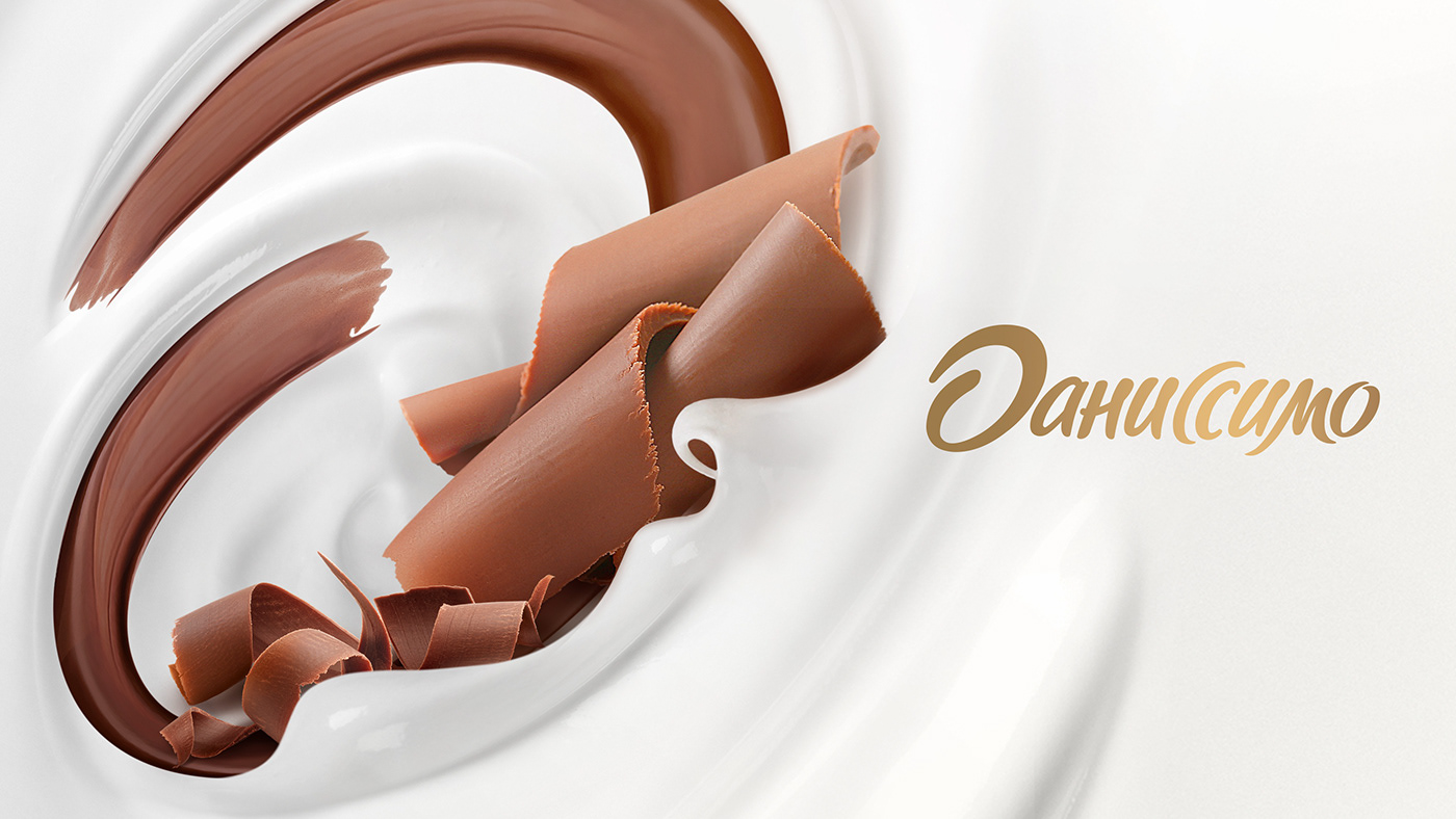
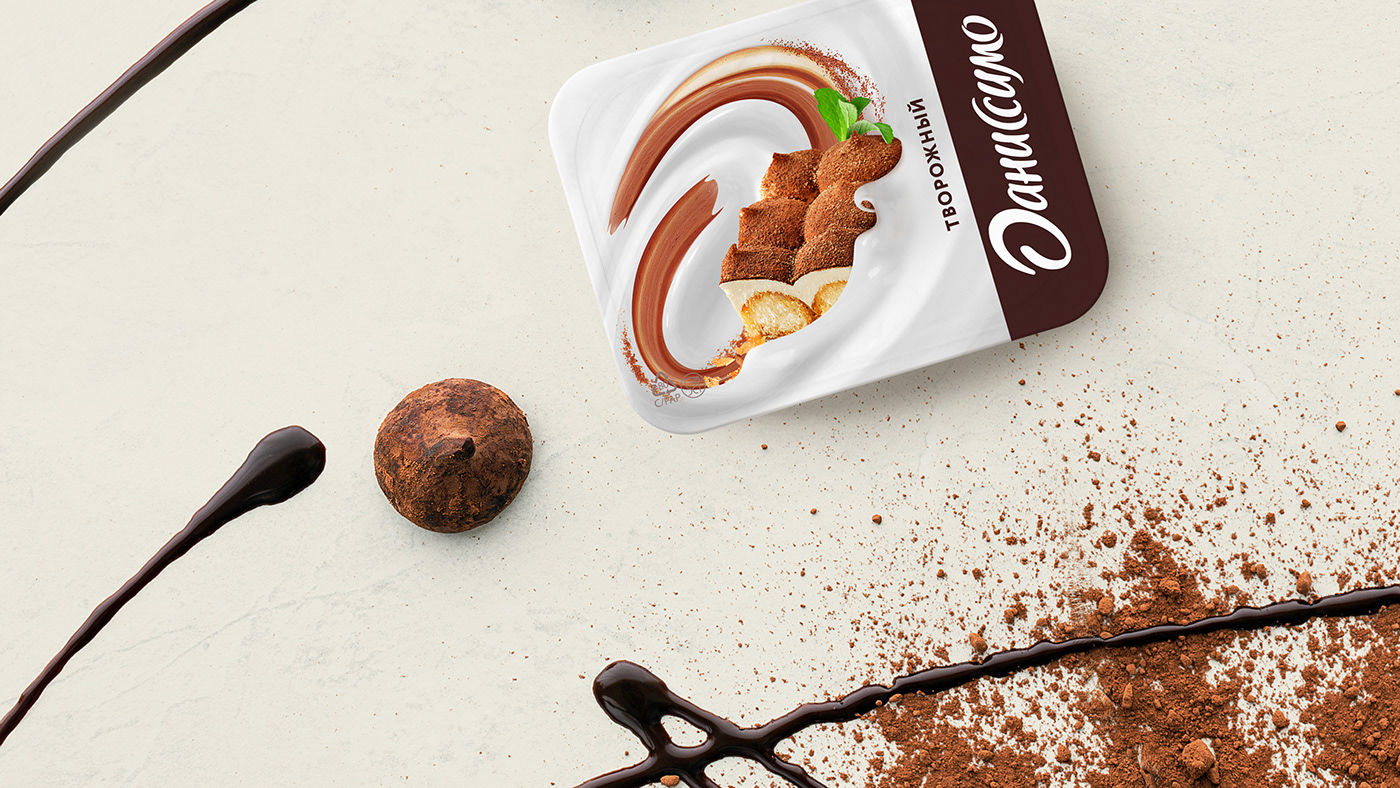
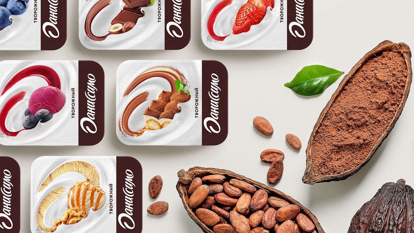
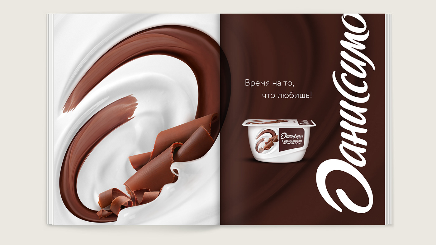
The idea to present the stroke of the logo’s capital letter, letter “D”, in the form of a swirl of exquisite fillings mixed with milk and yoghurt mass laid the foundation for the updated brand identity. We updated the logo design, developed a unified approach to shaping the design structure for a variety of line-ups and flavors, integrated a multitude of Danissimo flavors into the new identity and developed food zones for a large number of SKUs.
As things stand now, the Danissimo brand has not only strengthened its position on the market, but also continues to actively and successfully develop and bring joy to consumers with new releases and all-time favorites!
redesign, package design, food style development, line extension, categorization by flavors, development of key visual, prepress


