

Carry
About
Carry is a delivery company that wants to appear on the parcel market. The aim was to design the first visual identification for her. The largest companies operating in this industry today have bright, clear and dominant typography and colors that allow them to stand out in the urban landscape. As a rule, they have short, catchy single-word names, often acronyms. The second feature that characterizes courier companies is the communication of speed of delivery. Often, elements that suggest this appear in their logos.
Who are their clients?
The customer is a person who expects direct delivery of the ordered products.


The Challenge
The new courier company should have a short, easily memorable name that will emphasize the subject of activity and should, if possible, stand out from the "flashy" and visually dominant competition. All visual language needs to be simple, because if it is going to appear on fast-moving vehicles, it needs to be digestible quickly.


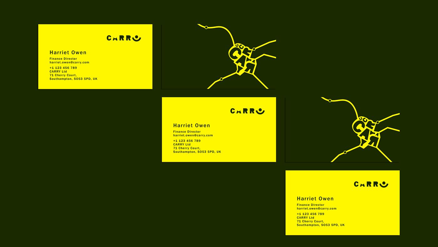
Colors
Yellow - the dominant color is to express activity, action and speed. Green - a complementary color as a contrast, but not black, but something more natural to the eye. White and Black - complementary colors.
Typography
Franklin Gothic Bold, Regular
Logotype
Franklin Gothic Bold font used, some letters transformed. The graphic symbol that replaces the letter "Y" is a symbol of care for the shipment. The circle is the symbol of the shipment that is moved from the letter "A" to the letter "Y". The circle will be used in other visual materials.
Visual Theme
A network of streets with visible moving circles - parcels. Comparison to the GPS locator. In some materials, the letters from the logotype are "exploded" and give the buildings on the map. Several patterns of urban topography are shown.


My goal was to create a dynamic logotype using a simple font and a minimum amount of additional graphic elements, while showing the movement of the shipment in space with care for it, as the basic advantage of this business. I decided to use in this project only typography, maximum 3 colors and vector and linear illustrations, without spatial elements, because we show the route from the top, as if on a map.


