Overview
I came to know Satzuma and its ideals while working there as an intern graphic designer during the summer of 2012. The London-based company is best known for its eye-catching novelty accessories for desktop computers targeted for young adults. Since possessing the graphic skills in a real working environment, I am happy to be relied on for several freelance commissions involving photography and layout based projects to this day.
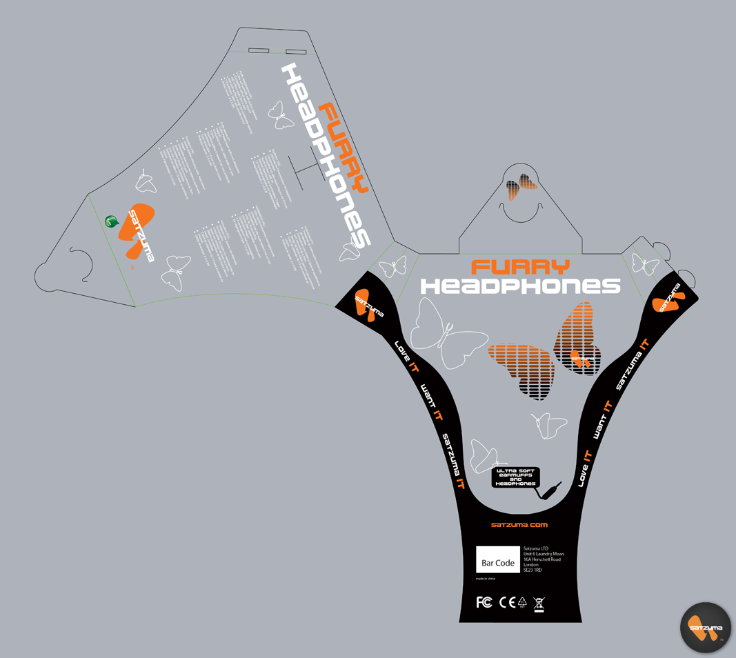
This is a series of five flat packaging concepts, made possible by following the Satzuma branding principles. A palette of orange, white and black, with a futuristic typographic theme and solid vector illustrations on printable transparent plastic material wonderfully shows off these elements along with the featured product. The packaging dimensions was also considered for economical reasons. By following this process, I have assisted Satzuma in creating five sets of packaging for the new products to be released in late 2012 / early 2013. The images below show the complete development of the Furry Headphones, followed by the remaining four flats I was involved in.
See the SATZUMA / Packaging project in my portfolio for photos of these product designs.
All alterations were done with Adobe Illustrator.
Thanks for checking this page out. Visit the Satzuma webpage to learn more about the brand.
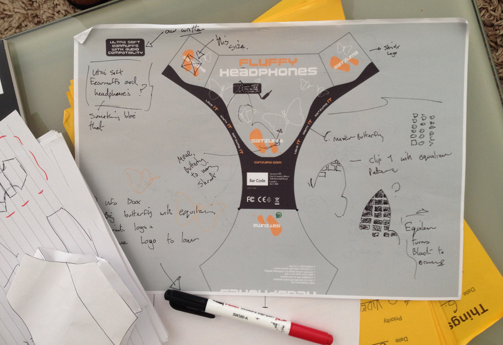
Step 1
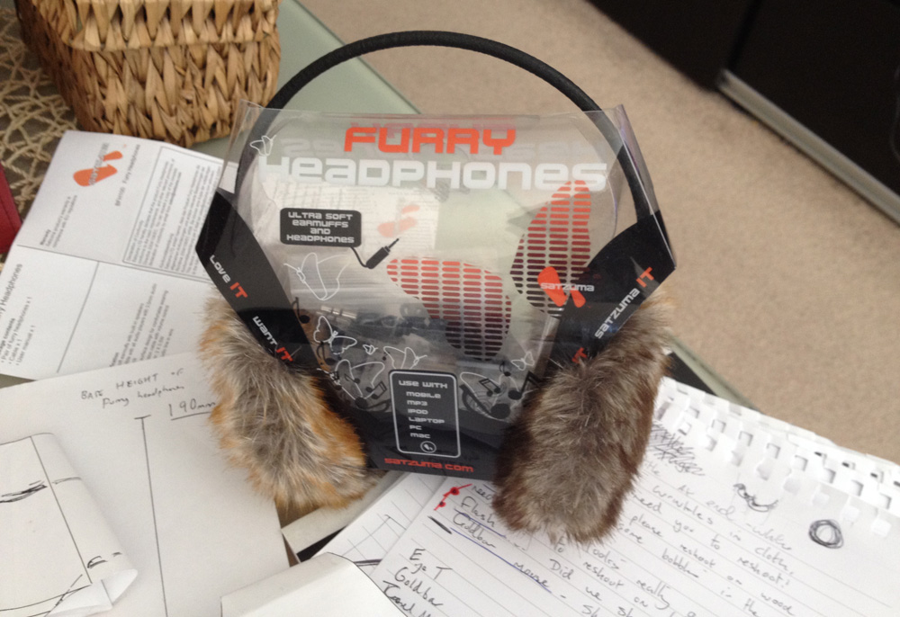
Starting off with early concepts, from analysing the product information, what it will be used for and who the target audience will be. Choosing the style of packaging to represent the product also comes to consideration for these 'furry headphones', which may appeal to females of all ages. Letting potential buyers 'try' out our headphones by feeling the texture of the fur is a nice example of effective product design. To make this possible, the packaging should allow users to try out this feature before making a potential purchase, and let the Satzuma brand speak volumnes on its unique selling point.
Step 2
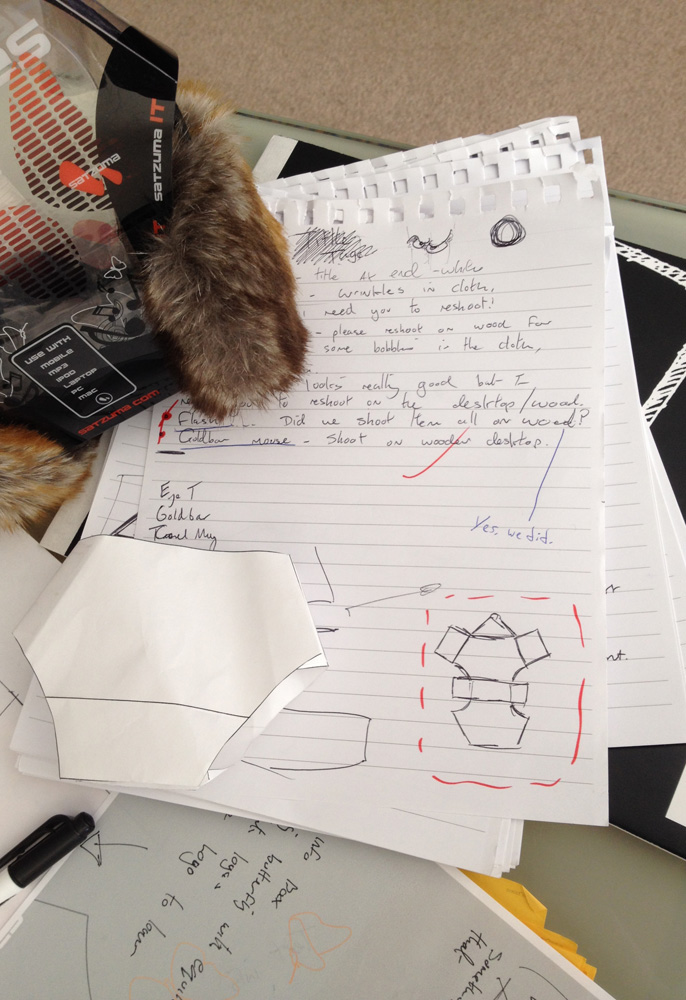
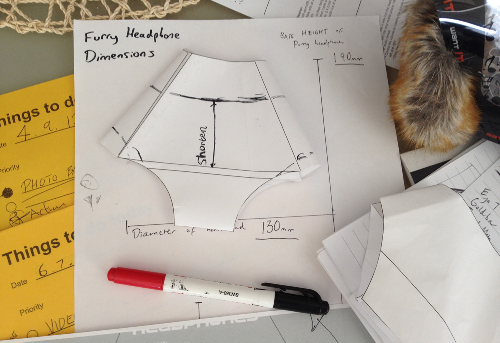
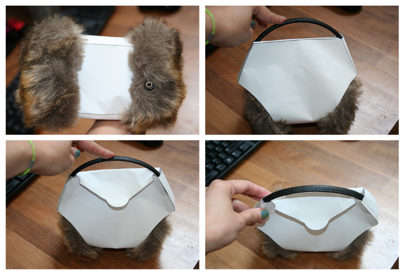
This style of packaging will allow people to feel the sense of fur around the earpiece, so this concept is developed further with many mock-ups on how the packaging should look, how it should be folded to support the product inside it, and measuring the dimensions compared to the actual headphones. What follows is a cycle of tried tests with folded paper - many of which were glued on and cut through numerous times to find the right length - until the basic shape is formed to produce with CAD software.
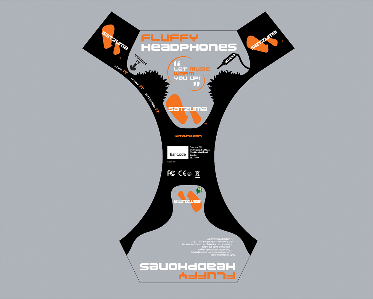
Step 3
One of the first digital drafts that incorporate the packaging used in our early mock ups, also making use of the stock graphic illustrations from Satzuma branding. Developing the product in this way allows us to make adjustments to many features ranging from size correction to positioning of the graphics and eventually testing out the flat plastic packaging first-hand from our print manufacturers. This process would require more iterations until all adjustments are corrected.
Step 4
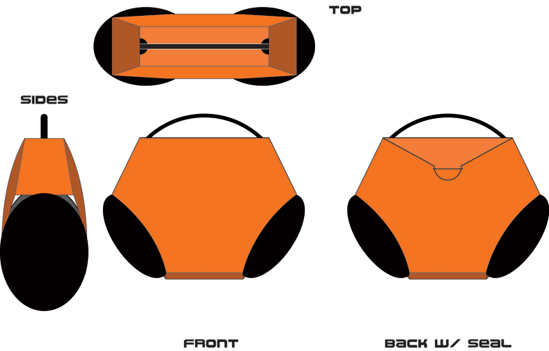
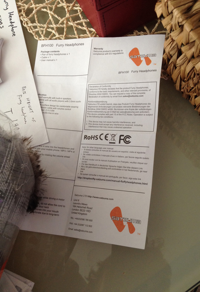
Additional elements that accompany the product design are developed ahead of schedule, such as a fold-out instruction manual to instruct the user in multiple languages in our market. The translator supplies this information yet it has to be corrected by the in-house Satzuma team to be as accurate and readable as possible before it sees fit to print. Other additional pieces include inner moulds to protect the product from damage but fortunately this package requires no extra material, giving this design a very economical advantage.
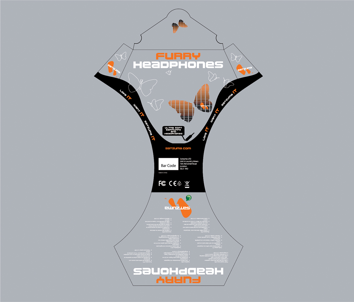
Step 5
In the five-week development process we were given, this was the result of the headphone packaging. It fulfills all our goals and intentions of the product and meets our satisfaction before it was put out on retail in 2013 at the latest. I followed the same steps for four other product designs but this proves an interesting experience given how different it looks from our Satzuma range.
Below are the rest of the concept designs I was responsible for.