

CACAOSUYO
Inca's Best Kept Secret
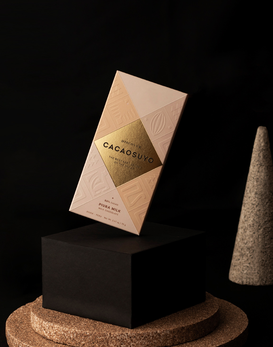
Existen muchos estudios que apuntan a que el Perú es el origen del fruto del cacao, específicamente, su selva amazónica. Cacaosuyo, que significa “territorio del cacao”, es una marca que busca representar el origen legendario del fino chocolate del país donde una vez estuvieron los incas. Debíamos hacer el repackaging de una marca que ha sido galardonada dos veces como el mejor chocolate del mundo pero cuyo empaque no reflejaba esta probada calidad; y el objetivo era entrar a nuevos mercados internacionales. Asimismo, la categoría de chocolates finos es muy competida en diseño en el mundo, por lo que el reto era de por sí difícil, pero más aún cuando Cacaosuyo era el campeón mundial vigente.
SOLUCIÓN
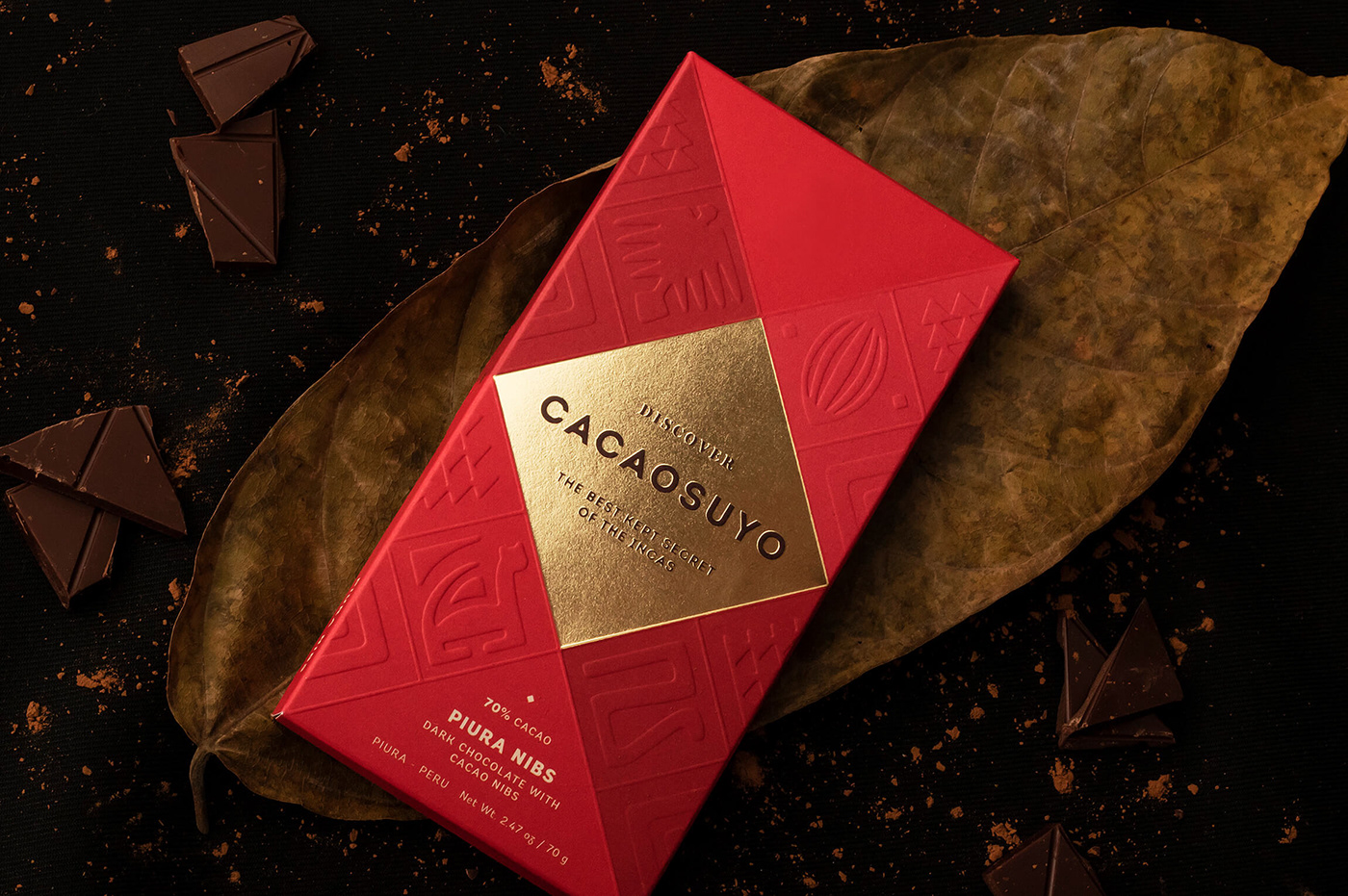
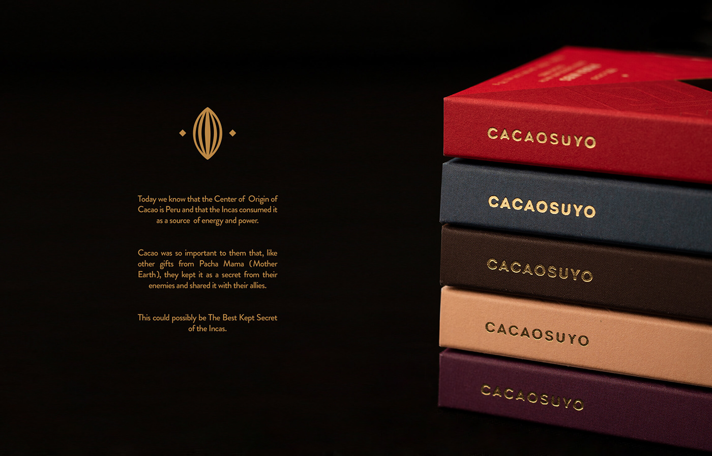
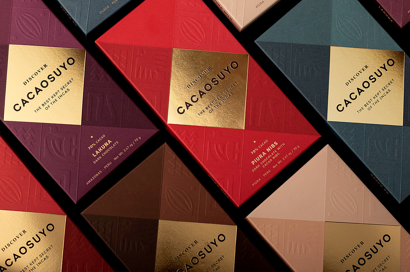
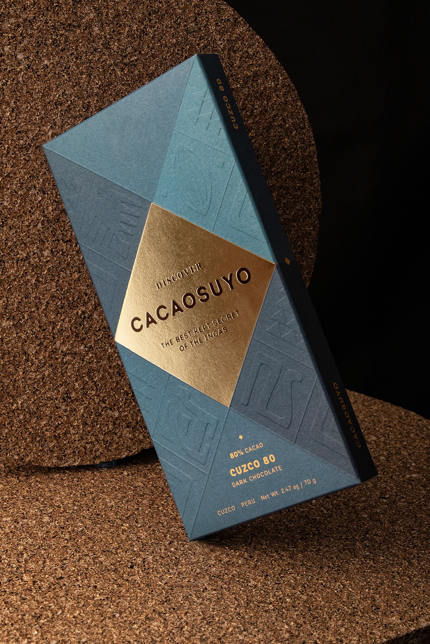
Cacaosuyo debía ser coherente con el claim de la marca: “The best kept secret of the incas”, ya que a nivel visual aún no se había logrado transmitir el valor de su contenido. La marca ya tenía un sistema geométrico inspirado en los tocapus, el sistema de comunicación gráfico de los incas, el cual decidimos mantener pero modificando sus proporciones. Además, le añadimos un sistema de íconos que representan a la trilogía andina (cóndor, puma y serpiente). De esta forma logramos darle un aire nuevo a la marca, pero conservamos su esencia. El nuevo empaque debía verse como un verdadero tesoro, por eso le dimos el acabo de “oro” al rombo que contiene a la marca y el resto del empaque funciona como un telar, así logramos que se perciba como una pieza de museo.
-
There are many studies that suggest that Peru is the origin of cacao, specifically, it's Amazon rainforest. Cacaosuyo, which means "cacao territory," is a brand that seeks to represent the legendary origin of fine chocolate from the country where the Incas once lived. We had to do the repackaging of a brand that has been awarded twice as the best chocolate in the world but whose packaging did not reflect this proven quality; and the objective was to enter new international markets. Likewise, the category of fine chocolates is very competitive in design in the world, so the challenge was difficult in itself, but even more so when Cacaosuyo was the current world champion.
SOLUTION
Cacaosuyo had to be consistent with the brand's claim: “The best kept secret of the Incas”, since at a visual level the value of its content had not yet been transmitted. The brand already had a geometric system inspired by the tocapus, the graphic communication system of the Incas, which we decided to maintain but modifying its proportions. In addition, we added a system of icons that represent the Andean trilogy (condor, puma and snake). In this way, we were able to give a new look to the brand, but retaining its essence. The new packaging had to be seen as a true treasure, that's why we gave the “gold” finish to the diamond that contains the brand and the rest of the packaging works like a loom, so we managed to make it feel like a museum piece.


STUDIO: FIBRA BRANDING
IG: @fibra_branding
CREATIVE & ART DIRECTION: Andrea Gálvez
GRAPHIC DESIGN: Luana Cieza / Ricardo Bustamante
ART DIRECTION PHOTOGRAPHY : Andrea Gálvez / Daniela Barrio de Mendoza
PHOTOGRAPHY: Daniela Barrio de Mendoza


