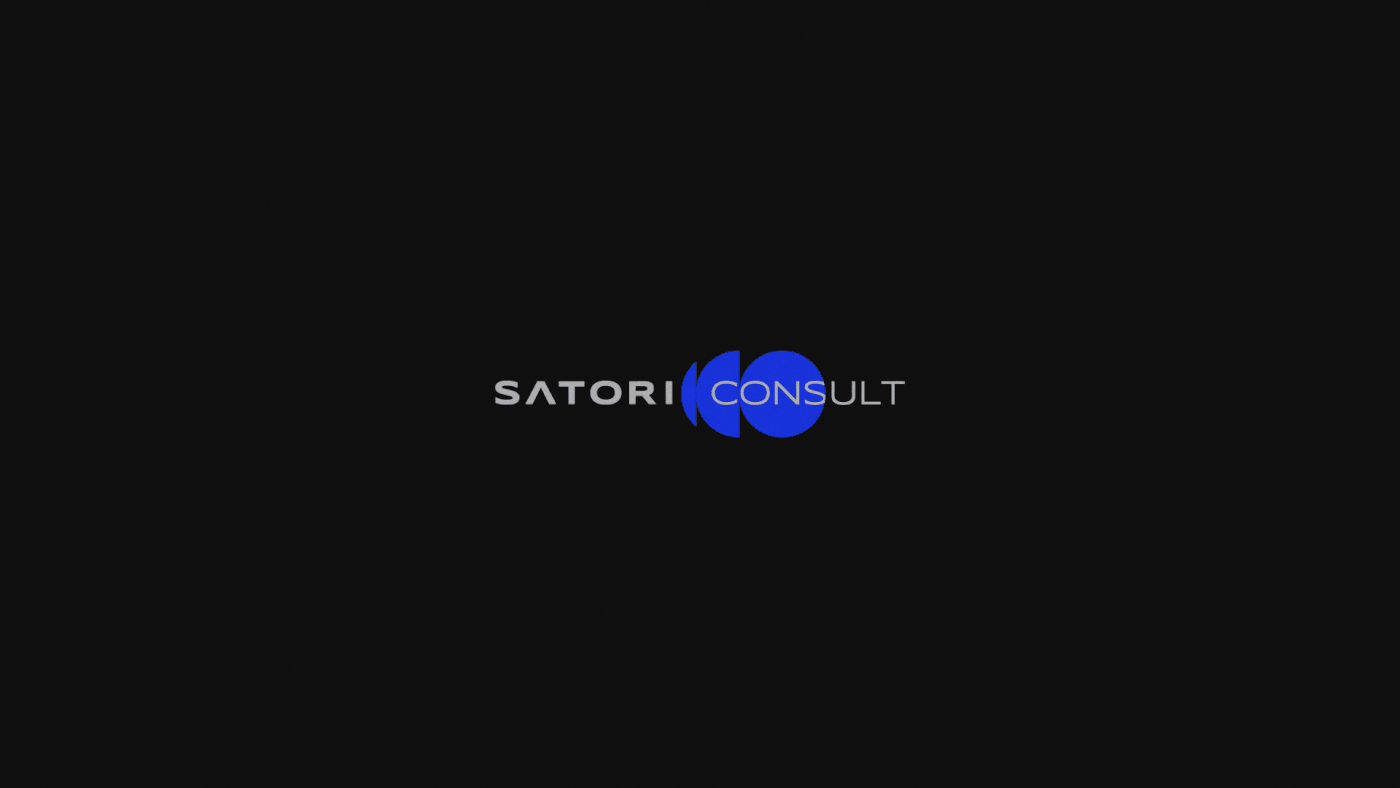
Satori Consult
Brand & Visual Identity
[PT-BR]
Sobre
Satori Consult é uma empresa de consultoria para empresas e grandes corporações, que buscam auxílio na solução de problemas de desenvolvimento, metas, falha na comunicação interna, marketing ineficiente, dentre outros.
[EN]
About
Satori Consult is a consulting company for companies and large corporations, which seek assistance in the solution of development problems, goals, internal communication failure, inefficient marketing, among others.

[PT-BR]
Conceito
Como o principal objetivo da Satori Consult é trazer resultados para as companhias, seja qual for o serviço prestado, era essencial conter na identidade visual como um todo, a clareza desse objetivo, ou seja, transformar esse conceito em um visual palpável e eficiente, do ponto de vista de comunicação.
Partindo desse objetivo, e também baseando-se nos pilares da marca, que são: estratégia, integração, conexão, organização, transformação e inovação, a referência pesquisada e utlizada para a conceituação na criação do logo, foi a arquitetura da Escola de Bauhaus, dominada por linhas retas, simples e formas geométricas.
[EN]
Concept
As the main objective of Satori Consult is to bring results for companies, whatever the service provided, it was essential contain in the visual identity as a whole, the clarity of this objective, that is, transform this concept into a palpable and efficient visual, from the point of view of communication.
Starting from this objective, and also based on the pillars of the brand, which are: strategy, integration, connection, organization, transformation and innovation, the researched and used reference for the conceptualization in the creation of the logo, was the architecture of the Bauhaus School, dominated by straight, simple lines and geometric shapes.

[PT-BR]
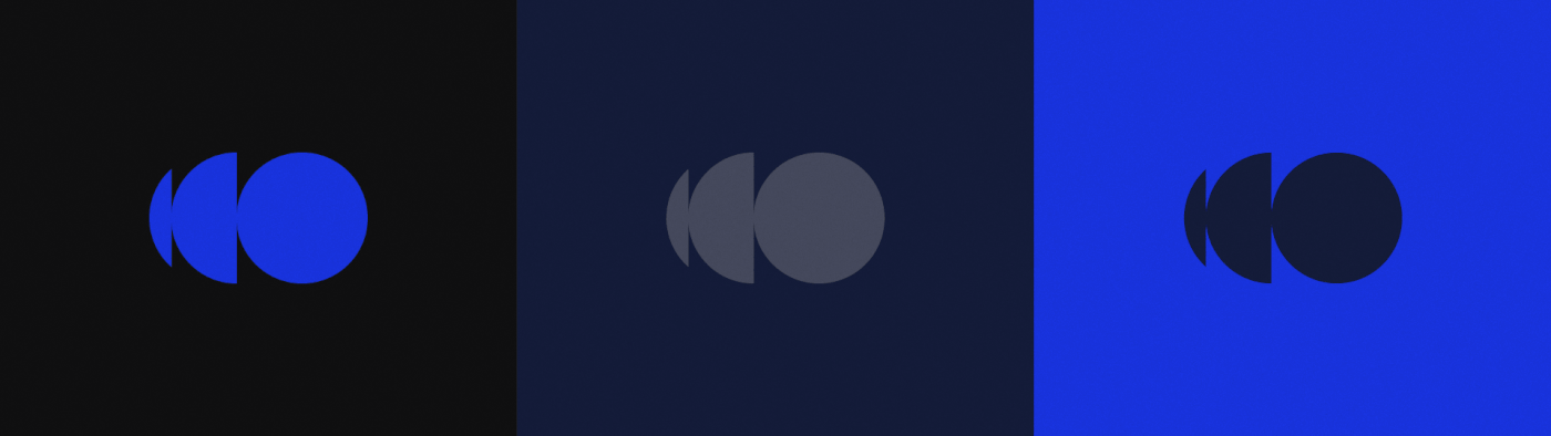
Cores
A escolha das cores e tons, se deu a partir do significado e emoções despertadas por cada uma delas:
- Preto: traz finesse, seriedade e sofisticação;
- Azul escuro: inspira segurança, consistência, confiabilidade, e significa também o céu da noite;
- Azul saturado: é propício para a comunicação, criatividade e também é uma conexão para o céu limpo e a ação de voar;
- Tons de cinza: são contrapontos visuais dos tons escuros e vibrantes de azul. Trazem ainda mais seriedade, frieza e sensação de controle.
[EN]
Colors
The choice of colors and tones was based on the meaning and emotions aroused by each one of them:
- Black: brings finesse, seriousness and sophistication;
- Dark blue: inspires safety, consistency, reliability, and also means the night sky;
- Saturated blue: it is conducive to communication, creativity and is also a connection to the clear sky and the action of flying;
- Shades of gray: are visual counterpoints to the dark and vibrant shades of blue. They bring even more seriousness, coolness and a sense of control.

[PT-BR]
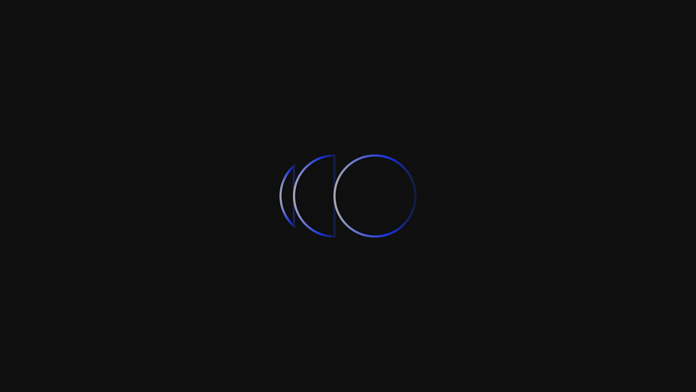
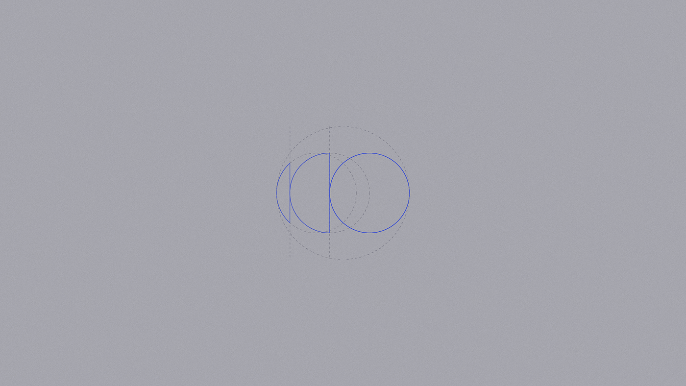
Logo
Para o logo, foi escolhido utilizar a forma geométrica "elipse" que traz a ideia de continuidade, ciclo infinito. O motivo por trás da escolha dessa forma geométrica se dá na aplicação dela ao conceito da empresa: para problemas simples e complexos, a solução sempre busca simplificar, tornar mais fácil, transformar para melhor, assim como a Satori Consult.
O símbolo criado é formado uma elipse perfeita e outros dois pedaços incompletos de elipses. ele começa com o menor pedaço, seguido da elipse dividida exatamente ao meio, que juntas simbolizam um “C” de Consult.
O “C” é a metade do “O”, a elipse completa que vem na sequência, e carrega consigo o signifcado também de processo em andamento, contínuo, de crescimento e aprendizado.
Por fim, a elipse inteira, completa a sigla “CO”, novamente, de Consult, mas também de: company, cooperation e cowork, termos que continuam traduzindo a essência da empresa. O “O” também tem o significado de solução, trabalho completo, de resultado eficiente pós todo um processo de trabalho e evolução.
Unidos, esses elementos geométricos completam uma forma abstrata preenchida, que pode ser vista também como metade de um olho, que remete a atenção, visão, análise, e a Consult é uma empresa especializada em analisar outras empresas e trazer soluções para os problemas que muitas das vezes estão ocultos ou invisíveis.
[EN]
Logo
For the logo, it was chosen to use the geometric shape "ellipse" that brings the idea of continuity, infinite cycle. The reason behind the choice of this geometric shape is in its application to the company's concept: for simple and complex problems, the solution always seeks to simplify, make it easier, transform for the better, just like Satori Consult.
The symbol created is formed by a perfect ellipse and two other incomplete pieces of ellipses. it starts with the smallest piece, followed by the ellipse divided exactly in half, which together symbolize a “C” for Consult.
The "C" is half of the "O", the complete ellipse that follows, and it also carries the meaning of an ongoing, continuous process of growth and learning.
Finally, the entire ellipse completes the acronym "CO", again, for Consult, but also for: company, cooperation and cowork, terms that continue to translate the essence of the company. The “O” also means a solution, a complete job, an efficient result after a whole process of work and evolution.
United, these geometric elements complete a filled abstract shape, which can also be seen as half an eye, which refers to attention, vision, analysis, and Consult is a company specialized in analyzing other companies and bringing solutions to problems that many sometimes they are hidden or invisible.
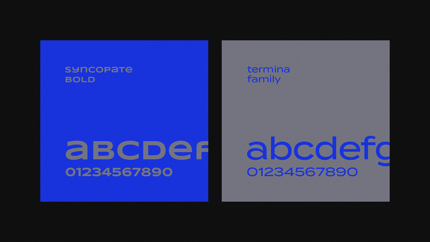
[PT-BR]
Tipografia
Para a tipografia, foram escolhidas duas fontes, uma para o principal nome da companhia, Satori, bastonada, bold, e outra fonte utilizada na versão light para o Consult, conferindo leveza e sofisticação à marca. Para títulos e textos, a fonte indicada é a família da Termina.
[EN]
Typography
For typography, two fonts were chosen, one for the main name of the company, Satori, bastonada, bold, and another font used in the light version for Consult, giving lightness and sophistication to the brand. For titles and texts, the indicated font is the Termina Family.
[PT-BR]
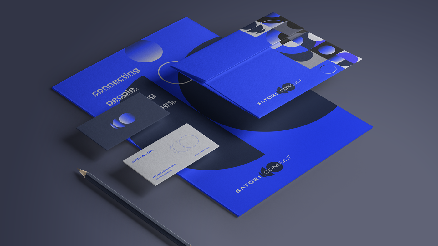
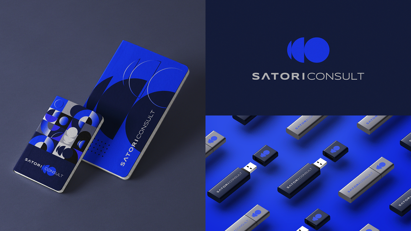
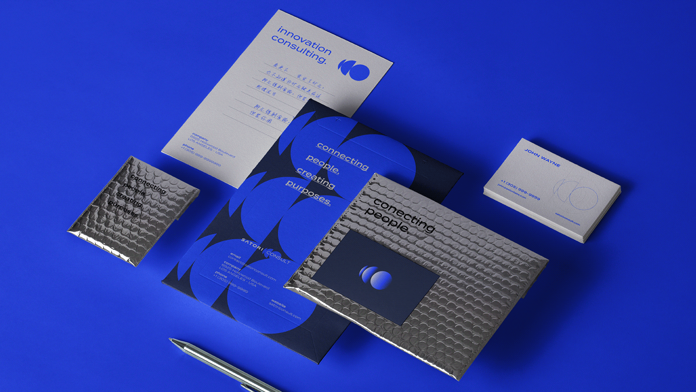
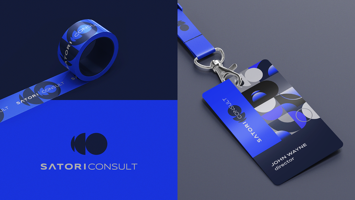
Identidade Visual
Compondo a identidade visual, foi utilizado o logo estourado e suas repetições, bem como todas as cores da paleta. Há também um degradê composto pelos azuis da paleta, que foi aplicado de forma que simbolizasse uma evolução, conceito diretamente ligado ao objetivo da marca.
O resultado é um logo e identidade visual assertivos, que se complementam e individualizam a marca perante à concorrência.
[EN]
Visual Identity
Composing the visual identity, the popped logo and its repetitions were used, as well as all the colors of the palette. There is also a gradient composed by the blues of the palette, which was applied in a way that symbolized an evolution, a concept directly linked to the brand objective.
The result is an assertive logo and visual identity, which complement and individualize the brand in relation to the competition.