

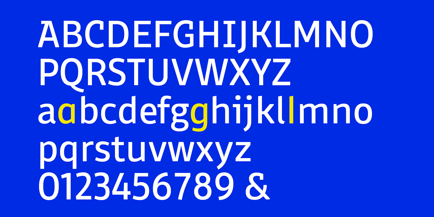
Domotika was first designed for Zetafonts by Cosimo Lorenzo Pancini in 2018, trying to translate
the modernist and humanist ideals into typographic form, looking for a conversation between the classical and the contemporary, the hand-made and the technological. Following the motto of Mies Van Der Roe and Gustave Flaubert ("God is in the details"), Domotika takes inspiration from architectural practice,
with a pragmatic attention to functionality that doesn't forget aesthetics. Its design juxtaposes the open humanist letterforms to slight calligraphic curve endings that marries perfect readability to expressive design. The name itself of the typeface is an homage to the science of living comfortably, with its reference to "domotics", robotic technology for use in the home.
In 2021 Andrea Tartarelli, who originally designed Domotika italics, completely reworked the original type family adding over five hundred glyphs to the original set and extending the language coverage to include over two hundred languages using latin, cyrillic and greek alphabets. Open type features have been also expanded, including positional numbers, small caps, ligatures, contextual alternates and stylistic sets,
as well as tabular, lining and oldstyle numerals.
as well as tabular, lining and oldstyle numerals.
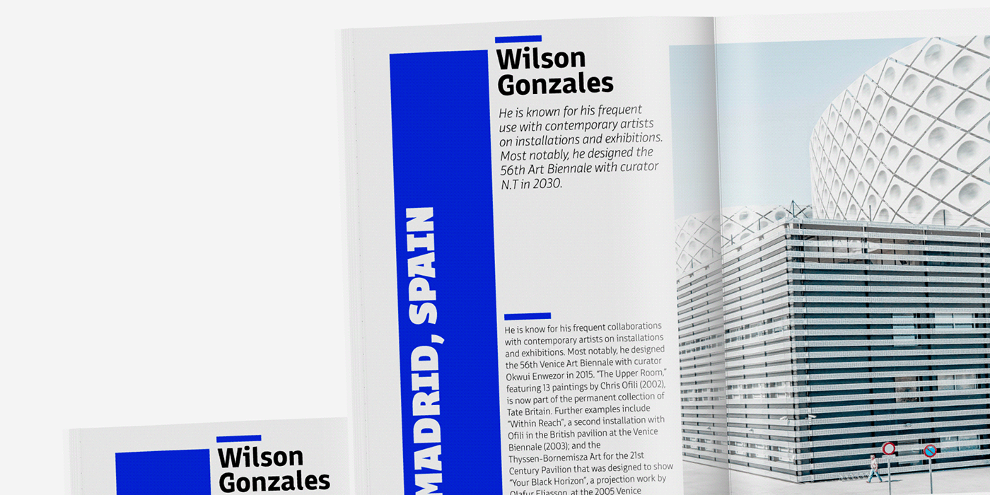
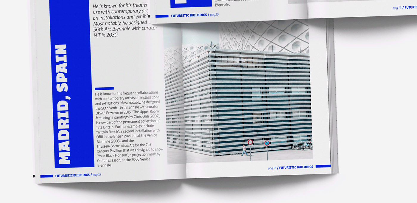
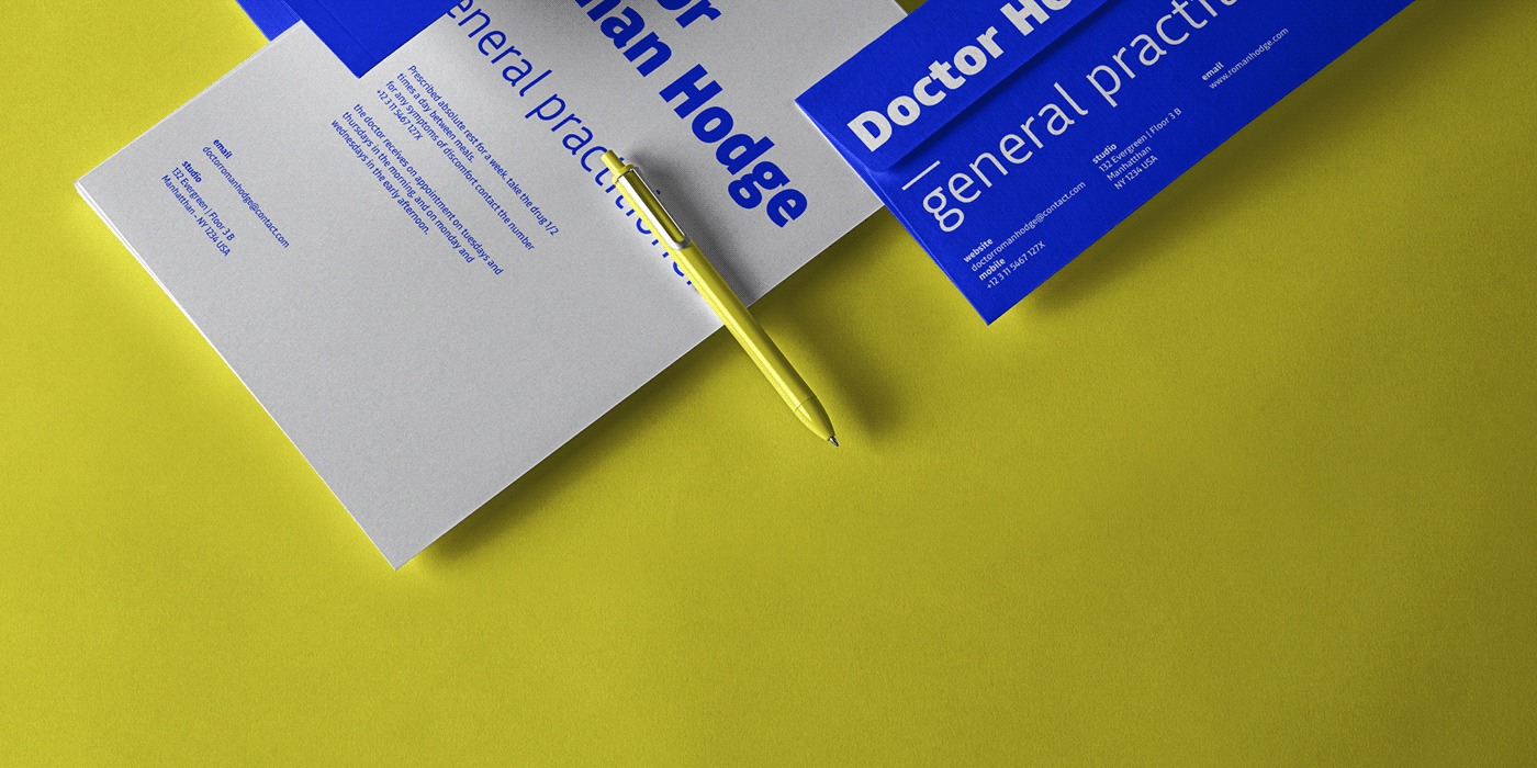
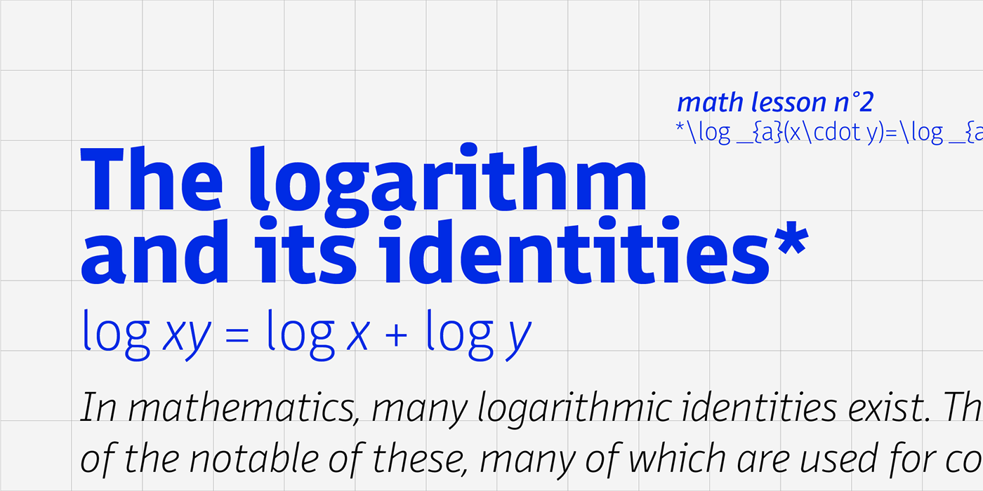
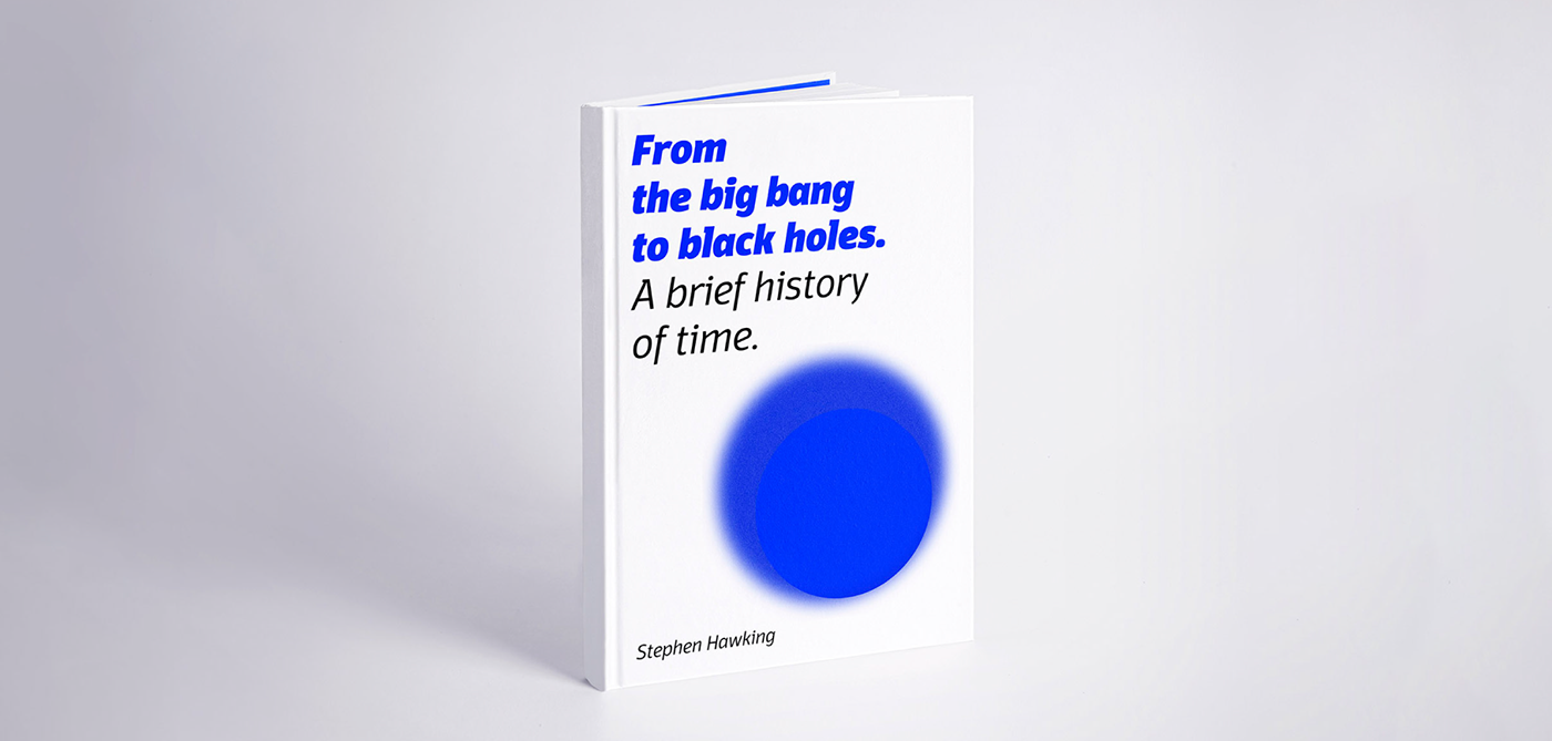
Conceived as a great tool for editorial use, Domotika is a workhorse family with a humanist soul
and a semi-condensed feel, great for display usage too where readability and personality
must match convenient space needs.
and a semi-condensed feel, great for display usage too where readability and personality
must match convenient space needs.
Get Domotika Pro at 60% introductory discount on Myfonts
at www.myfonts.com/fonts/zetafonts/domotika-pro
at www.myfonts.com/fonts/zetafonts/domotika-pro
or download the trial version at
www.zetafonts.com/domotika
www.zetafonts.com/domotika


Get Domotika Pro at 60% introductory discount on Myfonts
at www.myfonts.com/fonts/zetafonts/domotika-pro
at www.myfonts.com/fonts/zetafonts/domotika-pro
or download the trial version at
www.zetafonts.com/domotika
www.zetafonts.com/domotika


