Intermediate Typography | Spring 2009
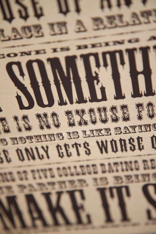
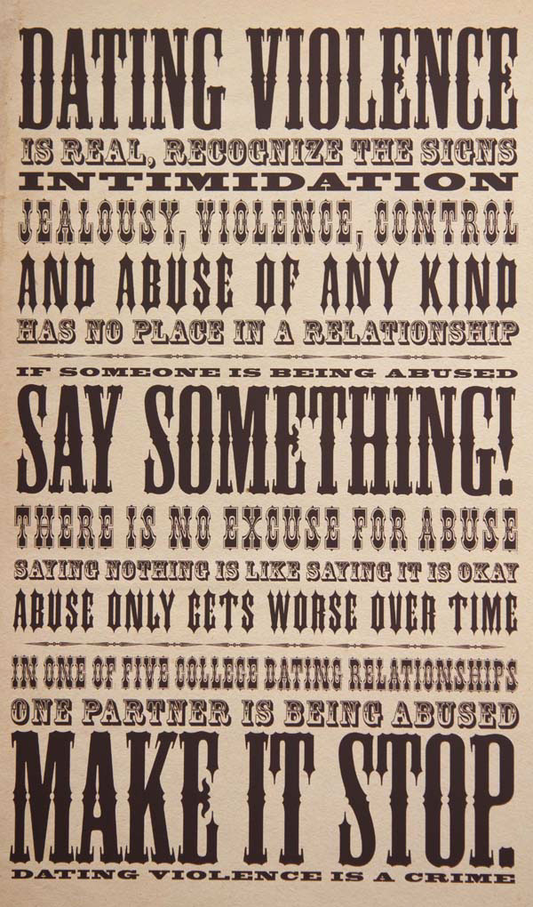
In keeping with the traditional style of wood type posters, I settled with using only type and no ornaments in the hopes that the words could speak more for themselves in this matter. Overall, hierarchy was established within the poster by the presence of the typestyles itsself, as some wood types are more solid than others. Gross variations in point size was used to highlight the key points to my theme over the rest of the text, which serves as secondary information to each portion of the main topic. When I originally designed this poster speaking out against a cause I had chosen child abuse and neglect, as I felt it was an important yet common issue to be addressed. However, as I sat down to rework this poster for the sake of my portfolio review, I thought it over and decided to change the topic of focus to dating abuse and violence, as it seems to be a topic that people are unaware of, mostly because it is hard to recognize the signs. With my poster, my goal was to draw attention to the subject, to spark interest in it, without scaring people off, which I feel tends to happen with most public service announcements targeted to a younger, more inexperienced age group. I wanted briefly overview the warning signs of dating abuse, and in the same poster announce that what may be see as a “relationship issue” is not ok, and could easily escalate into more serious problems.