Environmental Design | Summer 2010
After deciding on San Francisco International Airport (SFO) as the client for my signage project, I looked at photographs of the airport since I had not been there in person. Overall, the main building had interesting architectural elements. On both the inside and the outside of the building, the intricate metal skeleton was left exposed, adding a visual texture to the otherwise simple spacial designs. I choose to use metal (simulated with silver paper) to tie into these the architecture, even before I had a design concept.
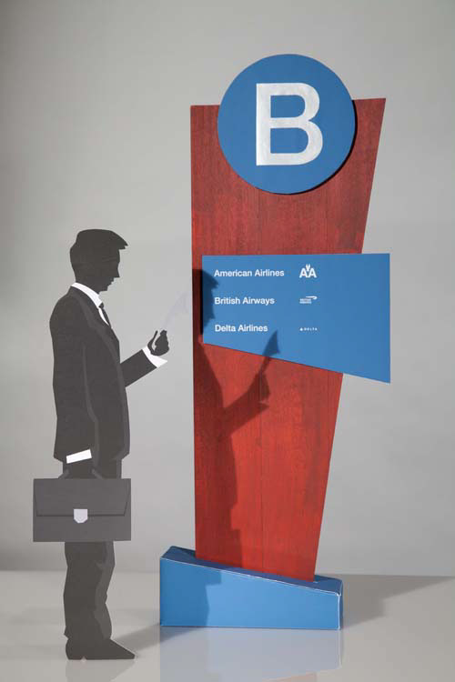
SFO has 3 terminals, 1 and 3 which are open, while 2 is currently closed for renovation. Digital renderings of the redesigned terminal have a warmer, more modern feel than the existing terminals. Featured in the redesign was cherrywood, contemporary lines and brushed silver. As contrasting elements, I felt that the cherrywood and metal worked together very well, and in addition to SFO’s corporate blue, I choose these as the colors and textures for my signage.
The concepts of the shape of my signage was based on the shape of an airplane wing, which I found appropriate for the airport. The shape is repeated in different scaled variations so that all the signage ties together and creates a dynamic presentation. Using cutouts and overlaying elements, I designed my signage to have the metal, cherrywood and blue mix interact with each other.