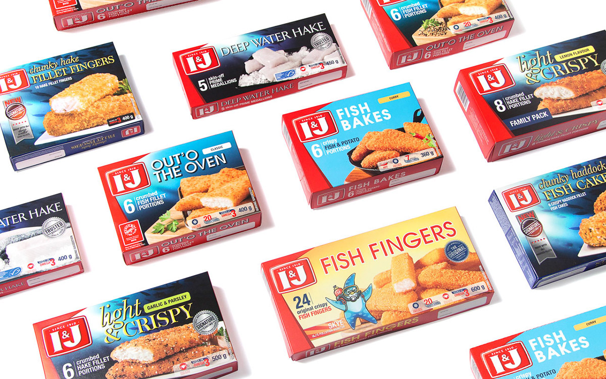
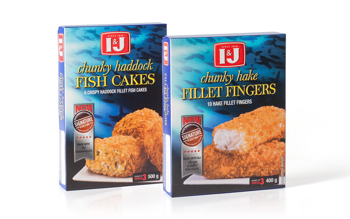
While I&J is a household South African brand name known for its quality, convenience and freshness; the company wanted to refresh its chicken, beef and fish packaging to further cement its position as market leader.
Given the vast range of products within the I&J stable, the key was to develop a consistent brand architecture that delineated the product tiers and offerings. This was achieved by means of different colours and fonts that reflect the individual sub-brand’s personality and price point. The red “frame” on the front of pack reinforces the I&J brand’s primary colour, thereby creating strong shelf blocking and standout against competitors. Last but not least, it was important that the food remained hero on-pack and was photographed in a clean modern style with minimal propping to really dial-up appetite appeal.
The first refreshed fish packaging has just hit the fridges and we await market response with - baited breath.