Project: Label and Signifier Swap
Products used: Arnott's Iced Animals, Bundaberg Ginger Beer
For this brief I had to choose two products with different target markets and swap the signifiers for each. This explores semiotics as a tool to help uncover some of the meanings of design. The final results dramatically change who the intended target market is and creates new meaning associated with the product. For this project I used Bundaberg Ginger Beer and Arnott's Iced Animals.
The result of my label swap has shown that each target audience has been changed. Any sophistication that was once associated with Bundaberg Ginger Beer has now gone along with the attraction to an adult audience. The bright colours and animation style are symbolic of children’s television shows and cartoons, something that adults do not immediately relate to. Instead, this directly appeals to a child. There is a sense of reality from the illustration on the product with a sky, trees, earth and animals. This would appeal to a child because it is a scene that they can follow and it allows them to have fun and create a game.
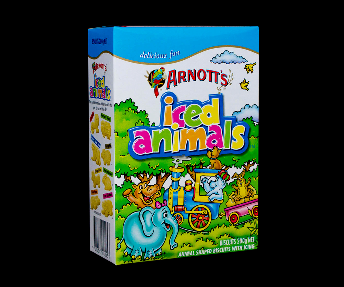
The Arnott’s Iced Animals is now simple and sophisticated. Clutter-free and easy to read, it now appeals to an adult audience. Only information that is needed has been put on and images have been kept to a minimum. The colour palette is refined and minimal, which is why the product is easily read. This appeals to an adult audience as they only require the basic information and a style that is sophisticated yet eye-catching.
This project was also exhibited in the Auckland Art Gallery.

Original Bundaberg Packaging

Original Bundaberg Ginger Beer Bottle
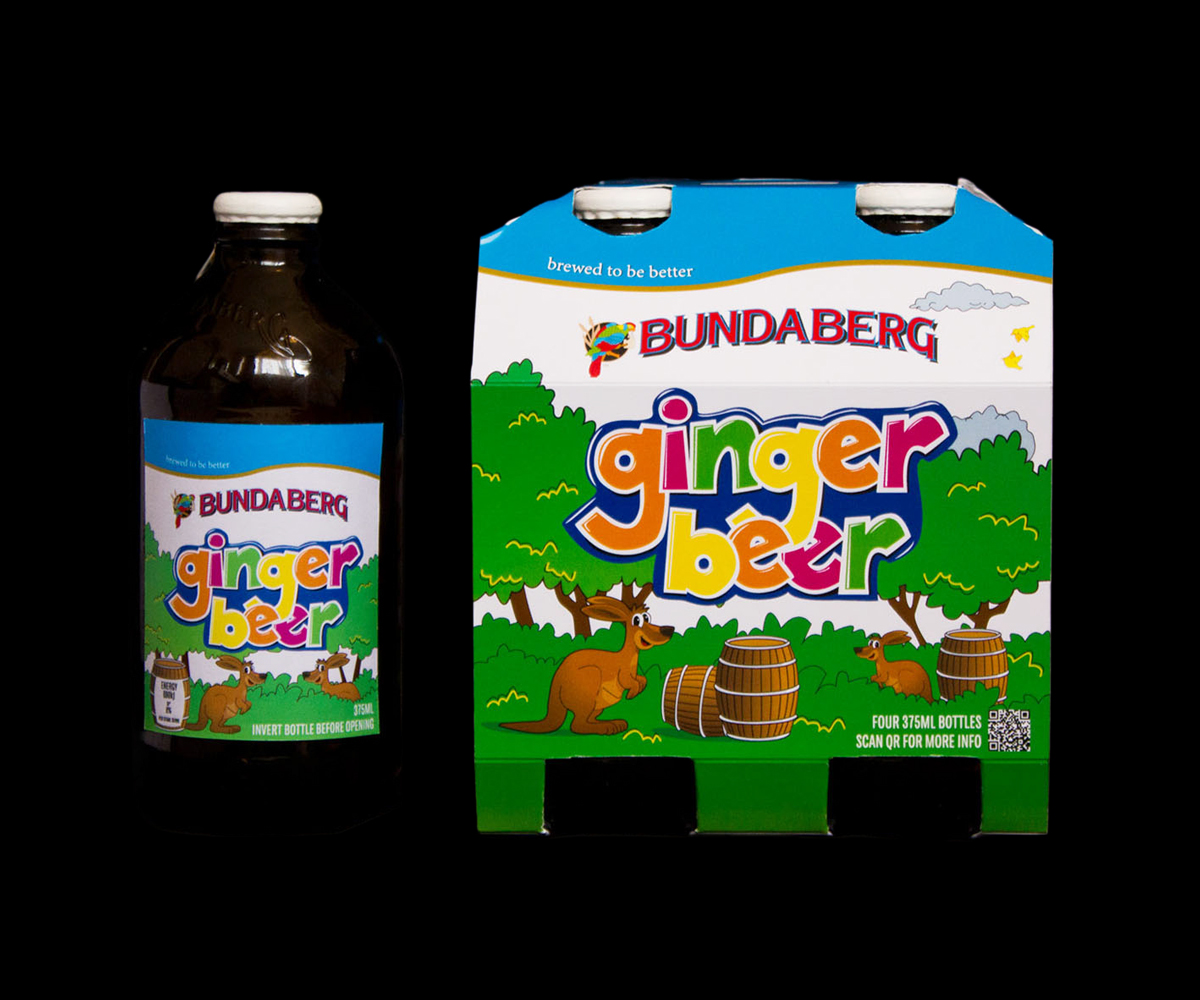
New Bundaberg packaging with label swap applied
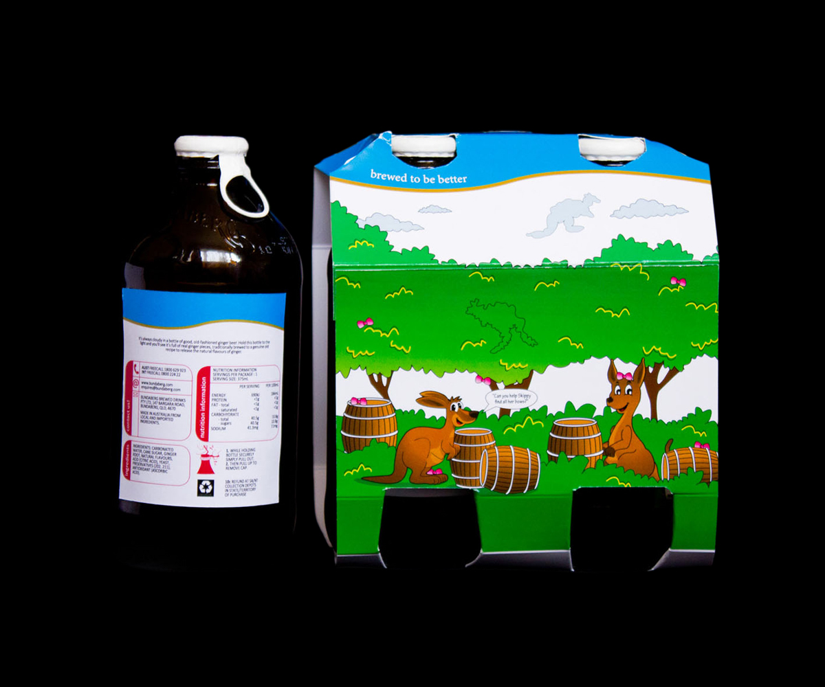
Back view
Original Arnott's Iced Animals packaging

Arnott's Iced Animals packaging with the new semiotics applied


