


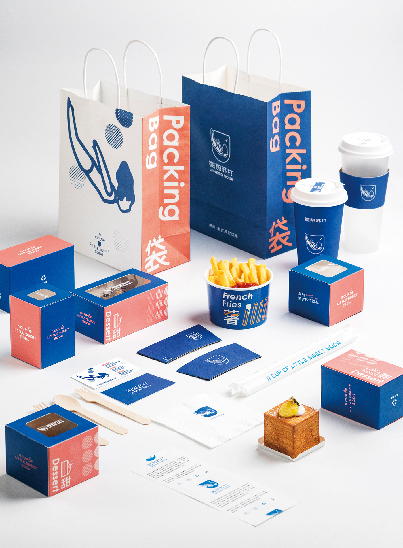
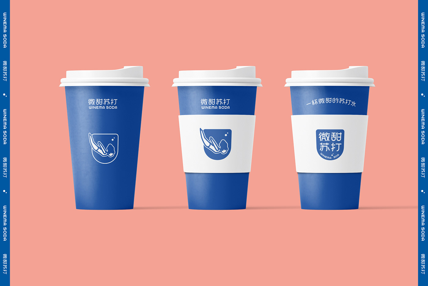
微甜苏打是一个原创新式苏打饮品品牌。品牌设计试图描绘炎炎夏日中饮一杯冰苏打的美妙瞬间——清爽的活力分子充满每一个细胞,仿佛带你潜入微甜苏打的海洋,如此不可抗拒。标识外轮廓与一杯冒气泡的苏打水杯融合,从图形直观的传达品牌属性。品牌主体色为清爽的蓝与白,在物料中适量融入撞色——粉色,使品牌更具年轻感与视觉冲击力的一体性。
WINEMA SODA is an original new style soda drink shop. Its brand LOGO design describes the wonderful moment of drinking a cup of light sweet cold soda——refreshing and active molecule fulfill every of your cell, just like you dive in the light sweet sea of light sweet soda. How irresistible! The outline of the LOGO is coincide with a cup of refreshing soda, showing the nature of this brand directly through this figure. The main colors of this brank are blue and white, both are very clean. We properly add pink into the materials to make the brand more attractive and unitized.
WINEMA SODA is an original new style soda drink shop. Its brand LOGO design describes the wonderful moment of drinking a cup of light sweet cold soda——refreshing and active molecule fulfill every of your cell, just like you dive in the light sweet sea of light sweet soda. How irresistible! The outline of the LOGO is coincide with a cup of refreshing soda, showing the nature of this brand directly through this figure. The main colors of this brank are blue and white, both are very clean. We properly add pink into the materials to make the brand more attractive and unitized.


项目:微甜苏打 WINEMA SODA
设计机构:亿電設 [ e ] De SIGN
品牌设计师:范一鼎 Yesired.Van / 武思七 547
摄影:王奕锟 Yanisk / 武思七 547
空间设计:重庆旋木室内设计
设计机构:亿電設 [ e ] De SIGN
品牌设计师:范一鼎 Yesired.Van / 武思七 547
摄影:王奕锟 Yanisk / 武思七 547
空间设计:重庆旋木室内设计


