


FR
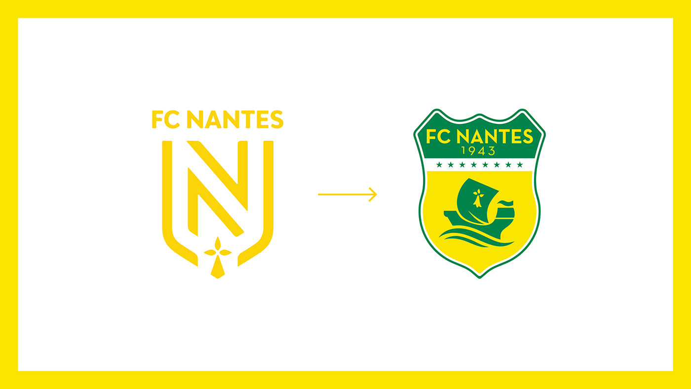
Le 23 mai 2019, le FC Nantes tente d’expliquer le choix de son nouveau logo.
Un logo balayant 77 ans d’histoire, en ayant gardé un seul symbole, l’hermine, dans le but de calmer la fronde à laquelle ils vont faire face. Un logo de club ne doit pas être réfléchis comme un logo d’entreprise. Un logo de club est un écusson, un blason, le symbole d’une entité. L’évolution techniques des logos est à prendre en compte, mais les codes du blason persistent. Un club fait parti du patrimoine d’une ville, à lui de savoir le préserver.
EN
On 23 May 2019, FC Nantes will attempt to explain the choice of its new logo.
A logo that sweeps away 77 years of history, having kept only one symbol, the ermine, in order to calm the slingshot they will face. A club logo should not be thought of as a company logo. A club logo is a crest, a coat of arms, the symbol of an entity. The technical evolution of logos has to be taken into account, still the codes of the coat of arms remain. A club is part of the city's heritage, it is up to the club to know how to preserve it.
FR
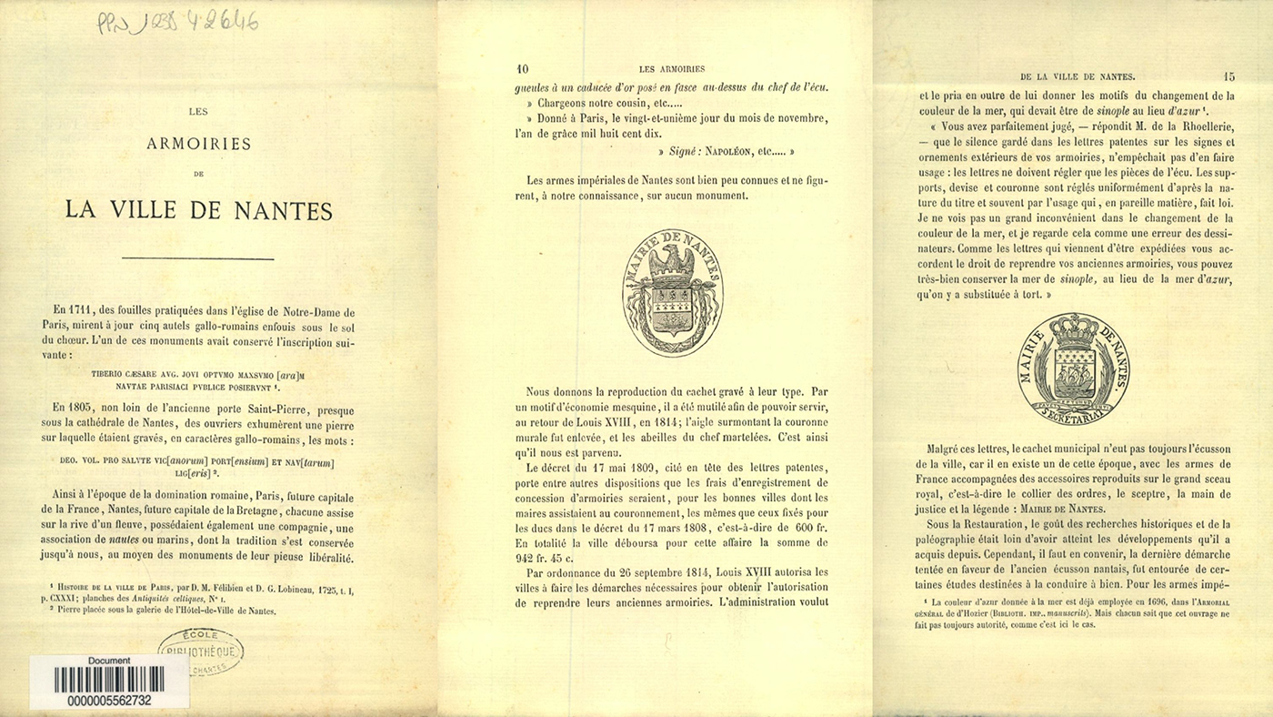
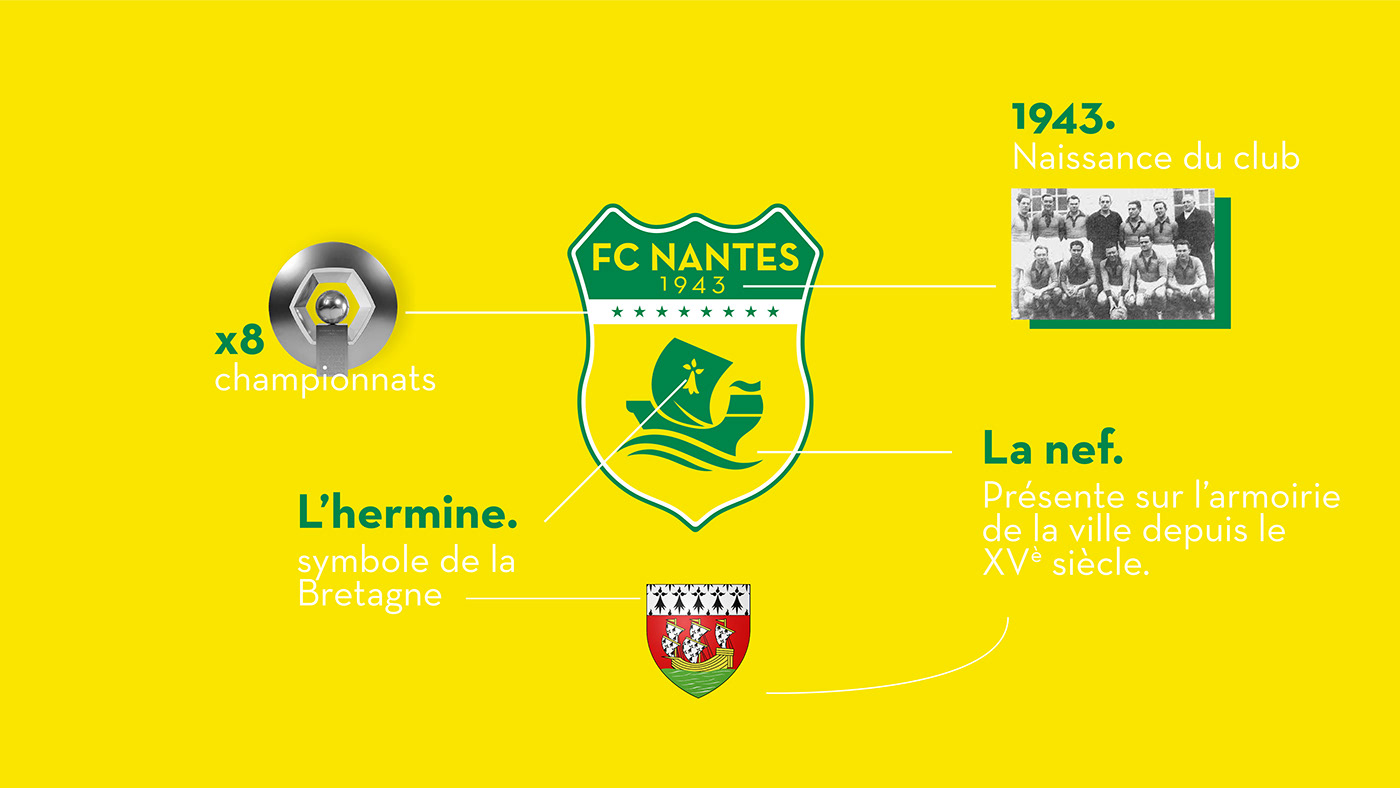
Pour réaliser ce logo, j’ai décidé de m’inspirer de l’identité de cette ville qui fait la fierté des nantais. L’inspiration des armoiries de la ville de Nantes n’est qu’une évidence. Maintenant que nous avons les symboles de Nantes, à savoir l’hermine et la nef, reste à faire le lien avec l’histoire du FC Nantes. 8 titres de champion de France.
EN
To create this logo, I decided to be inspired by the identity of this city which is the pride of the Nantes people. The inspiration of the coat of arms of the city of Nantes is only natural. Now that we have the symbols of Nantes, namely the ermine and the nave, we still have to make the link with the history of FC Nantes. 8 French championship titles.

FR
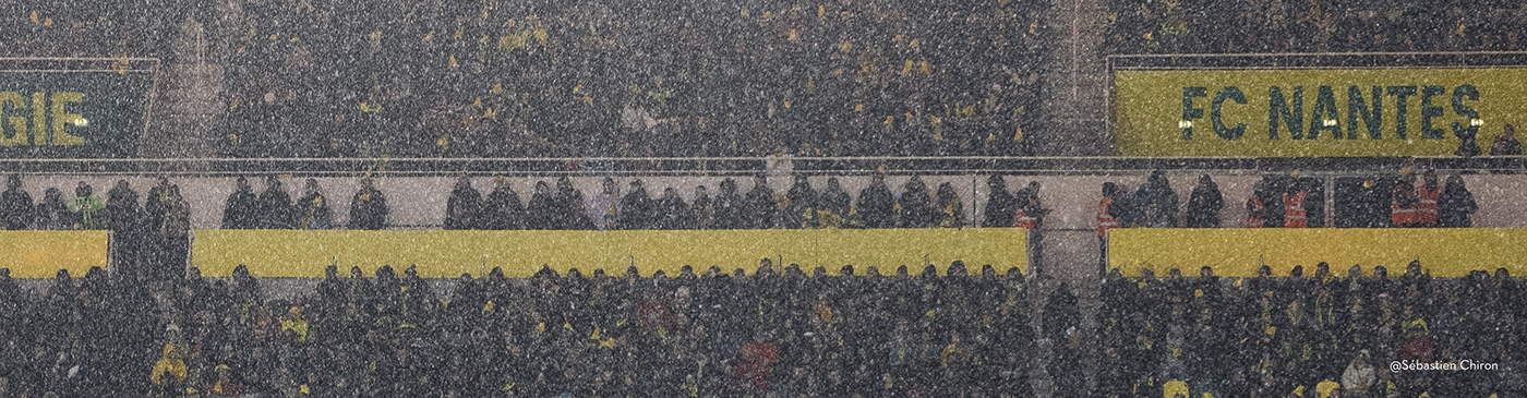
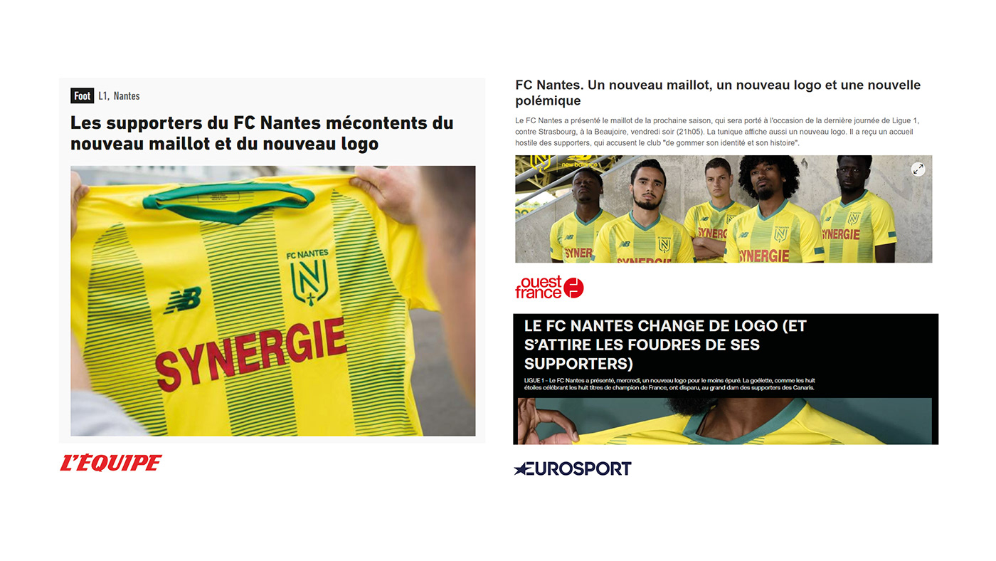
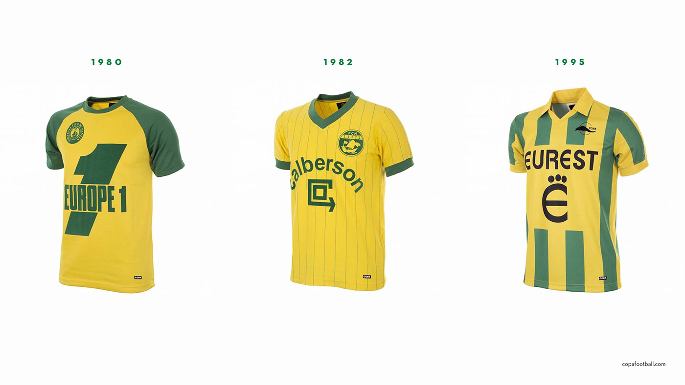
Tout comme le logo, il est important de faire un parallèle avec l’histoire de club lorsque l’on conçoit un maillot. Il fut naturel de réintroduire les bandes vertes sur le maillot domicile, disparues depuis des années. Le rouge de « Synergie » disparaît pour laisser place à cette harmonie.
Un maillot simple, moderne, qui prend en compte l’avis des supporters.
Un maillot simple, moderne, qui prend en compte l’avis des supporters.
EN
As the logo, it is important to draw a parallel with the history of the club when designing a jersey. It was natural to reintroduce the green stripes on the home jersey, which had been missing for years. The red of "Synergie" disappears to make way for this harmony.
A simple, modern jersey that takes into account the opinion of the fans.
A simple, modern jersey that takes into account the opinion of the fans.


FR
Aujourd’hui, les blasons de club doivent exister sur internet, les réseaux sociaux, et tout produits dérivés. C’est pourquoi il est nécessaire que les blasons évoluent avec leur temps, mais il n’est pas nécessaire de réaliser des logos minimalistes pour se faire reconnaitre, l’identité d’un club étant déjà très forte.
EN
Today, club coats of arms must exist on the internet, social networks and all derived products. This is why it is necessary for coats of arms to evolve with the times, but it is not necessary to create minimalist logos to be recognized, as the identity of a club is already very strong.


