


Voronezh State University
of Forestry and Technologies
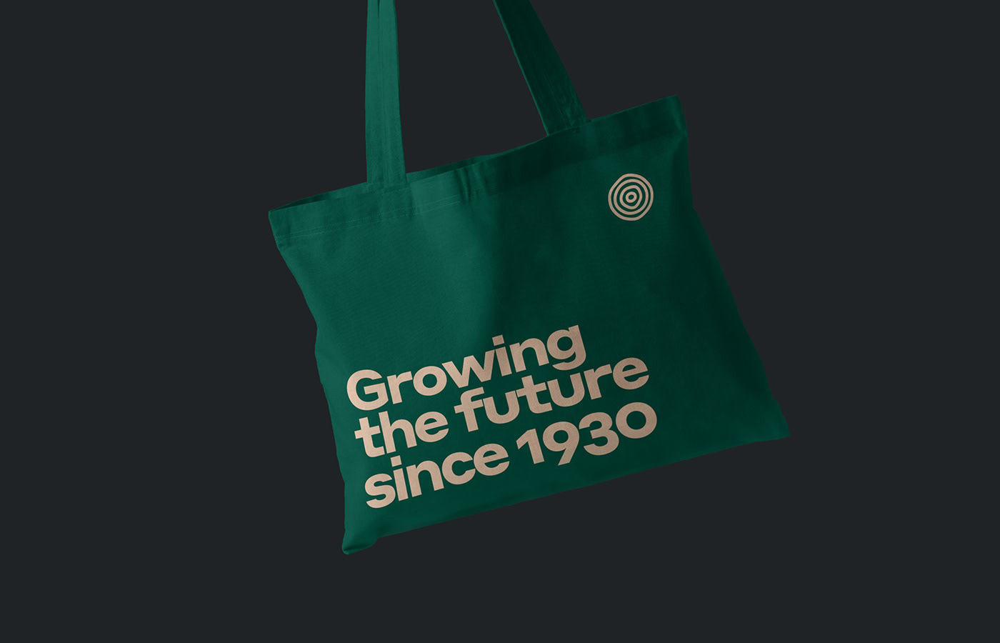
Evrone Design has developed an identity for the Voronezh State University of Forestry and Technologies. The visual language illustrates the interaction of natural resources and technical approach. The new identity helps us recognize two parts of the system that are perfectly balanced.
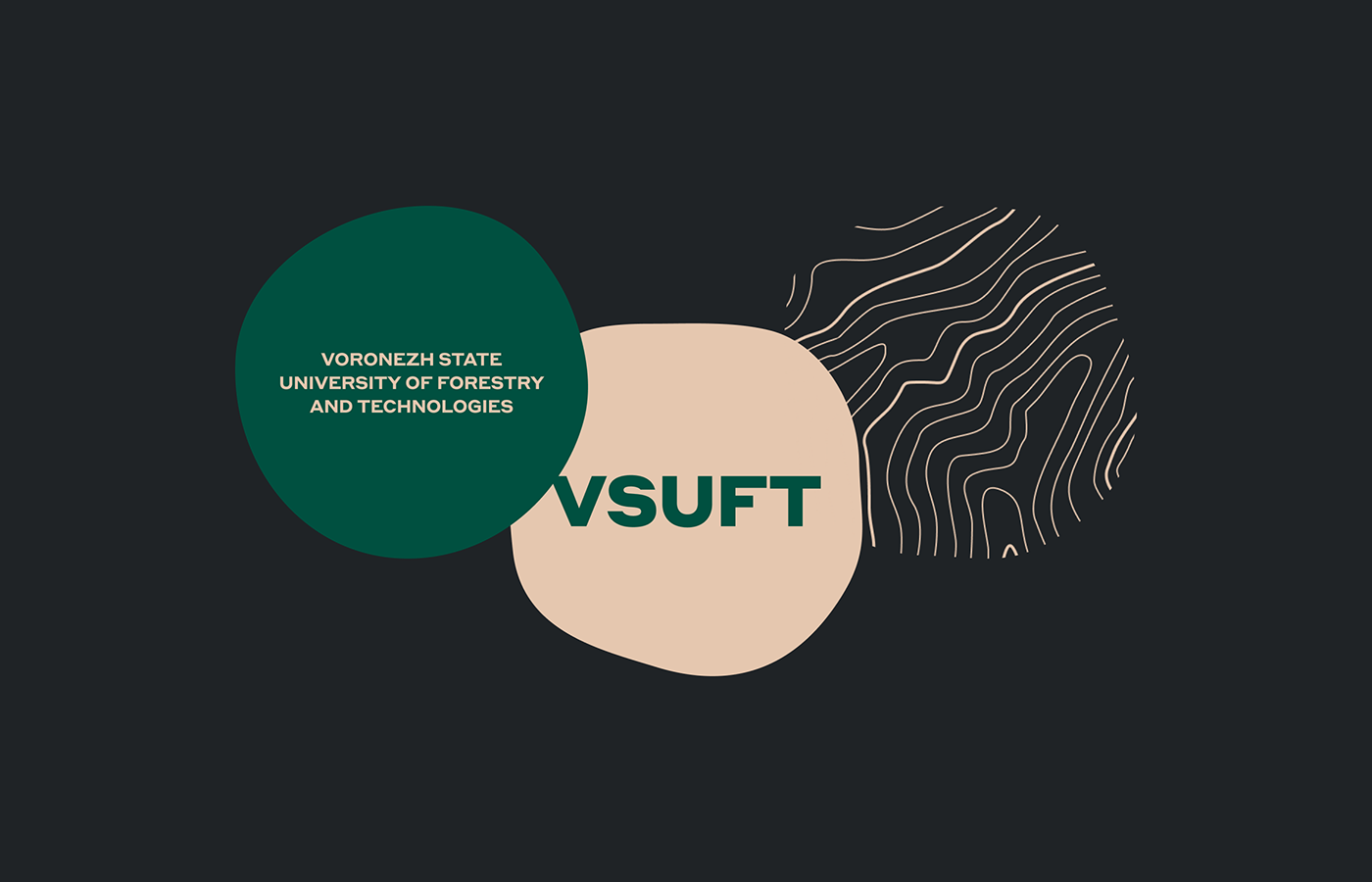
The tree rings of the logo refer to natural forms, metaphors of development, continuity and evolution. They are not symmetrical geometrical circles, but naturally living forms. Each circle is similar to the previous one but unique in its own way. The contours of the logo are emphatically geometric. They reflect manufacturability and balance the vitality of the sign.
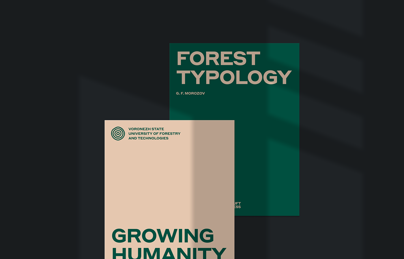
The discreet colour palette is based on complex natural colours of processed wood and deep forest greens. In addition to natural associations, colours are reminiscent of the tradition of classical universities.
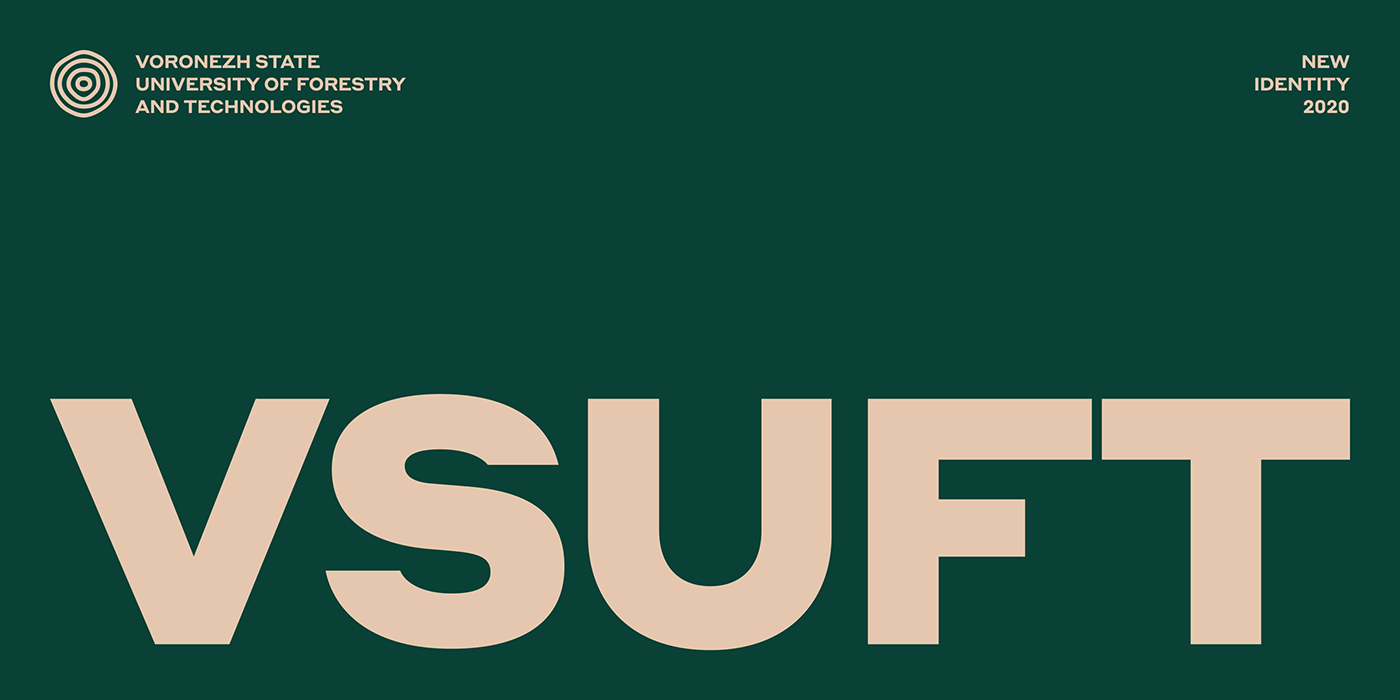
Modern typography based on the Styrene typeface and the aesthetics of a Swiss poster helps the style to be modern, and not tied to trends.The style balances between academic rigour and natural dynamics.


Thank you!
Art Direction: Sergei Anenko
Design: Denis Bezrukov
Made by Evrone.com
Send us an mail@evrone.com
More identity cases on Evrone.com
Branding for education


