

iN Consultoria de Marcas is an award winning brand strategy and identity. iN's clients consist of a range of different business, that can go from start-ups to bigger brands, including a relevant presence among capital market firms. Considering this range, iN's partners decided the brand needed to communicate with an array of different tones of voice, so every part of their audience felt included in their speech. That’s how we got into play. We had previously wrote an article on Variable Brand Voice, a concept we named with that exact use in mind: brands that use typography to vary their expression. iN asked us to put this concept into practice.
The entire branding process was done in-house at their office. Our role was exclusively to design their proprietary typeface. Being designers and branding specialists themselves, iN's partners made for the perfect type design clients: not only they were interested on actively participating on the creative process, as would also bring us great references and inspiration.
We are happy to report that the end result is as much our creation as it is theirs’.

During the branding process, iN had already laid out the type palette they wished for, using retail fonts. Our job was to create custom designs for them, while following those general guidelines. Above, some inicial sketches. Below, the three creative paths we presented at the first stage of the custom type project. First one was the way forward.
The project turned out to be more ambitious than we initially thought, so we ended up designing four different typefaces put together in one variable font file: Sans, Serif, Sans Mono and Serif Mono. As you can imagine, making four different but cohesive designs to fit the same family is already a big challenge, let alone making them variable as well.

The chosen path combines the proprietary look & feel they were looking for with friendly and easy-to-read shapes.
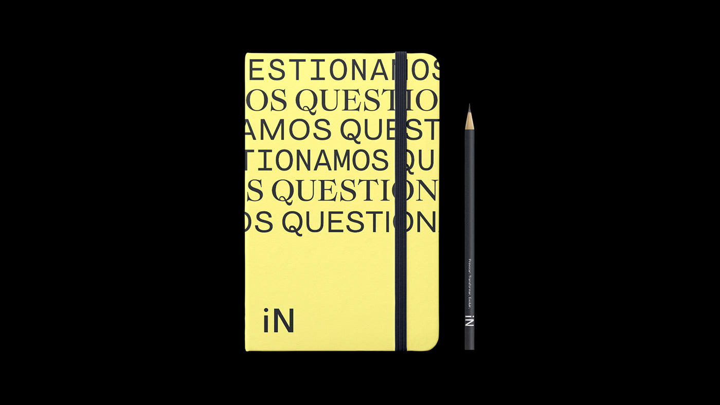
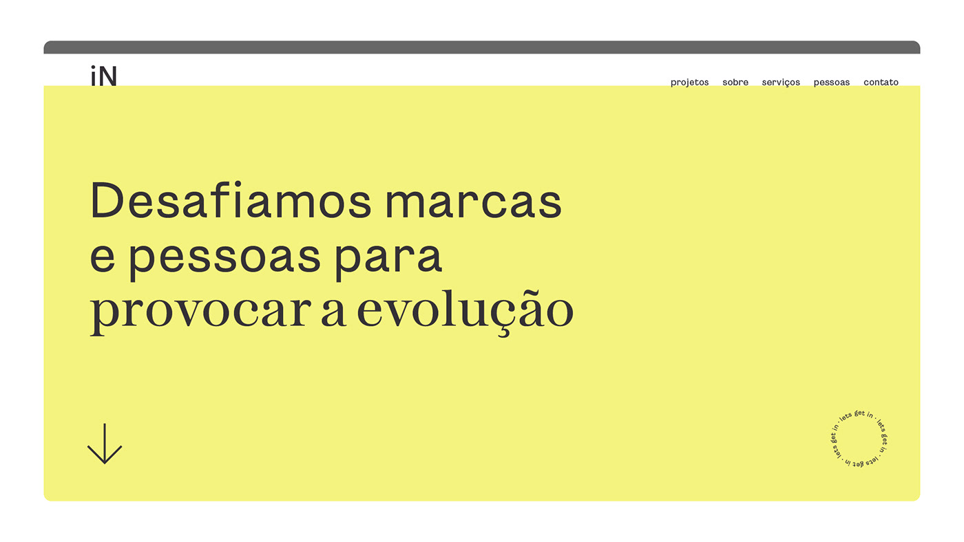
iN is particularly known for great work in tone-of-voice branding. The written form is thus crucial for their brand expression. This is a project where we know for a fact that the type family we designed will be used extensively and in ways we can't even imagine yet.
A notable trait of this project is that iN planned to use the different typefaces together, sometimes even within the same sentence. This means that, on one hand, the designs are similar enough make smooth transitions from one another and on the other they are markedly distinct so as no to make the layout look hesitant.


Bolds and italics for each typeface were a late addition to the project, since the team realised that it would make the fonts more suitable for composing text, especially under Microsoft Office domain.


Project Credits:
Creative Direction: Caio Campana & Team (iN Consultoria de Marcas) + Rodrigo Saiani
Project Lead: Carlos Mignot
Typedesign: Carlos Mignot, Felipe Casaprima and Rodrigo Saiani
Motion: Felipe Casaprima
Brand identity: iN Consultoria de Marcas
Brand video: Rafael Barnete
Typedesign: Carlos Mignot, Felipe Casaprima and Rodrigo Saiani
Motion: Felipe Casaprima
Brand identity: iN Consultoria de Marcas
Brand video: Rafael Barnete


