DOOR to ASIA 是一個設計師駐村計畫,邀請亞洲地區設計師前來日本當地社區駐村,為在地企業創造並提供永續經營的傳達設計觀點與方法。
受DOOR to ASIA邀請,HOUTH的設計師參加了DESIGN CAMP in NARA Japan為期一週的駐村計畫,共有三組來自日本與亞洲的設計師與一位奈良當地的導師。與HOUTH同一組的是自大阪的平面設計師Urara,我們的合作的對象是位於吉野的茶品牌,嘉兵衛本舗KAHEE HONPO 。
我們一開始在嘉兵衛本舖住宿三天,跟著業主體驗他們每日的工作行程,透過提問交流,深度了解他們經營品牌的方式以及正在面臨的問題。接下來的三天我們透過設計思考與企劃,提出解決方案,最後一天向業主與地方的人們提出成果發表。
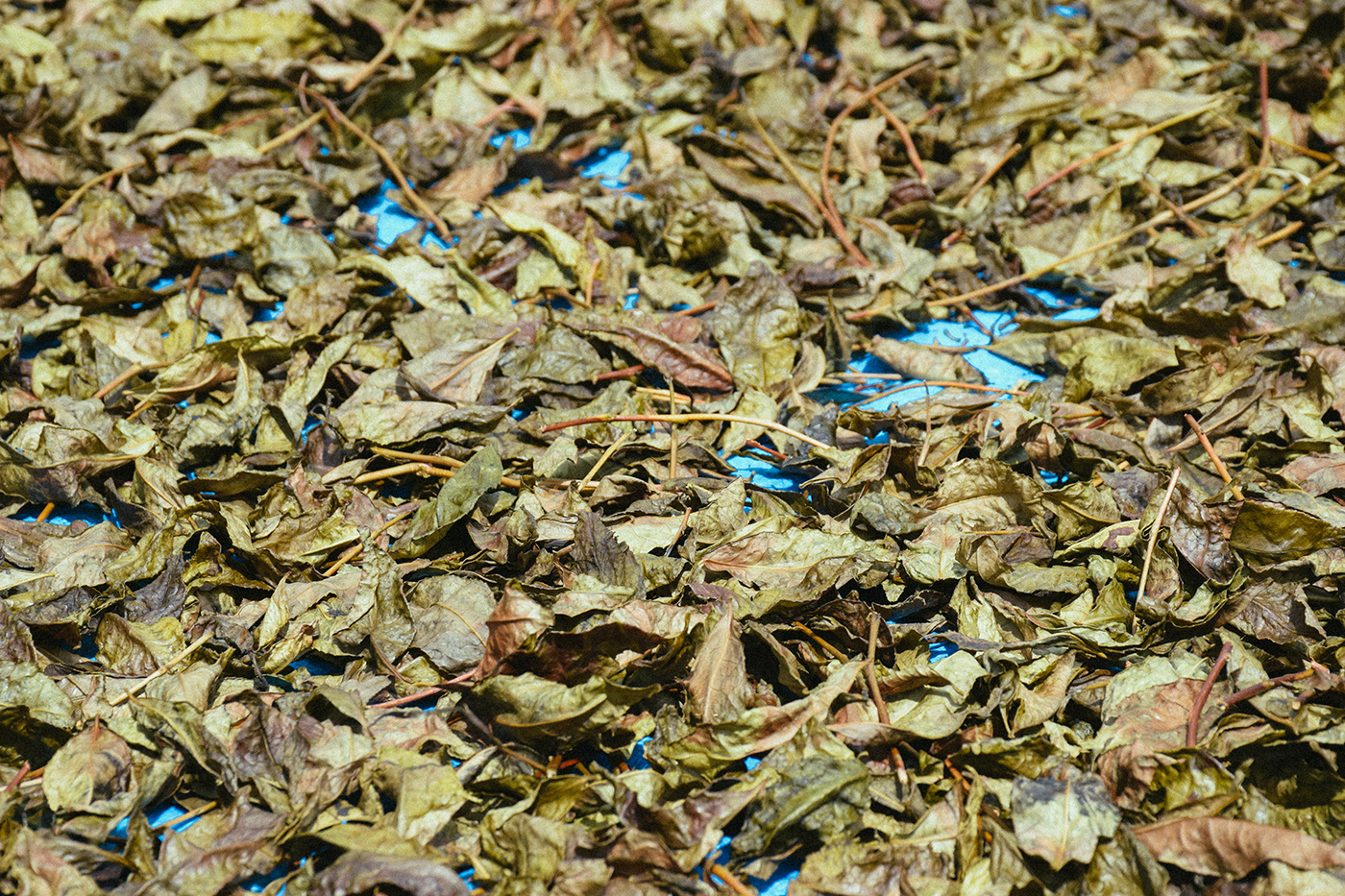
嘉兵衛本舖是位於奈良吉野超過百年的茶品牌,最廣為人知的是經典傳統的日曬番茶,番茶的製作過程需先摘下老葉蒸氣烘乾後,再將葉子自然日曬在太陽下,一天要經過幾次全人工的翻面曬葉,讓茶葉日曬至乾焦入袋。
百年來堅持用傳統的方式製作番茶,我們參與時他們不久前才更新了品牌識別,而他們遇到的問題是兩代間經營理念的不同,與地區人口老化人手不足造成的供給問題,以及銷售上的通路單一。
在駐村期間我們體驗到,他們擁有豐富的茶文化知識,品茶的體驗工作坊,甚至以茶入菜的料理食譜,將來也希望能在本舖附近開店。嘉兵衛本舖因為名字註冊問題所以無法沿用至新店鋪的設計。於是我們提出了一個全新的企劃:
ttt Preject 概念店
tea, 茶與茶的飲食與延伸
taste, 品茶的體驗工作坊或是跟茶有關的器具選品
trip, 手摘茶葉的體驗與手工日曬翻茶體驗以及茶的知識教室
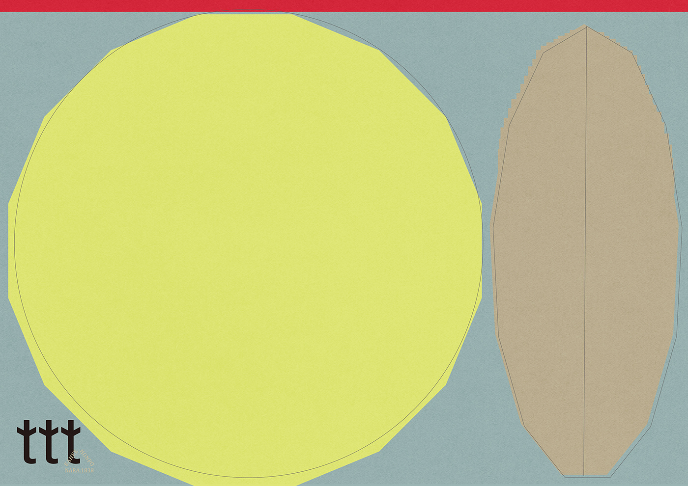
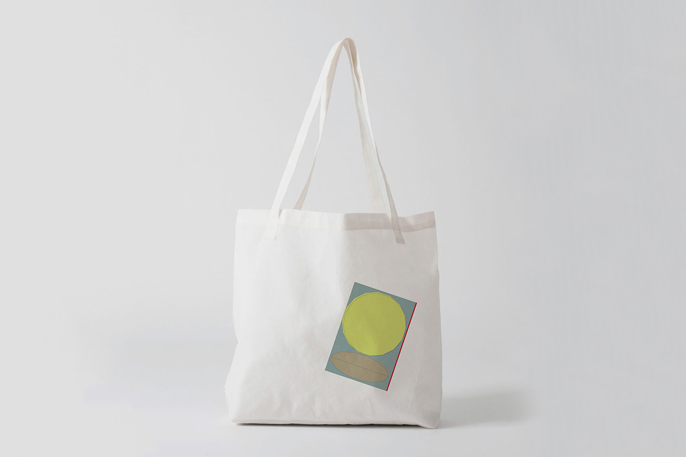
企劃的核心,透過新型態的概念店與營運方式,帶來年輕族群為地方注入創意與活力,同時為地方與傳統文化帶來新發展可能,甚至增加地方工作機會,解決目前所遇到的困境。我們在簡報中將企劃提出落實的建議與規劃。而視覺識別設計的思考希望呈現一種新傳統的印象,保留KAHEE HONPO年份的印記更具現代感的視覺表現嶄新的設計。logo三個並肩的t代表了傳承的三姐妹三人一心,也象徵茶葉了的一心二葉。延伸視覺以品牌最經典的日曬番茶與一心二葉的形象做為品牌圖形。在這分享部分視覺設計的成果。
DOOR to ASIA is a designers in residence program where designers from Asian countries gather in a community for a period of time to create “communication design” for the local companies.
Ho Wan Chun, the designer of HOUTH, got invited to join the 7 days residence program “DESIGN CAMP in NARA Japan”, Wan Chun team up with Urara, an Osaka designer, and to work together with a Yoshino local tea brand KAHEE HONPO.
Both designers homestay at the tea company for 3 days to work and live together with owners, in order to understand every process and details how they manage the brand and discover the problems they are facing now. Then the design team have 3 days to discuss and come out the design solution, and present to owners and local residents.
KAHEE HONPO is a tea brand based in Yoshino Nara, Japan over 100 years which specialize at traditional sun drying bancha. The process of making bancha is to pick old leaves and steam drying first, then put all the leaves natural dry under the sun. They have to flip the leaves manually couple times a day, till the leaves become really dried and packed into bags. This is how they make bancha, exactly the same way as 100 years ago.
When we start to research the brand, we found out the problem is not the visual identity, but the different business philosophy between 2 generations, the problem of insufficient local population and the single sales channel.
KAHEE HONPO has a wealth knowledge of tea culture, tea testing experience workshops and creative tea-related cuisine. They wish to open a new store near the old shop in the future. Because of the name registration problem of KAHEE HONPO, they can’t use the same name in the future store. Therefore, we propose a brand new project:
ttt Project Concept Store
t for tea and tea-related cuisine
t for tea testing workshops and tea utensils
t for trip of tea picking, tea leaves flipping and tea knowledge course
t for tea and tea-related cuisine
t for tea testing workshops and tea utensils
t for trip of tea picking, tea leaves flipping and tea knowledge course
Through the new concept store and new business model, to bring the young people back and increase the local creativity and energy, to refresh the local and traditional culture, even to increase employment opportunities.
Year : 2019
Host by : DOOR to ASIA, DESIGN CAMP in NARA Japan
Company : 嘉兵衛本舖 KAHEE HONPO
Visual Identity Design : Ho Wan Chun
Strategy Planning : Urara Matsumoto, Ho Wan Chun
Interpreter : Chloe Chong
Local Tutor : Hirose Yuko
Special Thanks : Pip and everyone who participate in this project
Host by : DOOR to ASIA, DESIGN CAMP in NARA Japan
Company : 嘉兵衛本舖 KAHEE HONPO
Visual Identity Design : Ho Wan Chun
Strategy Planning : Urara Matsumoto, Ho Wan Chun
Interpreter : Chloe Chong
Local Tutor : Hirose Yuko
Special Thanks : Pip and everyone who participate in this project