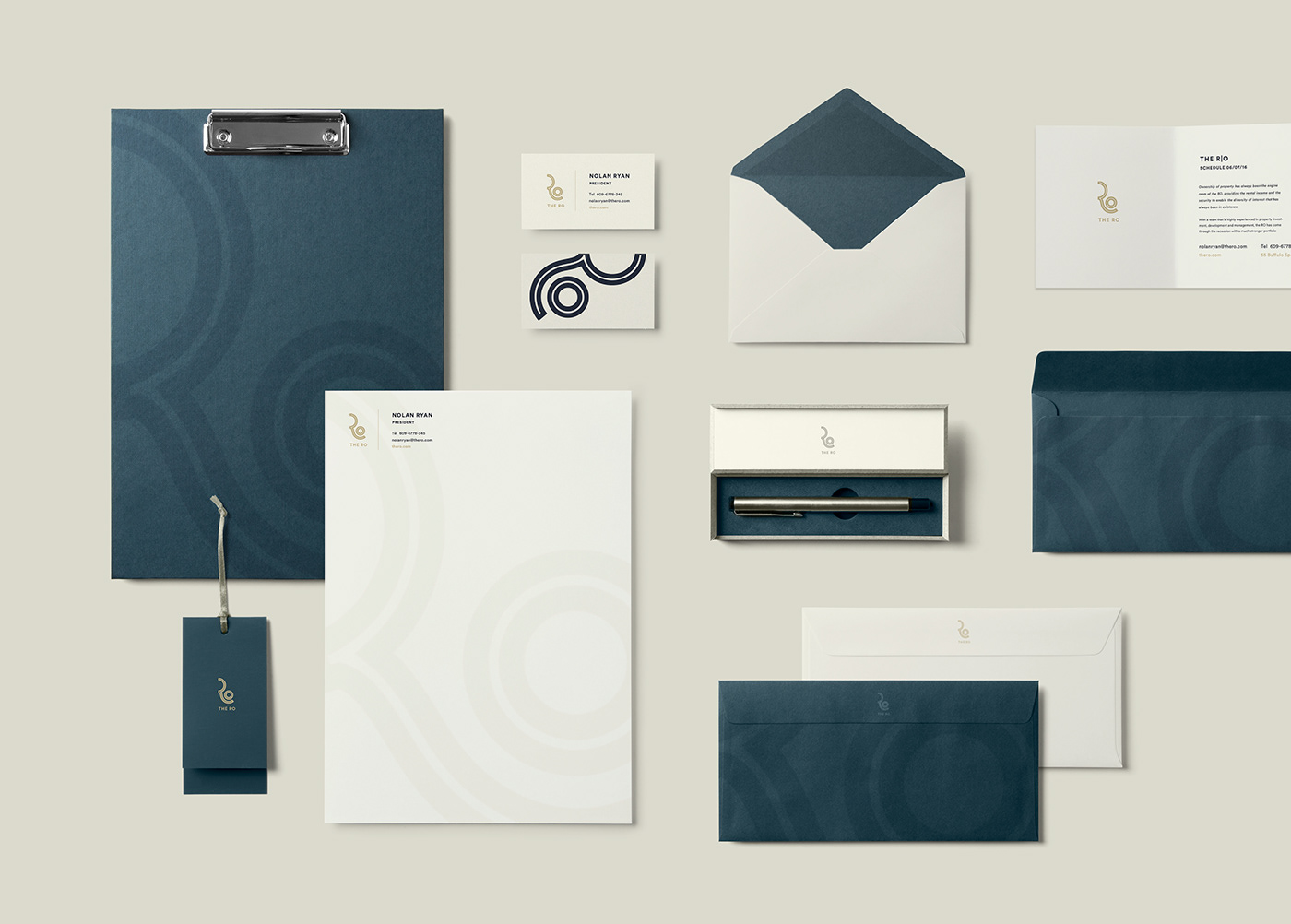
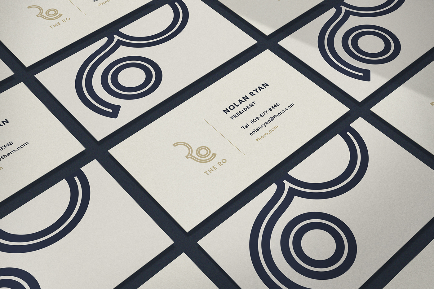
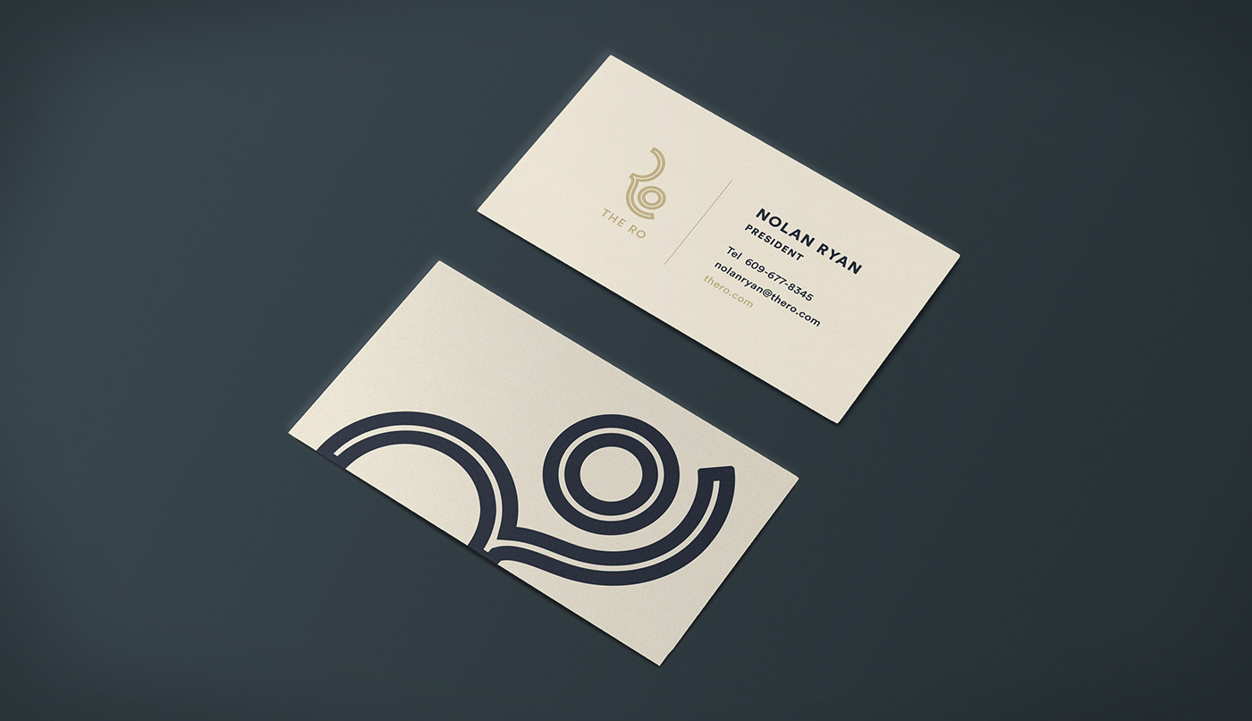
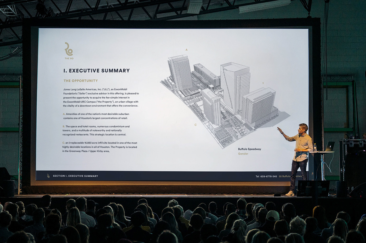
The R|O is a Commercial Real Estate Development company in Houston. The logo they were looking for needed to convey a high-end feel that took inspiration from the authentic landscape in the area of the River Oaks District.The first direction emphasizes the circular nature of the letters R and O to create an elegant monogram for the property. The relationship between the characters and the inline treatment of the letters hint at both a running river, a sculptural form as well as a woodgrain texture.

Alternate Direction
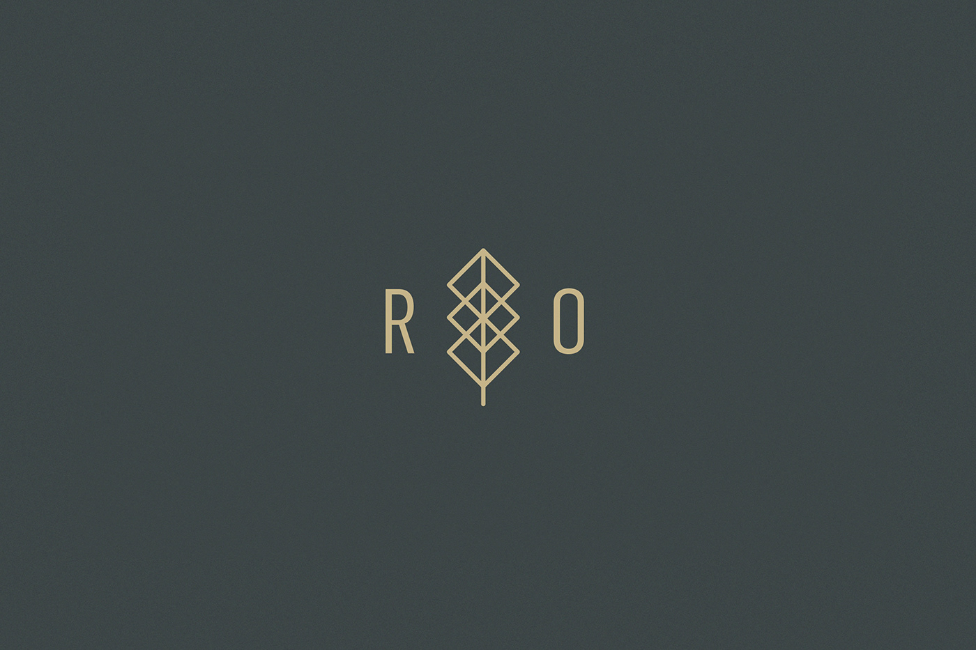
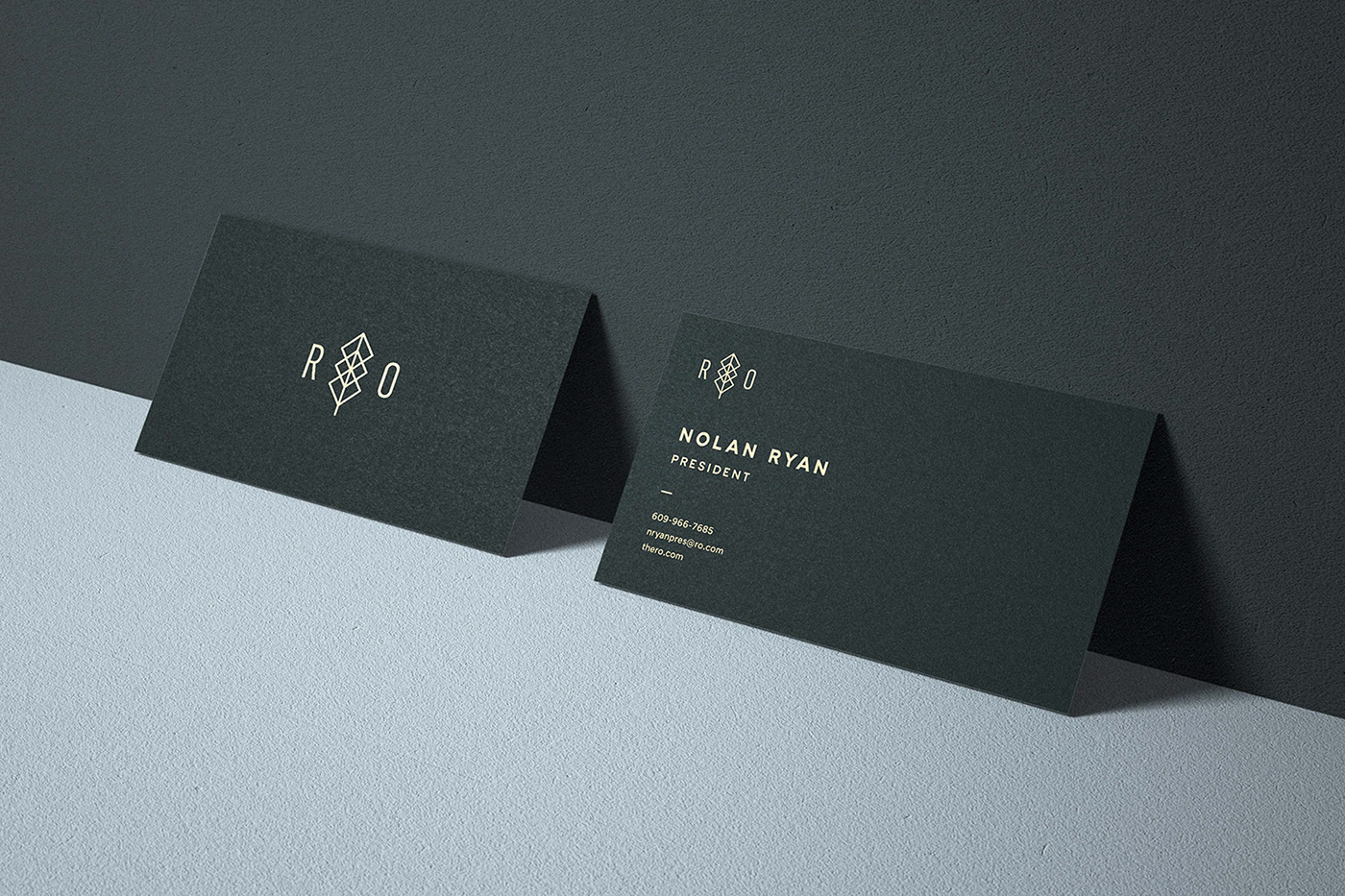
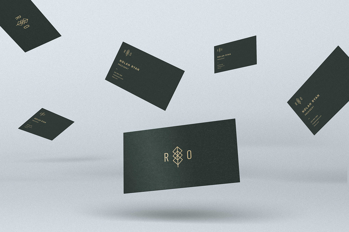
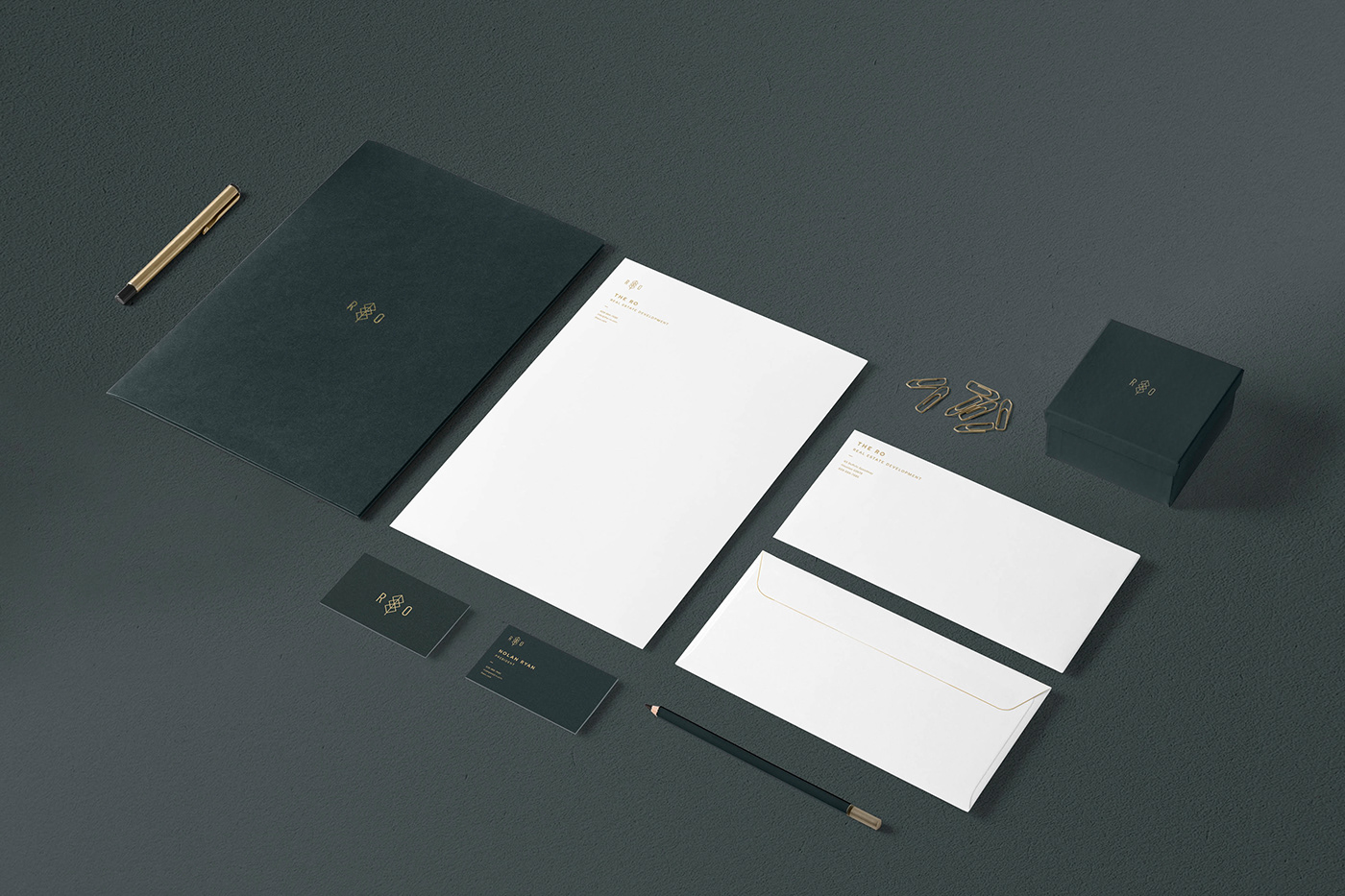
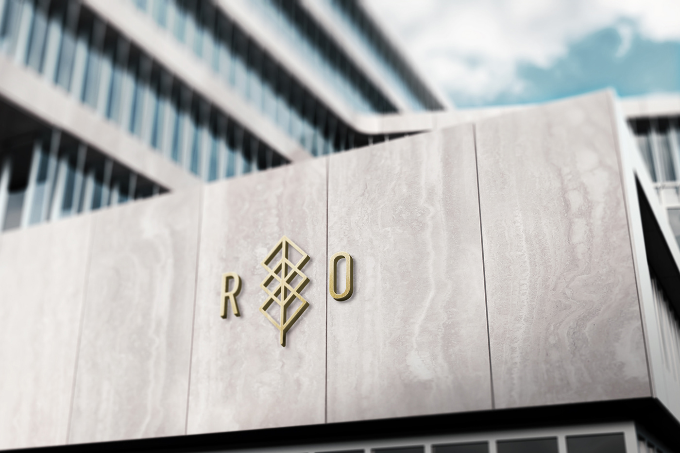
This direction plays up the “River Oaks District” origins of the R|O name with a structural Oak tree icon that serves as the typographic divider between the letterforms and takes inspiration from glass, which is often used in the R|O buildings.
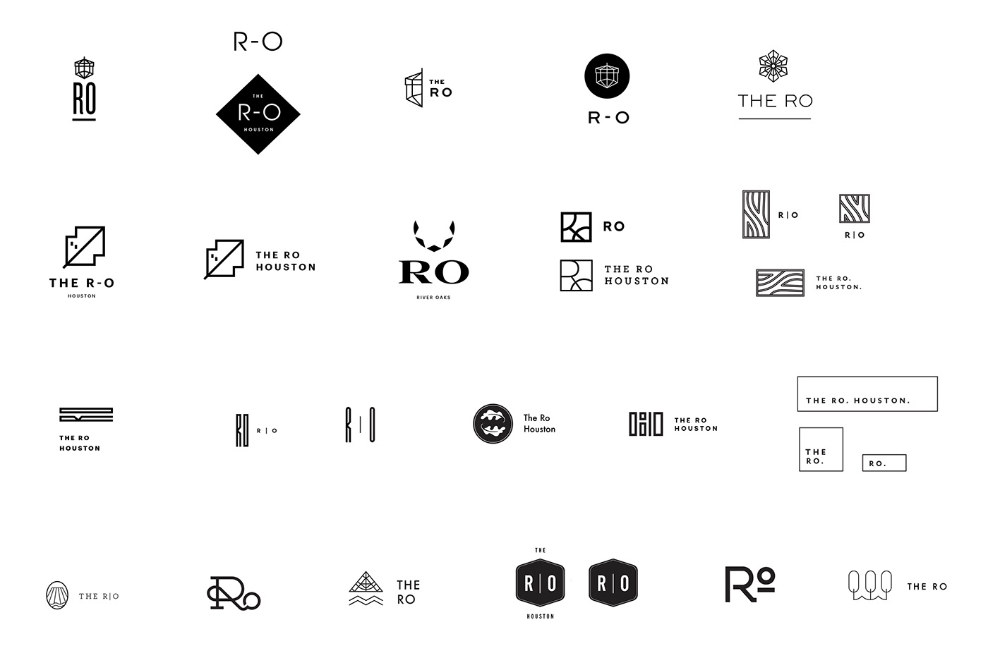
Exploration
Below is the full exploration I did while creating these logos.