Boston University College of Fine Arts Campaign Brochure
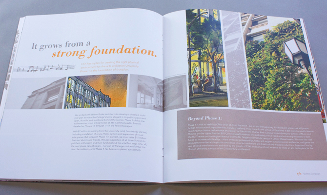
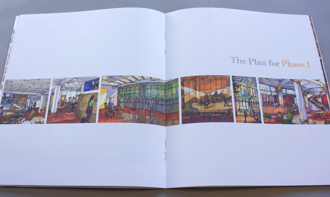
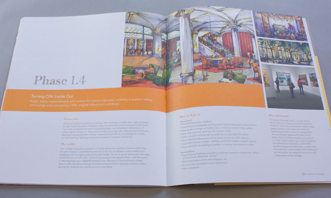
Boston University College of Fine Arts needed to attract high-level donors to support their multi-million dollar campaign. The brochure needed to make a strong case for a new facility by highlighting the current decrepit state of the building while giving a clear vision of its potential.
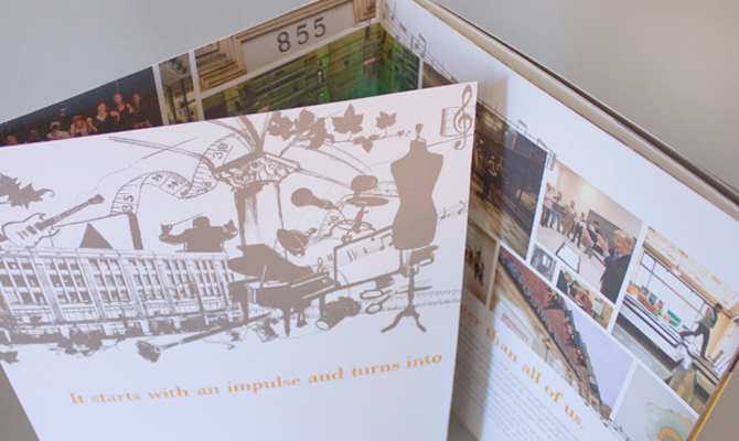
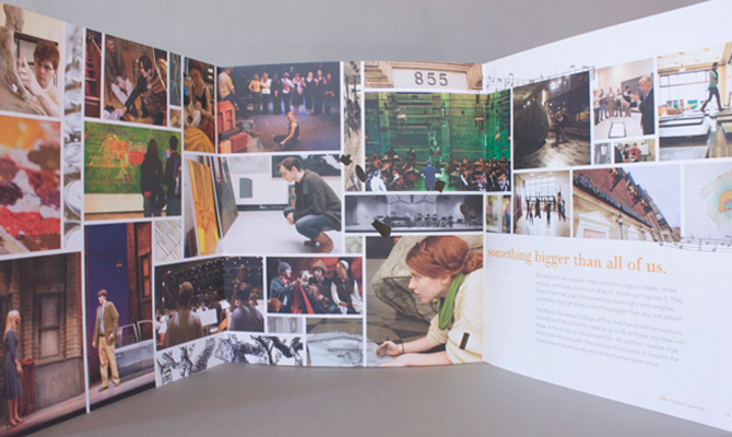
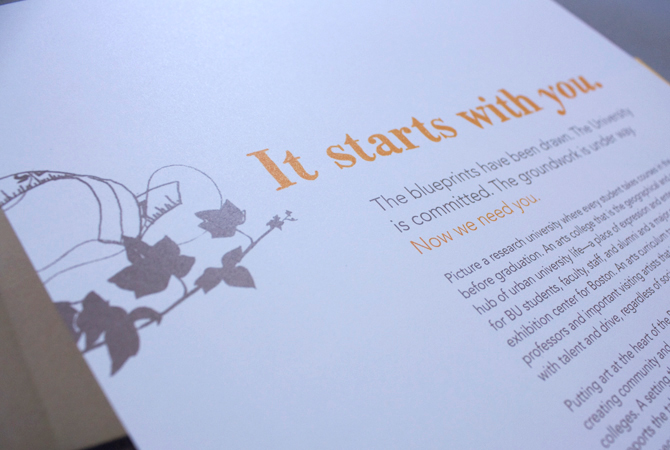
The campaign targeted art enthusiasts so the brochure had to appeal to their senses. The piece needed to feel like the school -- real, artistic, diverse, vibrant, and bold. It was printed on a stippled cover stock to give the feel of canvas; bright orange and yellow swatches were reminscent of paint; metallic ink was like clay. To highten the handmade feel, illustrations highlighting every major were used throughout the piece along with hand-rendered typography. Additionally, die cuts were used on the cover to bring color from the inside out; part of the renovations is to open up the building to the street with enormous gallery-like windows.
This brochure was designed alongside Laini Leto and together we won the Neenah Paperworks Gold Award.