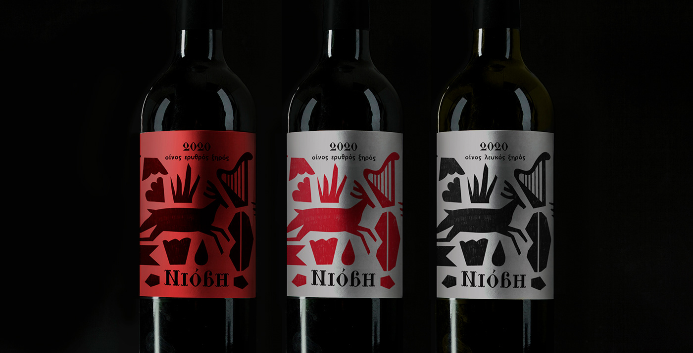
Branding and packaging design for Niobe, a series of homemade wines from Lesvos, Greece. It is named after Niobe, the greek mythological symbol of the bereaved mother, weeping for the loss of her children. It is one of the most memorable greek myths featuring an example of the consequences of hubris (a greek term for arrogance or excessive pride towards gods). The name inspired me for the label design to illustrate symbols, and figures that are found in the myth.
According to the myth, Niobe who had six daughters and six sons, boasted that she was more fertile than goddess Leto, who had only two children, Artemis and Apollo, the Olympian gods of the hunt and music respectively. As punishment for her pride, Apollo killed all Niobe's sons and Artemis killed all her daughters. Niobe was turned into a rock on Mount Sipylus (northeast of Izmir, Turkey).
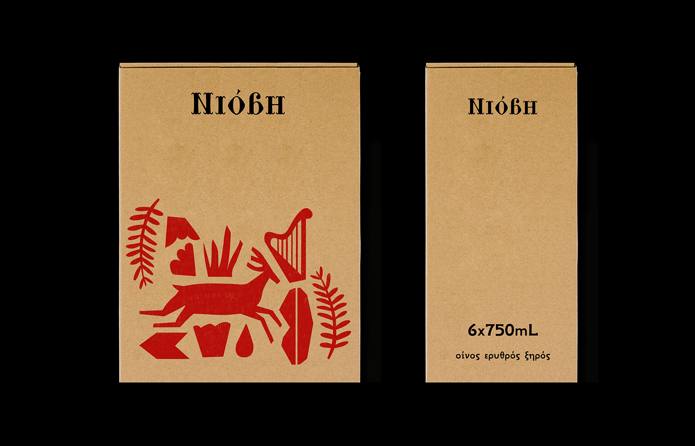
For the three types of wine I used a different colour palette and paper. Pale grey paper for the basic series of red and white wine and bright red paper for the limited series of aged red wine in oak barrel. Τhe label includes a small part of Homer's Iliad, where it narrates the legend of Niobe, the first time it was ever recorded. The illustrations were also used in other applications and materials in order to enhance the visual identity.