Logo Restyling - French/Italian bakery
Patisserie Turin is a small artisanal bakery in the heart of Briançon, a small french town.
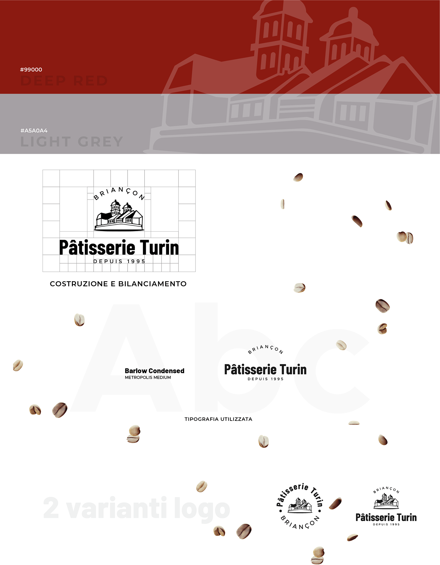
The old logo was outdated, with too much stuff in it, with an outdated, poorly readable typography and not well balanced.
I decided to keep the cathedral profile, since the Pâtisserie Turin is close to it, and the red color.
I changed the perspective and added some typical house profiles in it.
I changed the perspective and added some typical house profiles in it.
The chosen typography is a combination of 2 sans serif fonts that perfectly match the pictogram.